Chapter 6 Basics of cartographic design: elements of a map
6.1 Introduction
This chapter aims to focus on introducing good practice in map design and presentation. When putting a map together you need to think about its intended audience (their level of expertise, whether you want them to interact with the map), purpose, and format of delivery (e.g., printed, web, projected in a screen, etc). There are many design decisions you need to consider: fonts, labels, colour, legends, layout, etc. In this chapter we provide a general introduction to some basic design principles for map production. These themes, and the appropriate election of symbol representation, are the subject matter of cartography, the art and science of map making. Within cartography a considerable body of research and scholarship has focused on studying the visual and psychological implications of our mapping choices. As noted in previous chapters one of the problems with maps is that powerful as a tool as they can be, they can lead to misunderstanding. What the mapmaker chooses to emphasise and what the map reader see may not be the same thing. We will work you through an example of a fairly basic map and the process of taking to a point where it could be ready for presentation to an audience other than yourself.
In this chapter we will be working with some data published by Hungarian police available online (Police.hu 2020). Specifically we will be looking at some statistics related to drink driving. Drink driving is one of a number of problems police confront that relate to impaired and dangerous driving. Hungary has a strict drink driving policy, with the maximum drink diving limit being 0.0 BAC. Most European countries are at 0.5 BAC, while the UK is 0.8 (except 0.5 for Scotland). We have records for each county with the number of breathalyser checks carried out, and the number of these which returned a positive result.
We have downloaded and saved these data in the data folder made available with this textbook. The two data sets we will use are this drink driving data set, called drink_driving.csv, and a geometry of the counties within Hungary called hungary.geojson.
In this chapter, we will be making use of the following libraries:
# Packages for reading data and data carpentry
library(readr)
library(dplyr)

# Packages for handling spatial data and for geospatial carpentry
library(sf)
library(ggspatial)
library(rnaturalearth)

# Packages for mapping and visualisation
library(ggplot2)
library(RColorBrewer)
library(ggrepel)
library(cowplot)
So let’s read in our data sets, and join the attribute data to the geometry using left_join() (if you’re unsure about any of the below code, revisit Chapter 1 of this book for a refresher!).
# read in geojson polygon for Hungary
hungary <- st_read("data/hungary.geojson")

#read in drink driving data
drink_driving <- read_csv("data/drink_driving.csv")

#join the csv (attribute) data to the polygons
hu_dd <- left_join(hungary, drink_driving, by = c("name" = "name"))
We can now use this example to talk through the important principles of good visualisation of spatial data. We draw specifically from two areas of research: cartography and data visualisation. Let’s start with cartography.
Cartographers have always been concerned about the appearance of maps and how the display marries form with function (Field and Demaj 2012). As there is no definitive definition for what is meant by cartographic design it can be challenging to evaluate what makes good design. However there are themes and elements which can be used to guide the map maker, and offer points of reflection to encourage thoughtful designs.
The primary aim of maps is the communication of information in an honest and ethical way. This means each map should have a clear goal and know its audience, show all relevant data and not use the data to lie or mislead (Dent, Torguson, and Hodler 2008). It should also be reproducible, transparent, cite all data sources, and consider diversity in its audience (Dent, Torguson, and Hodler 2008). So what does that mean for specifically implementing these into practice. While a good amount of critical thought from the map maker will be required, there are aids we can rely upon. For example, Field (2007) developed a map evaluation checklist which asks the map maker a series of questions to guide their map making process. The questions fall into three broad categories:
- Cartographic Requirements: such as what is the rationale for the map, who are the audience?
- Cartographic Complication and Design such as are all the relevant features included and do the colours, symbols, and other features legible and appropriate to achieve the map’s objectives? And finally,
- Map Elements and Page Layout which tackle some specific features such as orientation indicator, scale indicator, legend, titles and subtitles, and production notes.
We will discuss these elements in this chapter to some degree, and the recommended reading will guide the reader to further advice on these topics.
Data visualisation is a somewhat newer field, however, it seems to encompass the same guiding principles when considering what makes good design. According to Kirk (2016) three principles offer a guide when deciding what makes a good data visualisation. It must be: ttrustworthy, accessible, and elegant. The first principle, of trust speaks to the integrity, accuracy, and legitimacy of any data visualisation we produce. Kirk (2016) suggests this principle to be held above all else, as our primary goal is to communicate truth (as far as we know it) and avoid at all cost to present what we know to be misleading content (see as well Cairo (2016)). Accessibility refers to our visualisation being useful, understandable, and unobtrusive, as well as accessible for all users. There are many things to consider in your audience such as dynamic of need (do they have to engage with your visualisation, or is it voluntary?), subject-matter knowledge are they experts in the area, are they lay people to whom you must communicate a complex message?, and many other factors (see Kirk (2016)). Finally, elegance refers to aesthetics, attention to detail, and an element of doing as little design as possible - meaning a certain invisibility whereby the viewer of your visualisation focussed on the content, rather than the design - that is the main point is the message that you are trying to communicate with your data. There are various schools of though within data visualisation research. For example, the work of Tufte (2001) emphasises clean, minimalist approaches to data visualisation, emphasising a low data-to-ink-ratio, which means all the ink needed to print the visualisation should contribute data to the graph. However, other research has explored the usefulness of additional embellishments on charts (which Tufte calls “chart junk”) - finding there may be value to these sorts of approaches as well (e.g. see Li and Moacdieh (2014)). In this chapter, we will aim to bring together the above principles, and work through a practical example of how to apply these to the maps we make.
6.2 Data representation
6.2.1 Thematic maps
We’ve been working with thematic maps thus far in this book. There are many decisions that go into making a thematic map, which we have explored at length in the previous chapters, such as how (and whether) to bin your data (Chapter 3) and how (or whether) to transform your polygons (Chapter 4). These are important considerations on how to represent your data to your audience, and require a technical understanding, not only an aesthetic one. So please do read over those chapters carefully when thinking about how to represent your data.
We’ve covered a few approaches to mapping (using ggplot2, tmap, and leaflet) but here we will continue with ggplot2 package to plot our thematic maps, specifically a choropleth map. We will map our sf objects using the geom_sf() function. To shade each polygon with the values of a specific variable, we use the fill = argument within the aes() (aesthetics) function. Most simply:
library(ggplot2)

map <- ggplot(data = hu_dd) + # specify data to use
  geom_sf(aes(fill = total_breath_tests)) # specify aestetics

map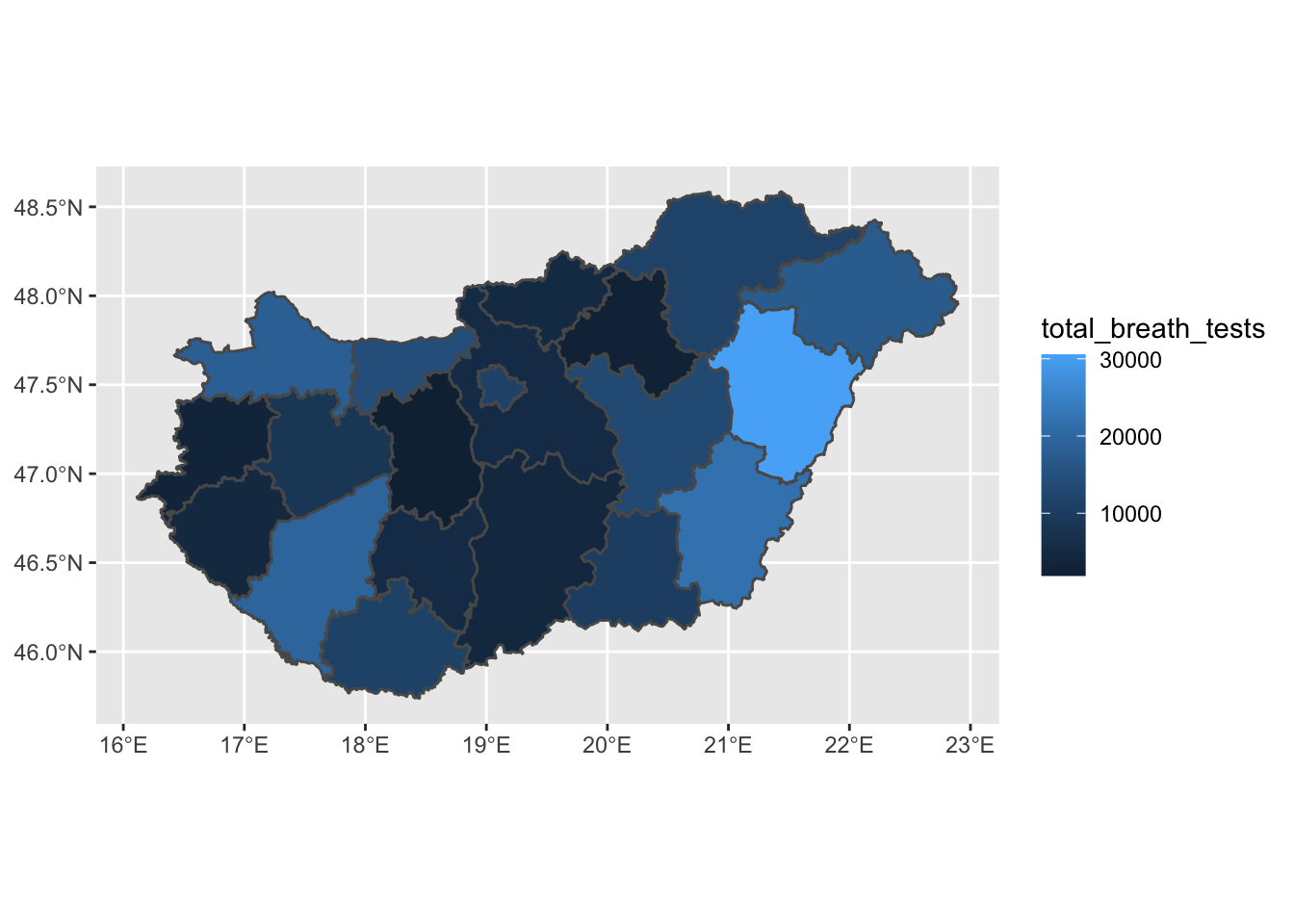
FIGURE 6.1: Quick thematic map with ggplot2
Maps made with ggplot are automatically placed upon a grid reference to our data (see our brief overview of building plots with ggplot in Chapter 1). To remove this, we can use the theme_void() theme, which will strip this away.
map <- map +
  theme_void()  # remove grid

map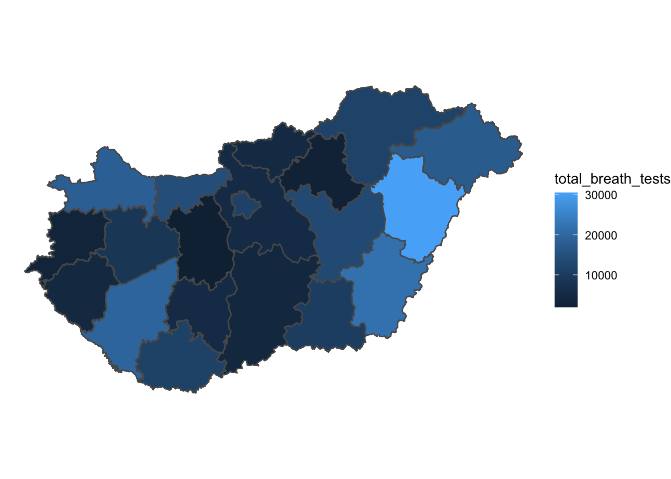
FIGURE 6.2: Add theme_void() to ggplot map
We can change the colour and size of the borders of our polygons with arguments inside the geom_sf() function, but outside the aes() function, as long as we’re not using our data to define these. For example we can change the line width (lwd =) to 0, eliminating bordering lines between our polygons:
ggplot(data = hu_dd) +
  geom_sf(aes(fill = total_breath_tests), lwd = 0) +  # specify line width
  theme_void()
FIGURE 6.3: Thematic map with border lines removed
Or we can change the colour of the borders with the col = argument:
ggplot(data = hu_dd) +
  geom_sf(aes(fill = total_breath_tests), lwd = 0.5,
          col = "white") + # specify border colour
  theme_void()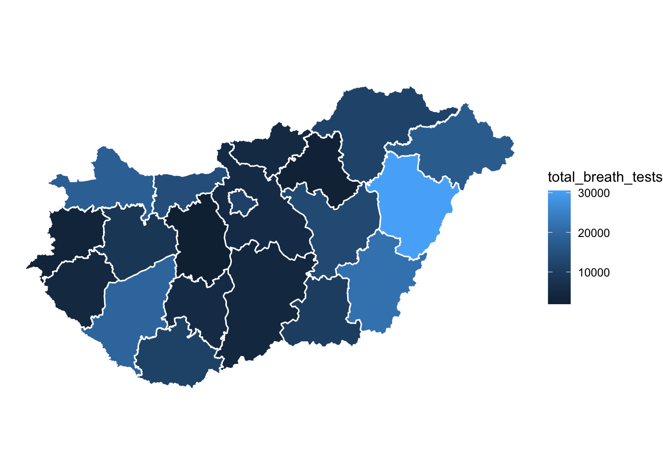
FIGURE 6.4: Thematic map with white borders
Here we have a continuous fill for our values, however we can employ our learning from Chapter 3 and apply a classification system, such as quantiles. To do this we might create a new variable which contains the quantiles of our numeric variable, and then use that as our fill =.
# create new variable for quantiles
hu_dd <- hu_dd %>%
  mutate(total_quantiles = cut(total_breath_tests,
                               breaks = round(quantile(total_breath_tests),0),
                               include.lowest = TRUE, dig.lab=10))

# plot this new variable
ggplot(data = hu_dd) +
  geom_sf(aes(fill = total_quantiles), lwd = 0.5, col = "white") +
  theme_void()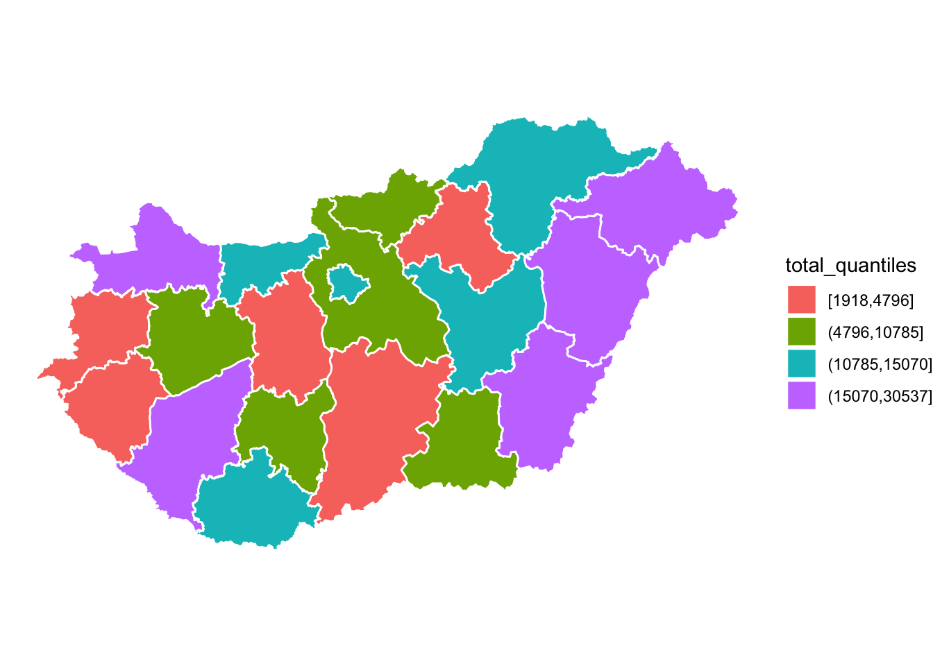
FIGURE 6.5: Map of quantiles with default colour scheme
The colour scheme is terrible, but we will talk about colour in the next section, so we can forgive that for now…
6.2.2 Symbols
You might not want to display your map as a choropleth map, you may want to use symbols. Again we explored this in Chapter 3 where you used the tmap package for this. Here is another way you can use graduated symbol map with ggplot(). You can take the centroid of each county polygon using the st_centroid() function from the sf package, and then when mapping with geom_sf(), within the aes() function specify the size = argument to the variable you wish to visualise:
ggplot(data = hu_dd) +
  geom_sf() +
  geom_sf(data = st_centroid(hu_dd),  #get centroids
          aes(size = total_breath_tests)) +  # variable for size
  theme_void()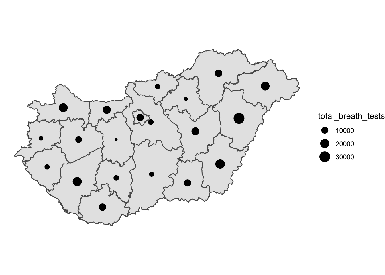
FIGURE 6.6: Graduated symbol map
Like with the thematic map you can play around with colour and shape:
ggplot(data = hu_dd) +
  geom_sf(fill = "light yellow",   # specify polygon fill colour
          col = "white") +    # specify border colour
  geom_sf(data = st_centroid(hu_dd),
          aes(size = total_breath_tests),
          col = "orange") +  # specify symbol colour
  theme_void()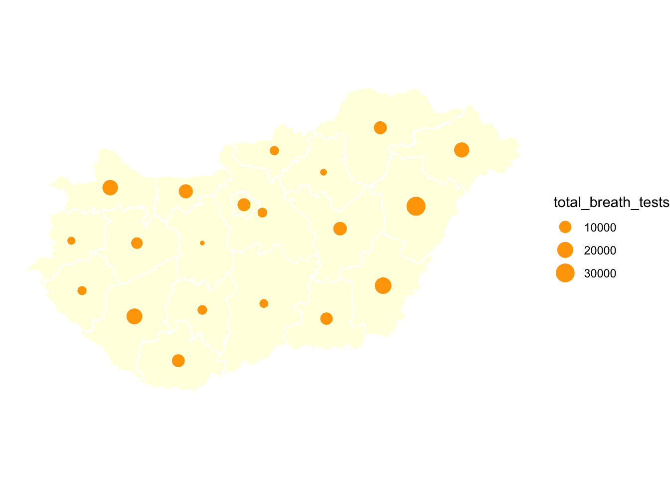
FIGURE 6.7: Graduated symbol map with adjusted colours
You can also change the symbol itself with the shape = parameter. For example you could use a triangle:
ggplot(data = hu_dd) +
  geom_sf(fill = "light yellow",
          col = "white") +
  geom_sf(data = st_centroid(hu_dd),
          aes(size = total_breath_tests),
          col = "orange",
          shape = 17) + # set shape to be a triangle
  theme_void()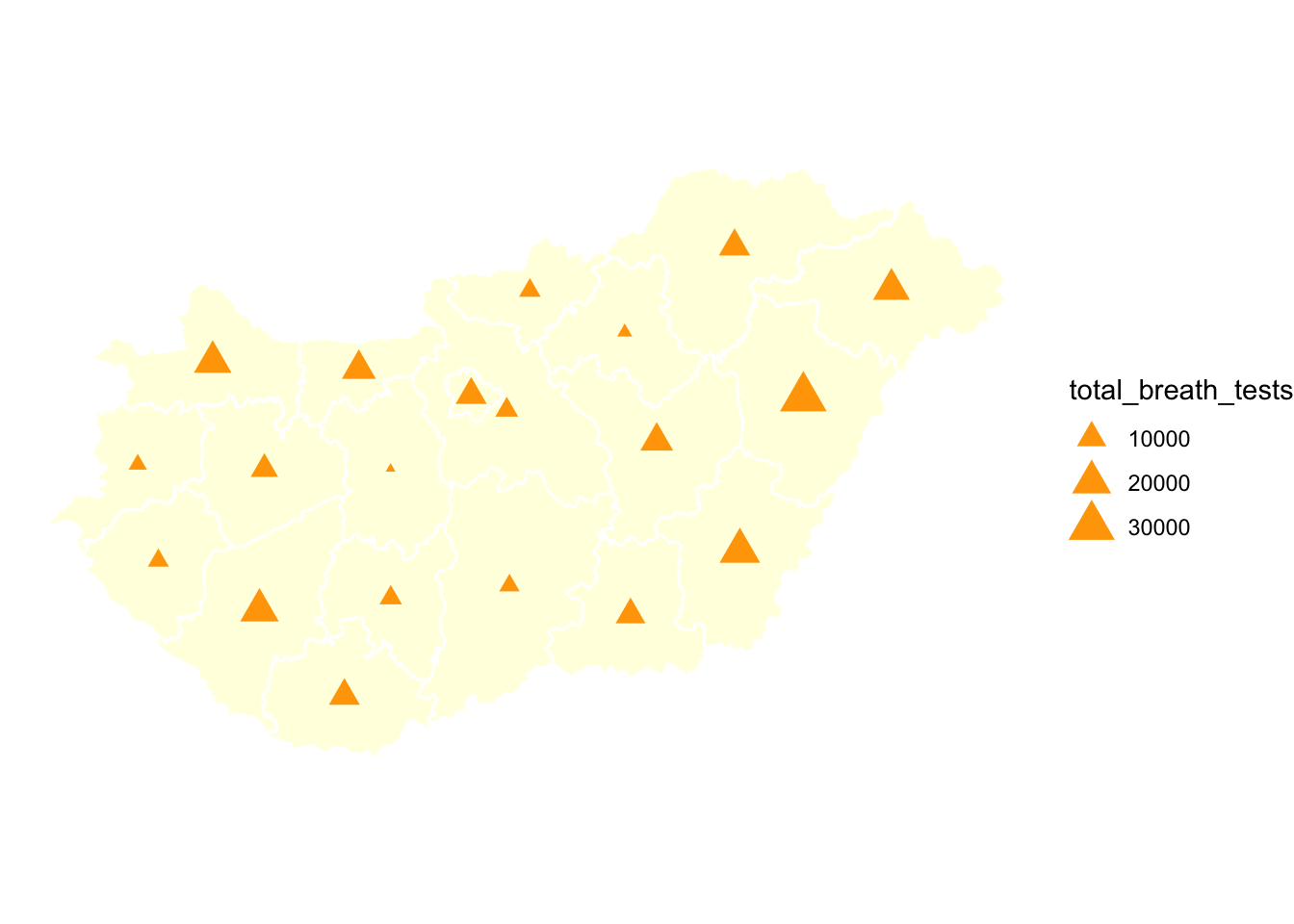
FIGURE 6.8: Graduated symbol map with triangle shape
Or to any other symbol. The possible values that you can use for the shape argument are the numbers 0 to 25, and the numbers 32 to 127. Only shapes 21 to 25 are filled (and thus are affected by the fill colour), the rest are just drawn in the outline colour. Shapes 32 to 127 correspond to the corresponding ASCII characters. For example, if we wanted to use the exclamation mark, the corresponding value is 33. How you choose to represent your data will depend on your decisions to the questions asked above about audience, message, integrity, and so on.
6.2.3 Rate vs count
In Chapter 3 we have discussed this already in great detail, so do consult this, but it is important that your data are meaningful and easy to interpret. We might, in this case for example, want to consider the rate of positive breath tests per test carried out in each county. To compute this, we might want to consider the proportion of positive results on the breatalyser tests (where the person had been drinking and their result is over the limit). To compute this, we can simply divide the positive results by the total test, and multiply by 100. We also include the round() function in there, as we don’t need much precision in this case.
hu_dd <- hu_dd %>%
  mutate(pos_rate = round(positive_breath_tests/total_breath_tests*100,1))
We can see the county with the highers proportion of test yielding drink drivers is Pest megye with 3 %, while the county with the lowest is Hajdú-Bihar with 0.2 %. We can visualise this rate on our thematic map in exactly the same way as the count data, but using our new variable in the fill = argument:
ggplot(data = hu_dd) +
  geom_sf(aes(fill = pos_rate), lwd = 0.5, col = "white") +
  theme_void()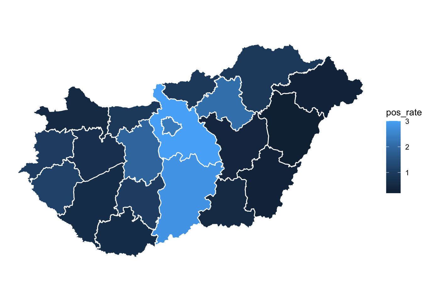
FIGURE 6.9: Map with rate instead of count
6.3 Colour
When choosing a colour palette, the first thing to consider is what kind of colour scheme we need. This will depend on the variable we are trying to visualise. Depending on the kind of varaible we want to visualise, we might want a qualitative colour scheme (for categorical nominal variables), a sequential colour scheme (for categorical ordinal, or for numeric variables) or a diverging colour scheme (for categorical ordinal, or for numeric variables). For qualitative colour schemes, we want each category (each value for the variable) to have a perceptible difference in colour. For sequential and diverging colour schemes, we will want mappings from data to colour that are not just numerically but also perceptually uniform.
- sequential scales (also called gradients) go from low to high saturation of a colour.
- diverging scales represent a scale with a neutral mid-point (as when we are showing temperatures, for instance, or variance in either direction from a zero point or a mean value), where the steps away from the midpoint are perceptually even in both directions.
- qualitative scales identify as different the different values of your categorical nominal variable from each other.
For your sequential and diverging scales, the goal in each case is to generate a perceptually uniform scheme, where hops from one level to the next are seen as having the same magnitude.
Of course, perceptual uniformity matters for your qualitative scales for your unordered categorical variables as well. We often use colour to represent data for different countries, or political parties, or types of people, and so on. In those cases we want the colours in our qualitative palette to be easily distinguishable, but also have the same valence for the viewer. Unless we are doing it deliberately, we do not want one colour to perceptually dominate the others.
The main message here is that you should generally not put together your colour palettes in an ad hoc way. It is too easy to go astray. In addition to the considerations we have been discussing, there we might also want to avoid producing plots that confuse people who are colour blind. Fortunately for us, almost all of the work has been done for us already. Different colour spaces have been defined and standardized in ways that account for these uneven or nonlinear aspects of human colour perception.
A good resource is colorbrewer. We have come across the work of Cynthia Brewer (2006) in Chapter 3. Colorbrewer is a resource developed by Cynthia Brewer and colleagues in order to help implement good colour practice in data visualisation and cartography (Brewer 1994). This site offers many colour schemes we can make use of for our maps, which are easily integrated into R using the Rcolorbrewer package.
library(RColorBrewer)Once you have the package loaded, we can look at all the associated palettes with the function display.brewer.all().
display.brewer.all()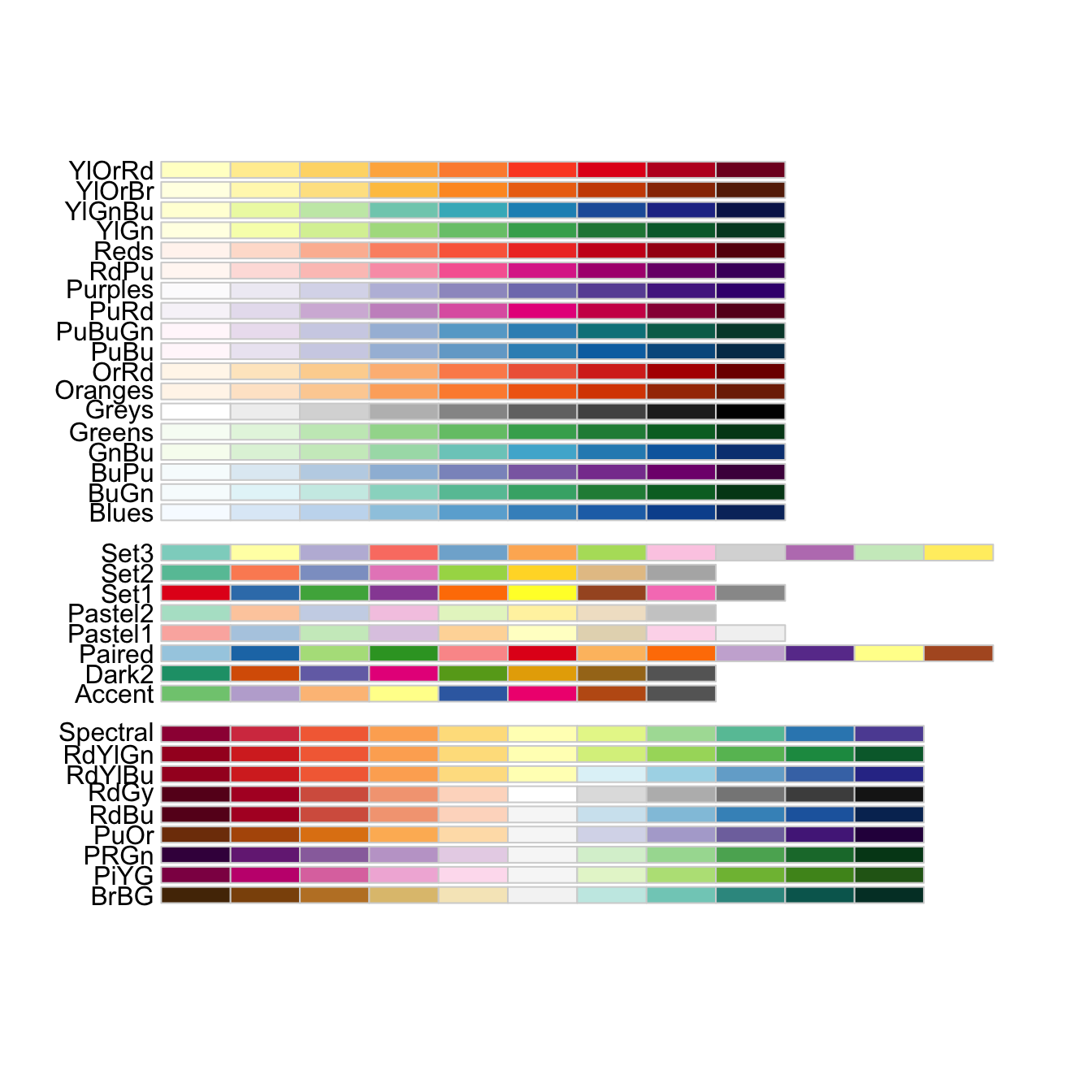
FIGURE 6.10: Palettes in RColorBrewer package
The above gives a wide choice of pallettes, and while they are applicable to all sorts of data visualisations, they were created especially for the case of thematic maps. We might use the above code to pick a palette we like. We might then want to examine the colours more closely. To do this we can use the display.brewer.pal() function, and specify n= - the number of colours we need, as well as the palette name with name =:
display.brewer.pal(n = 5, "Spectral")
FIGURE 6.11: The “spectral” palette in RColorBrewer package
Let’s go back to our choropleth map of the quantiles of total breath tests per county. We might be interested in this map to show distribution of policing activity for example. We made this map earlier with the default colour scheme, which didn’t really communicate to us the graduated nature of our data we were visualising. To properly do this, we may imagine using a sequential scale. We can use one of the sequential scales available within RColorBrewer with adding the scale_fill_brewer() function to our ggplot. In this function we can specify the type= parameter, i.e. if we want to use sequential, divergining, or qualitative colour schemes (specified as either “seq” (sequential), “div” (diverging) or “qual” (qualitative)). We can then specify our preferred palette with the palette = argument. Let’s demonstrate here with the “YlOrRd” sequential palette:
ggplot(data = hu_dd) +
  geom_sf(aes(fill = total_quantiles),
          lwd = 0.5,
          col = "white") +
  scale_fill_brewer(type = "seq",   # pick pallette type
                    palette = "YlOrRd") +  # specify pallette by name
  theme_void()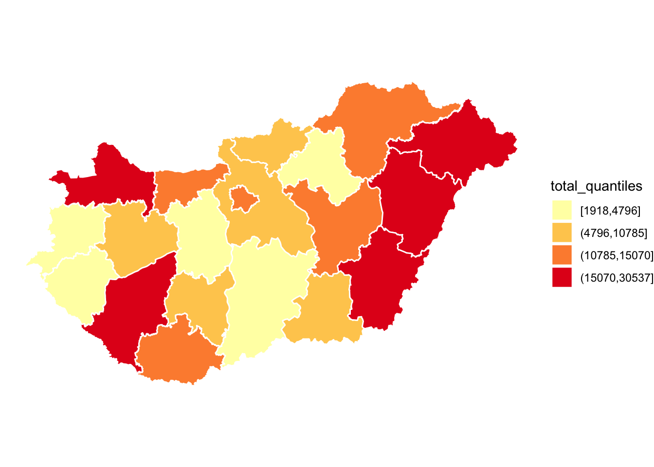
FIGURE 6.12: Thematic map with “YlOrRd” sequential palette
This looks much better, and communicates our message much more clearly. Is this accessible to our colourblind colleagues? Earlier, when we asked to view all the palettes with the display.brewer.all() function, we did not specify any arguments. However, we can do so in order to filter only those palettes which are accessible for all audiences. We can include the parameter colorblindFriendly = to do so:
display.brewer.all(colorblindFriendly = TRUE)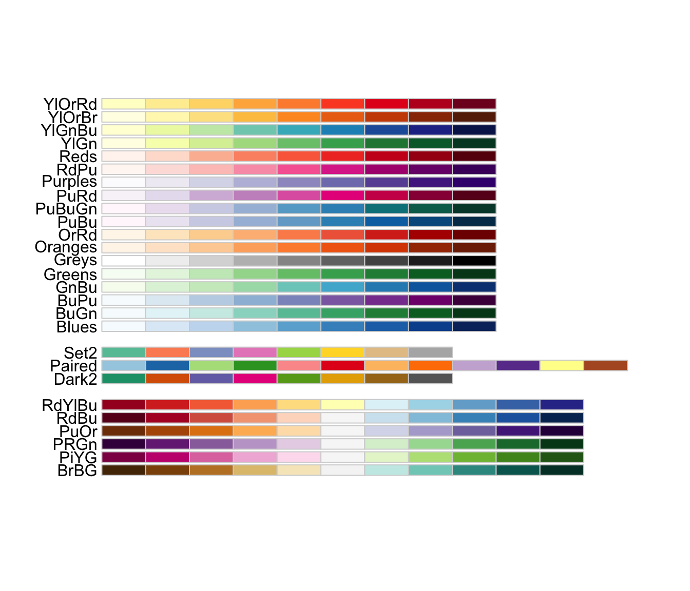
FIGURE 6.13: Colourblind friendly palettes in RColorBrewer package
You can see there are a few palettes missing from our earlier results, when we did not specify this requirement. Our recommendation is to always use one of these palettes.
Another way to ensure that we are making accessible maps is to use greyscale (if your map is being printed, this may also save some money). To introduce a greyscale palette, you can use the function scale_fill_grey() from the ggplot2 package:
ggplot(data = hu_dd) +
  geom_sf(aes(fill = total_quantiles), lwd = 0.5, col = "white") +
  scale_fill_grey() + # use greyscale colour scheme for fill
  theme_void()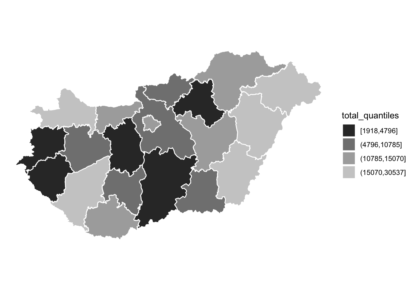
FIGURE 6.14: Map with greyscale palette
Sometimes you might prefer such a map. However, do keep in mind, a number of studies have shown the desirability of monochrome colour (over greyscale) thematic maps, as they are linked to less observer variability in interpretation (Lawson 2021b). So you might want to use something like this instead:
ggplot(data = hu_dd) +
  geom_sf(aes(fill = total_quantiles), lwd = 0.5, col = "white") +
  scale_fill_brewer(type = "seq", palette = "Greens") +
  theme_void()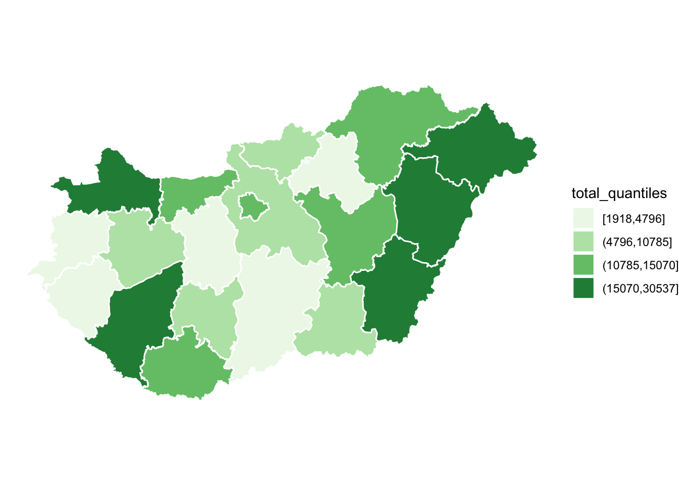
FIGURE 6.15: Map with monochrome palette
Overall, the key thing is to be conscious with the colours you choose to represent your data. Make sure that they are accessible for all audiences, and best represent the patterns in your data which you want to communicate.
6.4 Text
There are important pieces of information with every map which are represented by text. Titles, subtitles, legend labels, and annotations all help to make the message communicated by your map more clear and obvious to your readers. Further, important information about the underlying data can be communicated through product notes. You want to acknowledge the sources of your data (both attribute data and geometry data), as well as leave some information about yourself as the map maker, so consumers of your map can understand who is behind this map, and leave some contact information to get in touch with any questions. In this section we go through how to add such text information to your maps.
6.4.1 Titles and subtitles
To give your map a title and subtitle, you can use the appropriate functions from the ggplot2() package. In this case we can add both within the ggtitle function. Make sure that your title is short and specific, so it is clear what your map is about. You can include a subtitle to elaborate on this, or you can add additional information such as the period for which your map represents data (in this case January 2020).
First let’s save our map into an object, call it map. Then we can add to this object.
map <- ggplot(data = hu_dd) +
  geom_sf(aes(fill = total_quantiles),
          lwd = 0.5, col = "white") +
  scale_fill_brewer(type = "seq", palette = "Greens") +
  theme_void()
Now we can add a title, with the ggtitle() function.
map <- map +
  # specify both title and subtitle:
  ggtitle(label = "Number of breathalyser tests per county in Hungary",
          subtitle = "January 2020")

map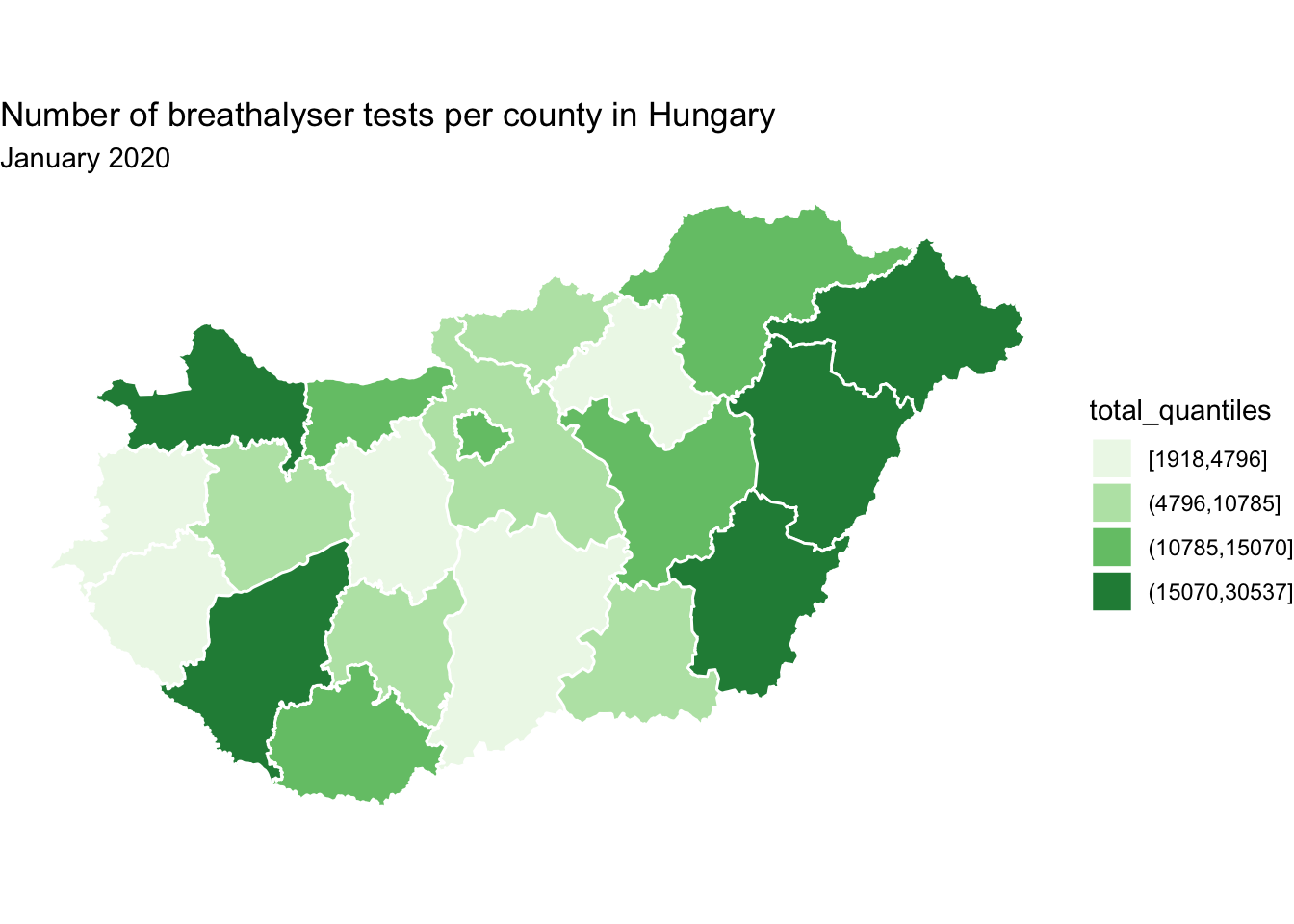
FIGURE 6.16: Add title(s) to map
6.4.2 Legend
Besides an informative title/subtitle you need your legend to be clear to your readers as well. To modify the title to your legend, you can use the name = parameter in your scale_fill_brewer() function, where we specified the colour palette.
map <- map +
  scale_fill_brewer(type = "seq", palette = "Greens",
                    name = "Total tests (quantiles)")  # desired legend title

map
FIGURE 6.17: Add title to map legend
Besides the legend title, we can also change how the levels are labeled. For this, we can use text manipulation functions, such as gsub() which substitutes one string for another. For example, we can replace the “,” with a ” - ” if we’d like using the gsub() function. We can create a new object, here new_levels, which has the desired labels:
# create object new_levels with desired labels
new_levels <- gsub(","," - ",levels(hu_dd$total_quantiles))
We can then assign this new levels object in the labels = parameter of the scale_fill_brewer() function:
map <- map +
  scale_fill_brewer(type = "seq", palette = "Greens",
                    name = "Total tests (quantiles)",
                    labels = new_levels)   # specify our new labels

map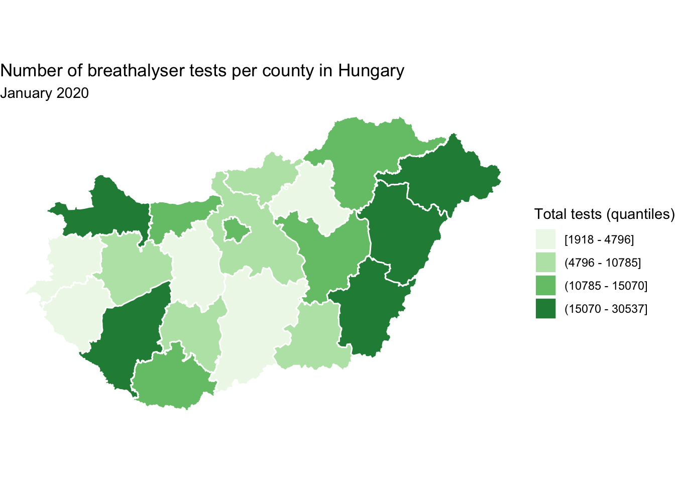
FIGURE 6.18: Edit labels on map legend
Of course it is possible that we want to completely re-write the levels, rather than just swap out one character for another. In this case, we can completely rename the levels if we liked, by passing the new, desired labels into this new_levels object
new_levels <- c("< 4796", "4796 to < 10785", "10785 to < 15070", "> 15070")And once again, we specify to use these labels in the labels = parameter of the scale_fill_brewer() function:
map +
  scale_fill_brewer(type = "seq", palette = "Greens",
                    name = "Total tests (quantiles)",
                    labels = new_levels) # again specify labels object
FIGURE 6.19: Rewrite values on map legend
You can change the labels however you would like, but do keep in mind any loss of information you may introduce. For example with this second version, we no longer know what are the minimum and maximum values on our map, as we’ve removed that information with our new levels. Again, no wrong answers here, but whatever best fits the data and the purpose of the map. Depending on the context, for example, you may use the title to draw home the key finding or lesson you want the reader to take from the map (rather than describing the plot variable).
6.4.3 Annotation
In certain cases, it might be that we want to point out something specific on our map. This would be the case if we imagine showing someone the map in person, and pointing to a specific region, or area, to highlight it. Or we might just want to label all polygons, for clarity. If we are not present to discuss our map, we might want to include some text annotation instead, which will do this for us. From ggplot2 versions v.3.1.0 the functions geom_sf_text() and geom_sf_label() make it very smooth for us to do this.
In the below example, let’s say we want to label each polygon with the name of the county which it represents. In this case, we use the geom_sf_label() geometry, and inside it we use aes() to point to which column in our dataframe we want to use (in this case the column is called name).
map  +
  geom_sf_label(aes(label = name))  # add layer of labels from the name column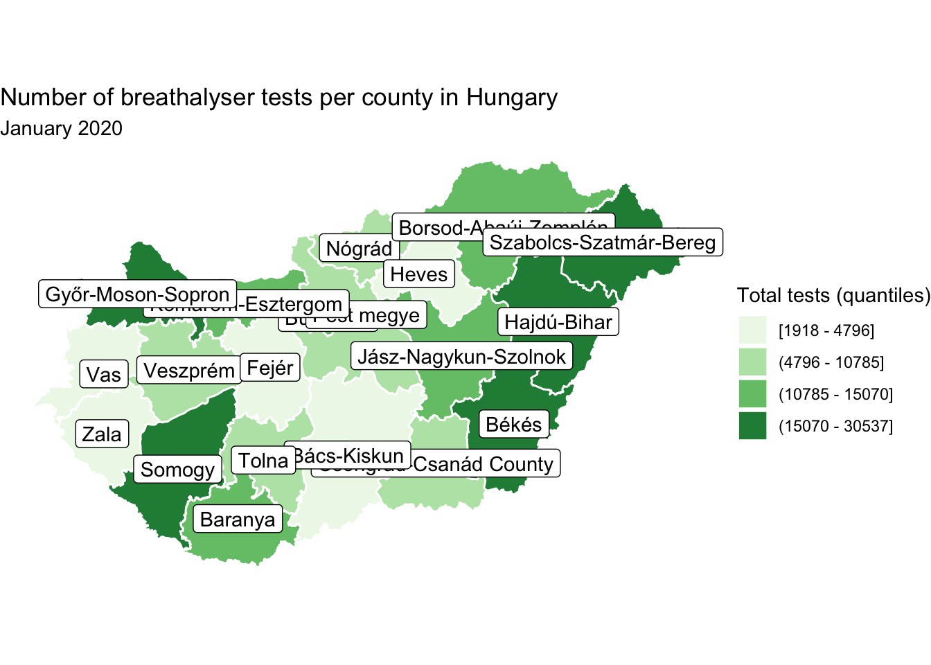
FIGURE 6.20: Add labels to map
You may notice there is some overlapping here which renders some names unreadable. Well while there is work in this space to develop the function geom_sf_label_repel() at the time of writing this is not yet available. However this application of the geom_label_repel() function from the ggrepel package advised by Yutani (2018) achieves the same outcome:
library(ggrepel)

map +
  geom_label_repel(data = hu_dd,       # add repel layer, specify dataframe
                   aes(label = name,   # specify where to find label (name column)
                       geometry = geometry),  # specify geometry
                   stat = "sf_coordinates",  # transformation to use on the data
                   min.segment.length = 0) # don't draw segments shorter than this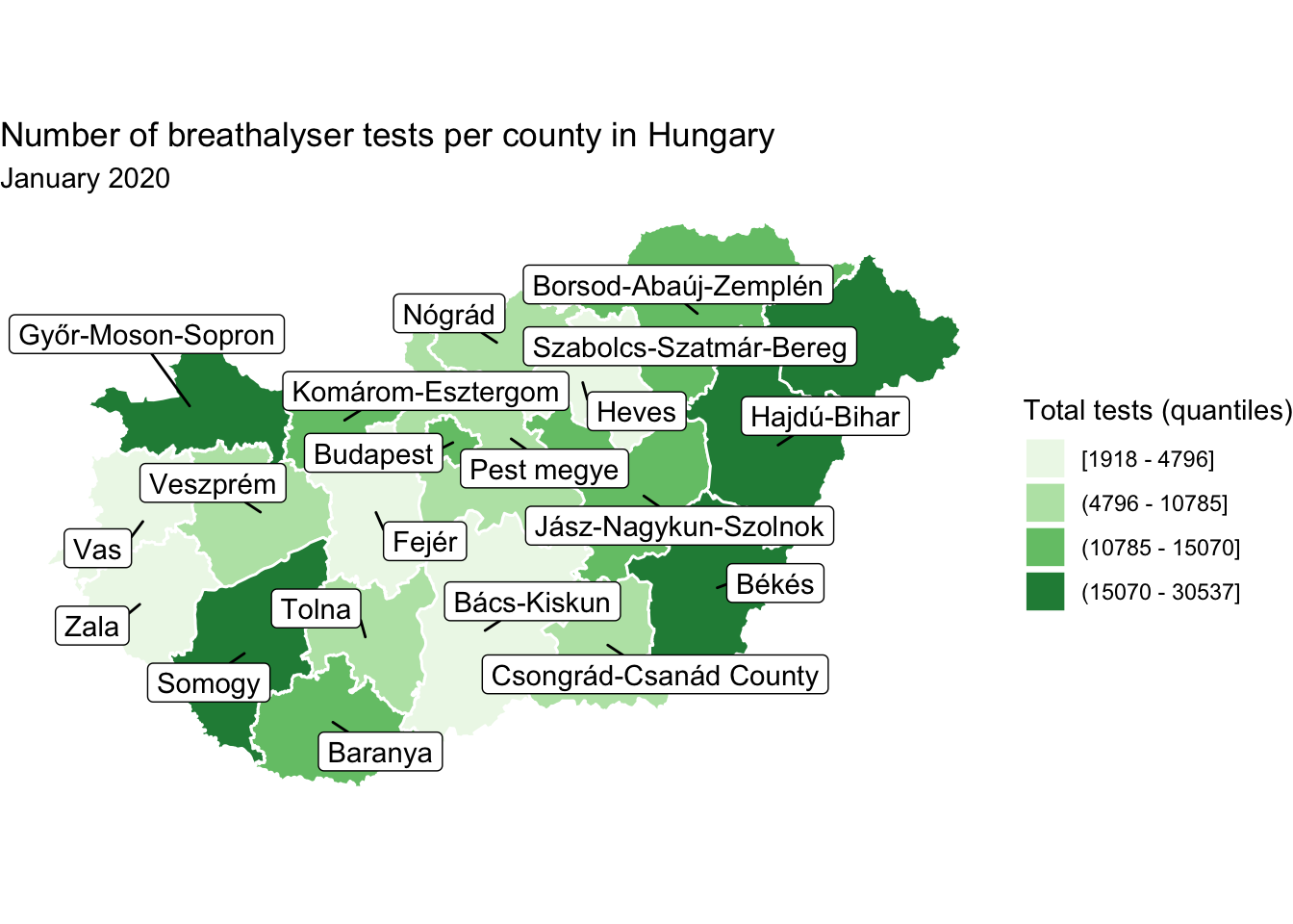
FIGURE 6.21: Repel labels for legibility
This way we can display the names of all the counties without overlap, so they all become legible. While this is achievable, think back to the principles of good design. This seems busy, and like it may overwhelm the reader. Not to mention - is it important that all polygons are labelled here? It might be - remember this depends on the message the map is intended to communicate! But here let’s consider a different scenario, where we want to use annotation to label only those counties which meet some specific criteria. For example, you might want to label only those which are in the top quartile. One way to achieve this is to create a separate dataframe, which only includes the desired polygons, and pass this into the geom_sf_label() function.
#create new dataframe with only top counties
labs_df <- hu_dd %>% filter(total_breath_tests >= 15070)

#add to map
map +
  geom_sf_label(data = labs_df, # specify to use the labels df
aes(label = name)) 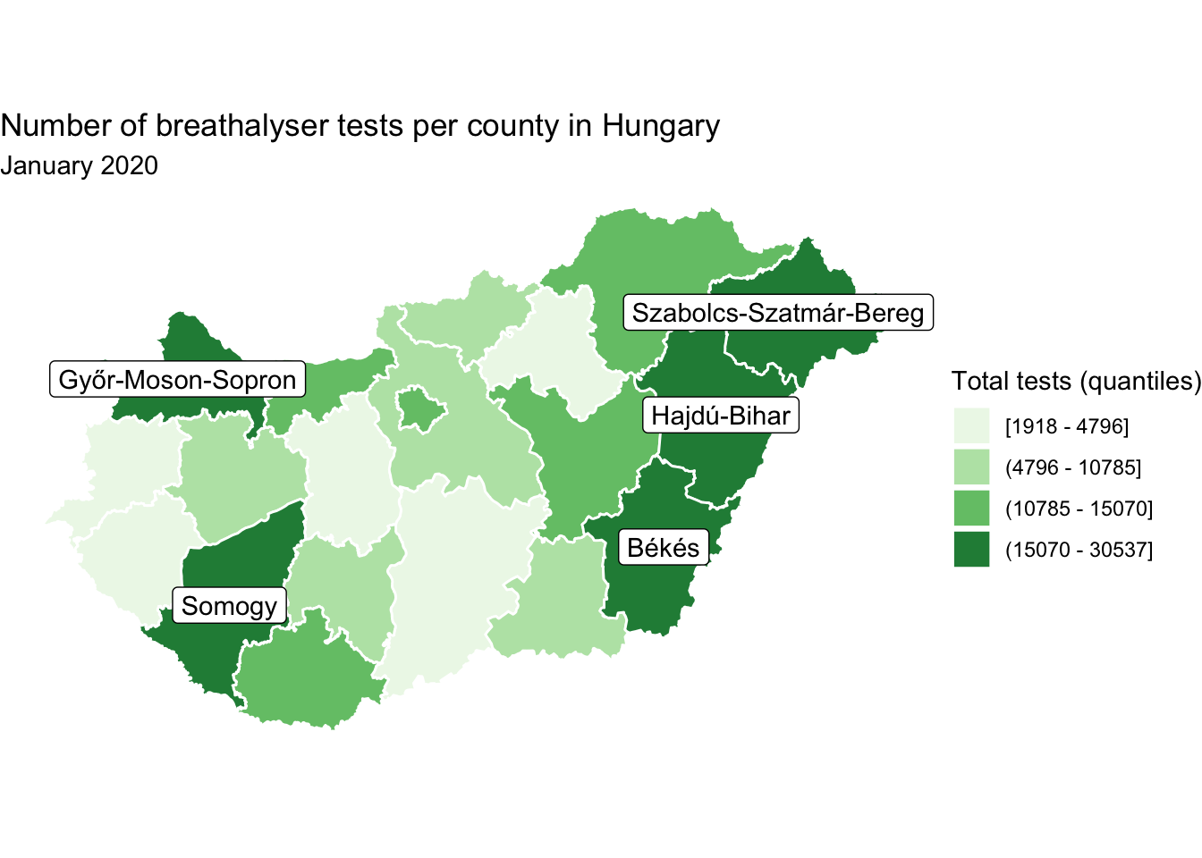
FIGURE 6.22: Label only polygons in top quartile of value on variable of interest
In another scenario, you might want to label only one region of interest. In this case, we might actually want to keep our annotation off the map, and draw an arrow onto the map pointing to where this annotation refers to. We can do this by using the nudge_x and nudge_y parameters of the geom_sf_label() function, to nudge the label position along the x and y axis respectively. In this case, let’s label only Budapest.
#create new labels dataframe
labs_df <- hu_dd %>% filter(name == "Budapest")

map +
  geom_sf_label(data = labs_df, aes(label = name), # label from name column
                nudge_y = 0.9,  # move label on y axis
                nudge_x = -0.1)  # move label on x axis
FIGURE 6.23: Label only one area of interest
But this floating label is a little ambiguous, and needs to be more explicitly connected to the map. To achieve this, we might want to use an arrow to point out Budapest on the map. To do this, we can use geom_curve() within ggplot2. We will need two sets of x and y values for this segment, the start point (x and y) and the end point (xend and yend). The end point will be the coordinates where we want the arrow pointing to. This would be some x,y pair within Budapest. We can use the st_coordinates() function once again the extract the centroid, this time of the Budapest polygon. Let’s extract the longitude of the centroid into an object called bp_x for our x value, and the latitude of the centroid into an object called bp_y for our y value.
# get x coordinate
bp_x <- labs_df %>%
  mutate(cent_lng = st_coordinates(st_centroid(.))[,1]) %>% pull(cent_lng)

# get y coordinate
bp_y <- labs_df %>%
  mutate(cent_lat = st_coordinates(st_centroid(.))[,2]) %>% pull(cent_lat)
Great, so we have the end point for our segment! But where should it start? Well we want it pointing from our label, so we can think back to how we adjusted this label with the nudge_x and nudge_y parameters inside the geom_sf_label() function earlier. We can add (or subtract) these values to our bp_x and bp_y objects to determine the start points for our curve. Finally, we can also specify some characteristics of the arrow head on our curve with the arrow = parameter. Here we specify we want 2 millimeter size.
map <- map +
  geom_curve(x = bp_x - 0.1,  # starting x coordinate (the label)
             y = bp_y + 0.9, # starting y coordinate (the label)
             xend = bp_x , # ending x coordinate (BP centroid)
             yend = bp_y,  # ending y coordinate (BP centroid)
             arrow = arrow(length = unit(2, "mm"))) +
  geom_sf_label(data = labs_df,
                aes(label = name),
                nudge_y = 0.9,
                nudge_x = -0.1)

map
FIGURE 6.24: Add arrow to clarify label off map
This is one way to include annotation while keeping the map clear, but still using the geographic information to reference. Annotations can be useful, but think carefully about whether you need them for your map, as they can also be distracting if not used appropriately.
6.4.4 Production notes
Something that should be a key feature of all maps is the inclusion of production notes. This includes some information about you who made it, as well as any attributions for data. Here we can string together a series of information we want to include, appended with a newline character (\n), in order to keep our notes nice and legible. We save this into a new object called caption_text.
caption_text <- paste("Map created by Réka Solymosi (@r_solymosi)",
                       "Contains data from Police Hungary",
                       "http://www.police.hu/hu/a-rendorsegrol/",
                       "statisztikak/kozrendvedelem",
                       "Map data copyrighted OpenStreetMap contributors",
                       "available from https://www.openstreetmap.org",
                       sep = "\n")
Then we can include this caption_text object as a caption in the function labs(), which stands for labels.
map <- map + labs(caption = caption_text) # include production notes here

map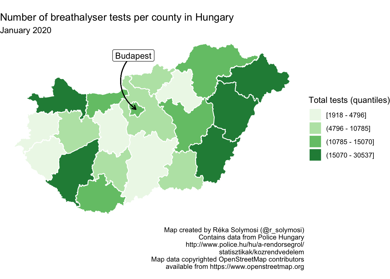
FIGURE 6.25: Include production notes in map
In this way we give credibility to our map, and we also make the proper attributions to where our data come from.
6.5 Composition
Composition of the map is the process of bringing all its elements together in order that they portray a complete image of what you are representing. Composition includes considerations of size, proportions, generalisation, simplification, and similar topics. We do not address these here, as they rely so much on the specific purpose of the map being created. Is it for the web? Is it for print? Are having detailed outlines of coasts and waterways important, or is a generalised representation of the underlying geography enough? These are questions the map maker should answer early on, and pick geometry data, and specify output sizes and resolutions accordingly. In this section instead, we will focus on the element of composition which is concerned with the inclusion of basic map elements - information required by the map readers to make sense of our data, specifically orientation and scale indicators
6.5.1 Orientation indicators
It used to be that no map was complete without the inclusion of an orientation indicator (known colloquially as the “North Arrow”). Readers who are geography fans may know that the issue of where is North is maybe not so straight forward - true north (the direction to the North Pole) differs from magnetic north, and the latter actually moves around as the Earth’s geophysical conditions change. There are reference maps which include both, however for most crime mapping applications we can conclude that this is overkill. Most maps are oriented to true north, anyway, so we are not being very deviant with choosing this approach.
So how to include this in our mapping in R? Well we can turn to the ggspatial library, and employ the function annotation_north_arrow(). In this function we can specify some aesthetic properties of our arrow, such as the height and width. Here we do so using millimeters as units.
library(ggspatial)

map + annotation_north_arrow(height = unit(7, "mm"), # specify arrow height
                         width = unit(5, "mm")) # specify arrow width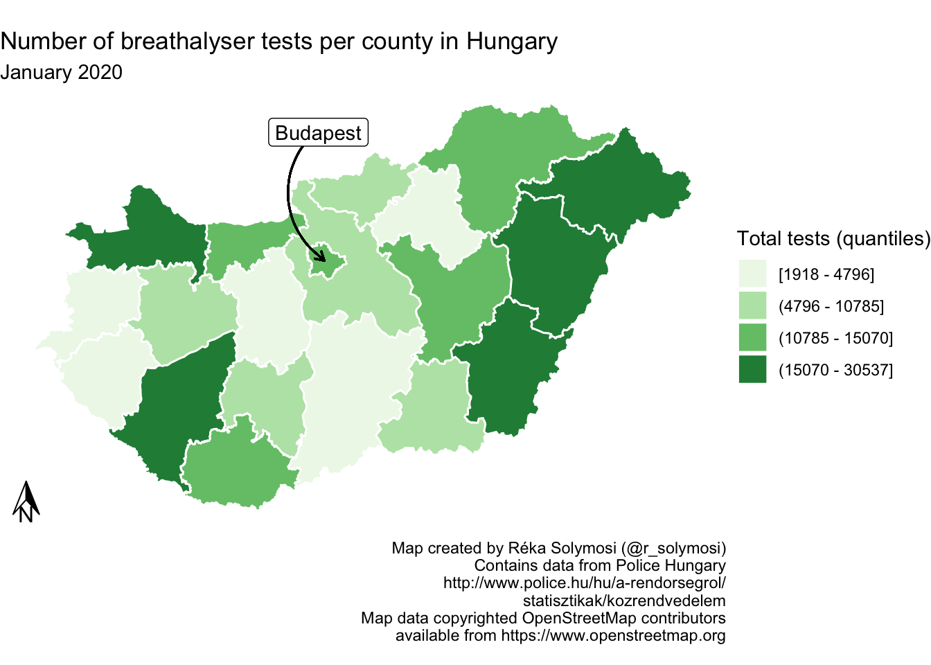
FIGURE 6.26: Add north arrow
You can also change the style with the style = parameter, and choose from styles such as north_arrow_fancy_orienteering() or north_arrow_minimal():
map <- map + annotation_north_arrow(height = unit(7, "mm"), # specify arrow height
                         width = unit(5, "mm"),
                        style = north_arrow_minimal()) # specify arrow style

map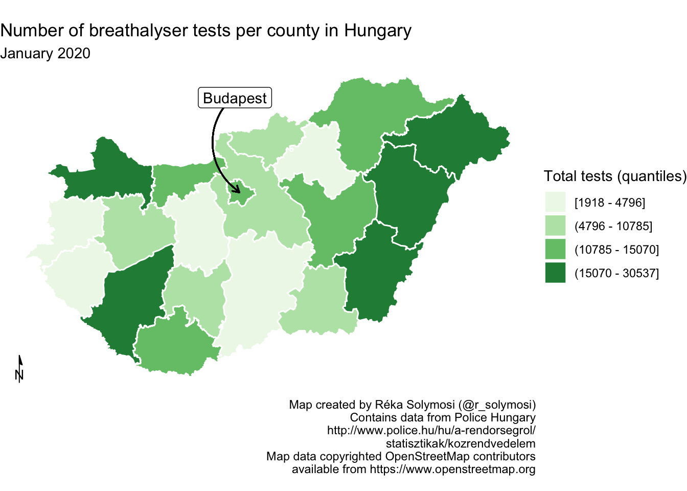
FIGURE 6.27: Change stype of north arrow
6.5.2 Scale indicators
Besides the North Arrow another key feature of maps is the scale indicator, which helps to understand distances we are presenting in our maps. Generally, scale should always be indicated or implied, unless the audience is so familiar with the map area or distance of such little relative importance that it can be assumed by the audience. You could use text to indicate scale. For example you could write “One centimeter is equal to one kilometer, or you could write 1:10000. But a common, graphical representation is to use a scale bar. Also in the ggspatial library, there is the function annotation_scale(), which helps us achieve this. To plot both the north arrow, and the scale indicator, you want to think about where you place these. You can move them along the x-axis using the pad_x parameter, and along the y-axis with the pad_y parameter.
map <- map +  annotation_scale(line_width = 0.5,      # add scale and specify width
                   height = unit(1, "mm"), # specify height
                   pad_x = unit(6, "cm"))  # adjust on x axis

map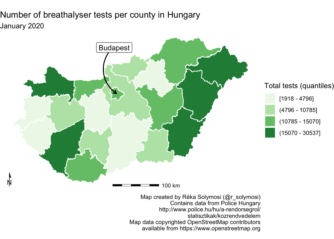
FIGURE 6.28: Include scale indicator on map
You can move these elements about however you like to achieve your desired composition.
6.6 Context
Besides the orientation and scale indicators, there are other ways to give context to your map, that is situate it within the wider environment, and put things into perspective for your map readers. In this section we will touch on basemaps, although this is something we have already encountered in great detail in earlier chapters, we illustrate how to add basemaps in ggplot. We also introduce inset maps, as a way of highlighting where your map sits in the wider context.
6.6.1 Basemap
As mentioned above, we have encountered and included basemaps in previous exercises in previous chapters. For the sake of illustration, we can add a basemap now using the the annotation_map_tile() function also from the ggspatial package (like the orientation and scale indicators). Make sure that the basemap is the first layer added to the map, so that all subsequent layers are drawn on top of it. If we were to add annotation_map_tile() last, it would cover all the other layers.
ggplot(data = hu_dd) +
  annotation_map_tile() +  # add basemap layer first
  geom_sf(aes(fill = total_quantiles), lwd = 0.5, col = "white") +
scale_fill_brewer(type = "seq", palette = "Greens", name = "Total tests") 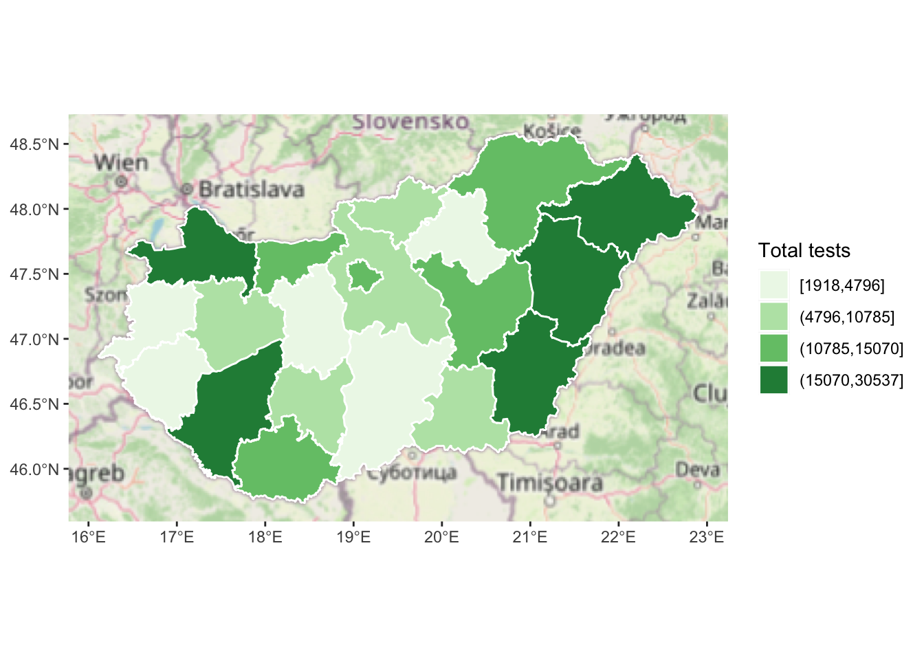
FIGURE 6.29: Add a basemap to our map
This provides one way to add context. In previous iterations, we have adjusted the opacity of our other layers, in order to aid visibility of the basemap underneath them, so this might be something to consider.
6.6.2 Inset maps
Inset maps provide another approach to situating your map in context. You might use this to show where your main map fits into the context of a larger area, for example, here we might illustrate how Hungary is situated within Europe. You might also use an inset map in another situation, where you have additional areas which you want to show which may be geographically far but politically related to your region. For example, we might want to portray a map of the United States of America, and make sure to include Hawaii and Alaska on the map. The basic principles behind these maps is the same. Essentially we must create two map objects, and then bring these together. Let’s illustrate how.
First, we need to create the map we will be displaying in the inset map. In this case, let’s highlight the location of Hungary on a map of Europe. We can do this by creating a map of Europe (let’s use the rnaturalearth package for this). We create a list of the countries from the world map `countries110’, and filter only Europe (we also exclude Russia because it is so big it makes the rest of Europe hard do see on a smaller map, and Iceland as it’s far, also making the map bigger than we need).
library(rnaturalearth)

europe_countries <- st_as_sf(countries110) %>%  # get geom for all countries
  filter(region_un=="Europe" & # select Europe
           name != "Russia" & name != "Iceland") %>%  # remove Russia and Iceland
  pull(name) # get only the names in a list

europe <- ne_countries(geounit = europe_countries, # get geoms for countries in list
                       type = 'map_units',  # country type as map_units
                       returnclass = "sf") # return sf object (not sp)
Now we can use the returned sf object europe to create a map of Europe. But this isn’t necessarily enough context. We also want the inset map to highlight Hungary within this map. We can do this by creating another layer, with only Hungary, and making its border red and a use thicker line width. By layering this on top of the Europe map, we are essentially highlighting our study region.
inset_map <- ggplot() +  # create new ggplot
  geom_sf(data = europe,  # add europe map as first layer
          fill = "white") + # white fill
  geom_sf(data = europe %>% filter(name == "Hungary"), # new layer only Hungary
          fill = "white" ,  # white fill
          col = "red",   # make the border red
          lwd = 2) +   # make border line thick
  theme_void() +  # strip grid elements
  theme(panel.border = element_rect(colour = "black", # draw border around map
                                    fill=NA))
We now have this separate map, which highlights where Hungary can be found, right there in Central Europe. To display this jointly with our map of breathalyser test, we must join the two maps. For this, we will need both as separate objects. We’ve already assigned out inset map to the object inset_map, and we also have our main map object we’ve been working with, called map.
So now we have our inset map and main map stored as two map objects. To display them together we can use the ggdraw() and draw_plot() functions from the cowplot package. Let’s load this package.
library(cowplot)First, we set up an empty drawing layer for our ggplot using the ggdraw() function. Then we layer on the two maps both using the draw_plot() function. This allows us to draw plots and sub plots. This function places a plot (which we specify as the first parameter of this function) somewhere onto the drawing canvas. By default, coordinates run from 0 to 1, and the point (0, 0) is in the lower left corner of the canvas. We want to therefore specify where the plots go on our canvas explicitly. Alongside position, we can also specify size. This is important, we usually make the inset map smaller.
hu_dd_with_inset <- ggdraw() +  # set layer
  draw_plot(map) +  # draw the main map
  draw_plot(inset_map,   # draw inset map
            x = 0.75,    # specify location on x axis
            y = 0,    # specify location on y axis
            width = 0.35,    # specify width
            height = 0.35)   # specify height
We now have our final map, which we can check out now:
hu_dd_with_inset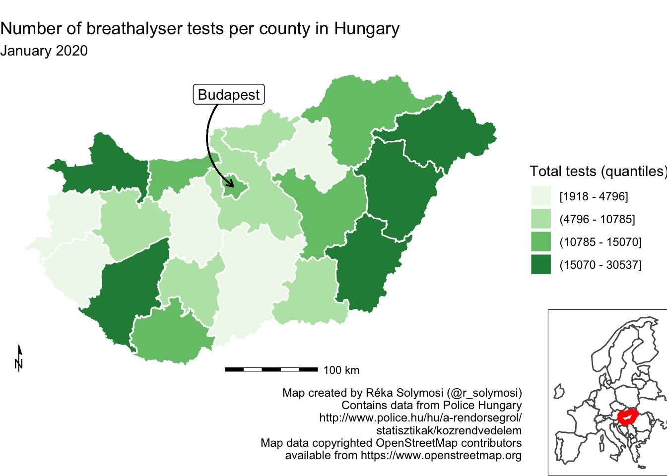
FIGURE 6.30: Adding an inset map to our map
You can play around with where you position your inset map by adjusting the x and y coordinates. You can also play around with the size of it by adjusting the parameters for height and width. And like mentioned above, you can use inset maps not only for context, but also to include geographically far away regions which belong to the same political unity, for example to include Alaska and Hawaii in maps of the United States.
6.7 Summary and further reading
In this chapter we covered some principles of data visualisation and good map design, specifically how to implement some of these using ggplot2 library in R. We talked about symbols, about colour, about text, and about adding context. ggplot2 provides an incredibly flexible framework, and through the use of layers you can achieve a very beautiful and meaningful map output. We could for example consider adding topography, such as rivers, lakes, and mountains to our maps, and it would be only a case of adding another layer. To get more familiar with this we recommend Wickham (2010) and Healy (2019).
For general readings on cartography, the work of Kenneth Field provides thorough and engaging guidance (eg: Field and Demaj (2012) or Field (2018)). For data visualisation, while Tufte (2001) is a classic text, those looking for practical instruction may wish to turn to Kirk (2016) or Cairo (2016) for more guidance.