Chapter 10 Spatial dependence and autocorrelation
10.1 Introduction
This chapter we begin to explore the analysis of spatial autocorrelation statistics. It has been long known that attribute values that are close together in space are unlikely to be independent. This is often referred to as Tobler’s first law of geography : “everything is related to everything else, but near things are more related than distant things”. For example, if area \(n_i\) has a high level of violence, we often observe that the areas geographically close to \(n_i\) tend to also exhibit high levels of violence. Spatial autocorrelation is the measure of this correlation between near things.
The analysis of spatial dependence and global clustering is generally a first step before we explore the location of clusters. In spatial statistics we generally distinguish global clustering from the detection of local clusters. Some techniques, the focus of this chapter, are based on the global view and is appropriate for assessing the existence of dependence in the whole distribution, or clustering. It is important to first evaluate the presence of clustering before one explores the location of clusters -which we will cover in the next chapter.
In this chapter we are going to discuss ways in which you can quantify the answer to this question. We will start introducing methods to assess spatial clustering with point pattern data, which typically start from exploring continuous distance between the location of the points. Then, we will discuss measures of global spatial autocorrelation for lattice data, which essentially aim to answer the degree to which areas (census tracts, police precincts, etc) that are near each other tend to be more alike.
We will be making use of the following packages:
# Packages for reading data and data carpentry
library(readr)
library(dplyr)
library(lubridate)
# Packages for handling spatial data and for geospatial carpentry
library(sf)
library(sp)
# Specific packages for spatial point pattern analysis
library(spatstat)
library(spatstat.Knet)
# Packages to generate spatial weight matrix and compute measures of dependence
library(spdep)
library(rgeoda)
# Packages for mapping and visualisation
library(tmap)
library(ggplot2)
library(ggspatial)
10.2 Exploring spatial dependence in point pattern data
10.2.1 The empirical K function
In Chapter 7 we assessed homogeneity, or lack of, in point pattern data. Another important aspect of point location is whether they show some kind of interpoint dependence. In observing a point pattern one is interested in what are referred to as first order properties (varying intensity across the study surface vs homogeneity) and second order properties (independence vs correlation among the points). As Bivand, Pebesma, and Gómez-Rubio (2013) explain:
” Spatial variation occurs when the risk is not homogeneous in the study region (i.e. all individuals do not have the same risk) but cases appear independently of each other according to this risk surface, whilst clustering occurs when the occurrence of cases is not at random and the presence of a case increases the probability of other cases appearing nearby.” (p. 204)
In chapter 7 we covered the Chi Square test and we very briefly discussed how it can only help us to reject the notion of spatial randomness in our point pattern, but it cannot help us to determine whether this is due to varying intensity or to interpoint dependence.
Both processes may lead to apparent observed clustering:
- First order clustering near particular locations in the region of study takes place when we observe more points in certain neighborhoods or street segments or whatever our unit of interest is;
- Second order clustering is present when we observe more points around a given location in a way that is associated with the appearance of points around this given location.
A technique commonly used to assess whether points are independent is Ripley’s K-function. For exploring global clustering in a point pattern we use the K-function. Baddeley, Rubak, and Turner (2015) defines the K function as the “cumulative average number of data points lying within a distance \(r\) of a typical data point, corrected for edge effects, and standardised by dividing by the intensity” (p. 204). This is a test that, as we will see, assumes that the process is spatially homogeneous. As Lu and Chen (2007) indicate:
“The basic idea of K-function is to examine whether the observed point distribution is different from random distributions. In a random distribution, each point event has the equal probability to occur at any location in space; the presence of one point event at a location does not impact the occurrence possibilities of other point events.” (p. 613)
Imagine we want to know if the location of crime events are independent. Ripley’s K function evaluates distances across crime events to assess this. In this case, it would count the number of neighboring crime events represented by the points found within a given distance of each individual crime location. The number of observed neighboring crime events is then traditionally compared to the number of crime events one would expect to find based on a completely spatially random point pattern. If the number of crimes found within a given distance of each individual crime is greater than that for a random distribution, the distribution is then considered to be clustered. If the number is smaller, the distribution is considered not to be clustered.
Typically, what we do to study correlation in a point pattern data is to plot the empirical K function estimated from the data and compare this with the theoretical K-function of the homogeneous Poisson process. So, for this to work, we need to assume that the process is spatially homogeneous. If we suspect this is not the case, then we cannot use the standard Ripley’s K methods. Let’s illustrate how all this works with the example of some homicide data in Buenos Aires.
10.2.2 Homicide in Buenos Aires
For this exercise we travel to Buenos Aires, the capital and largest city in Argentina. The government of Buenos Aires provides open geocoded crime data from 2016 onwards. The data is freely available from the official source. But we have added it already as supplementary material available with this book. Specifically we are after the file delitos.csv.
We will filter on “homicidios dolosos” (intentional homicides) and we are using all homicides from 2016 and 2017. After reading the .csv file we turn it into a sf object and plot it. We are also reading a GeoJSON file with the administrative boundary of Buenos Aires. The code below uses functions in ways we have demonstrated in earlier chapters.
delitos <- read_csv("data/delitos.csv") %>%   # read csv
  filter(tipo_delito == "Homicidio Doloso") %>%    # filter international homicides
  mutate(year = year(fecha)) %>%    # create new variable for 'year' from date column
  filter(year == "2016" | year == "2017")    # filter only 2016 and 2017


# create sf object of crimes as points
delitos_sf <- st_as_sf(delitos,
                      coords = c("longitud", "latitud"),
                      crs = 4326)

# transform to projected coods
delitos_sf <- st_transform(delitos_sf, 5343)

# read in boundary geojson
buenos_aires <- st_read("data/buenos_aires.geojson", quiet = TRUE)
After reading the files and turn them on sf objects, we can plot them. Let’s use the tmap package introduced in Chapter 3.
tm_shape(buenos_aires) +
  tm_polygons() +
  tm_shape(delitos_sf) +
  tm_dots(size = 0.08, col = "red") +
  tm_layout(main.title = "Homicides in Buenos Aires, 2016",
            main.title.size = 1)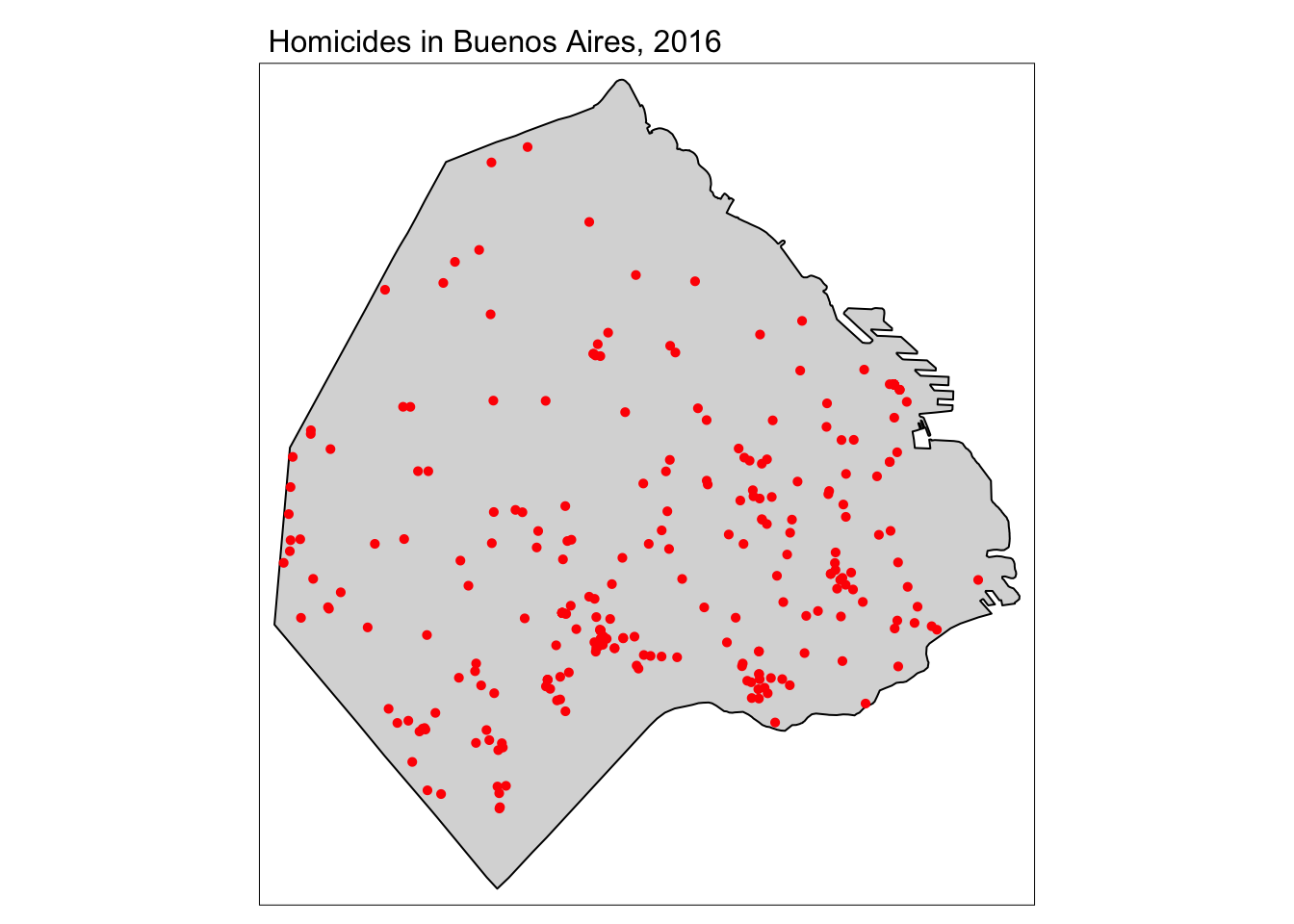
FIGURE 10.1: Map of homicides in Buenos Aires
We will be using the spatstat functionality, thus, need to turn this spatial point pattern data into a ppp object, using the boundaries of Buenos Aires as an owin object. We are using code already explained in Chapter 7. As we will see there are duplicate points. Since the available documentation does not mention any masking of the locations for privacy purposes, we cant assume that’s the reason for it. For simplicity purpose we will do as in Chapter 7 and introduce a small degree of jittering with a rather narrow radius.
# create window from geometry of buenos_aired object
window <- as.owin(st_geometry(buenos_aires))

# name the unit in window
unitname(window) <- "Meter"

# create matrix of coordinates of homicides
delitos_coords <- matrix(unlist(delitos_sf$geometry), ncol = 2, byrow = T)

# convert to ppp object
delitos_ppp <- ppp(x = delitos_coords[,1], y = delitos_coords[,2],
                   window = window, check = T)

# set seed for reproducibility and jitter homicide points because of overlap
set.seed(200)
delitos_jit <- rjitter(delitos_ppp, retry=TRUE, nsim=1,
                       radius = 2, drop=TRUE)
10.2.3 Estimating and plotting the K-function
For obtaining the observed K, we use the Kest function from the spatstat package. Kest takes two key inputs, the ppp object and a character vector indicating the edge corrections we are using when estimating K. Edge corrections are necessary because we do not have data on homicide outside our window of observation and, thus, cannot consider dependence with homicide events around the city of Buenos Aires. If we don’t apply edge correction we are ignoring the possibility of dependence between those events outside the window and those in the window close to the edge. There is also a convenient argument (nlarge) if your dataset is very large (not the case here) that uses a faster algorithm.
As noted by Baddeley, Rubak, and Turner (2015), “most users… will not need to know the theory behind edge correction, the details of the technique, or their relative merits” and “so long as some kind of edge correction is performed (which happens automatically in spatstat), the particular choice of edge correction technique is usually not critical” (p. 212). As a rule of thumb they suggest using translation or isotropic in smaller datasets, the border method in medium size datasets (1000 to 10000 points), and that there is no need for correction with larger datasets. Since this is a smallish dataset, we show how we use two different corrections: isotropic and translation (for more details see Baddeley, Rubak, and Turner (2015)).
k1 <- Kest(delitos_jit, correction = c("isotropic", "translate"))
plot(k1)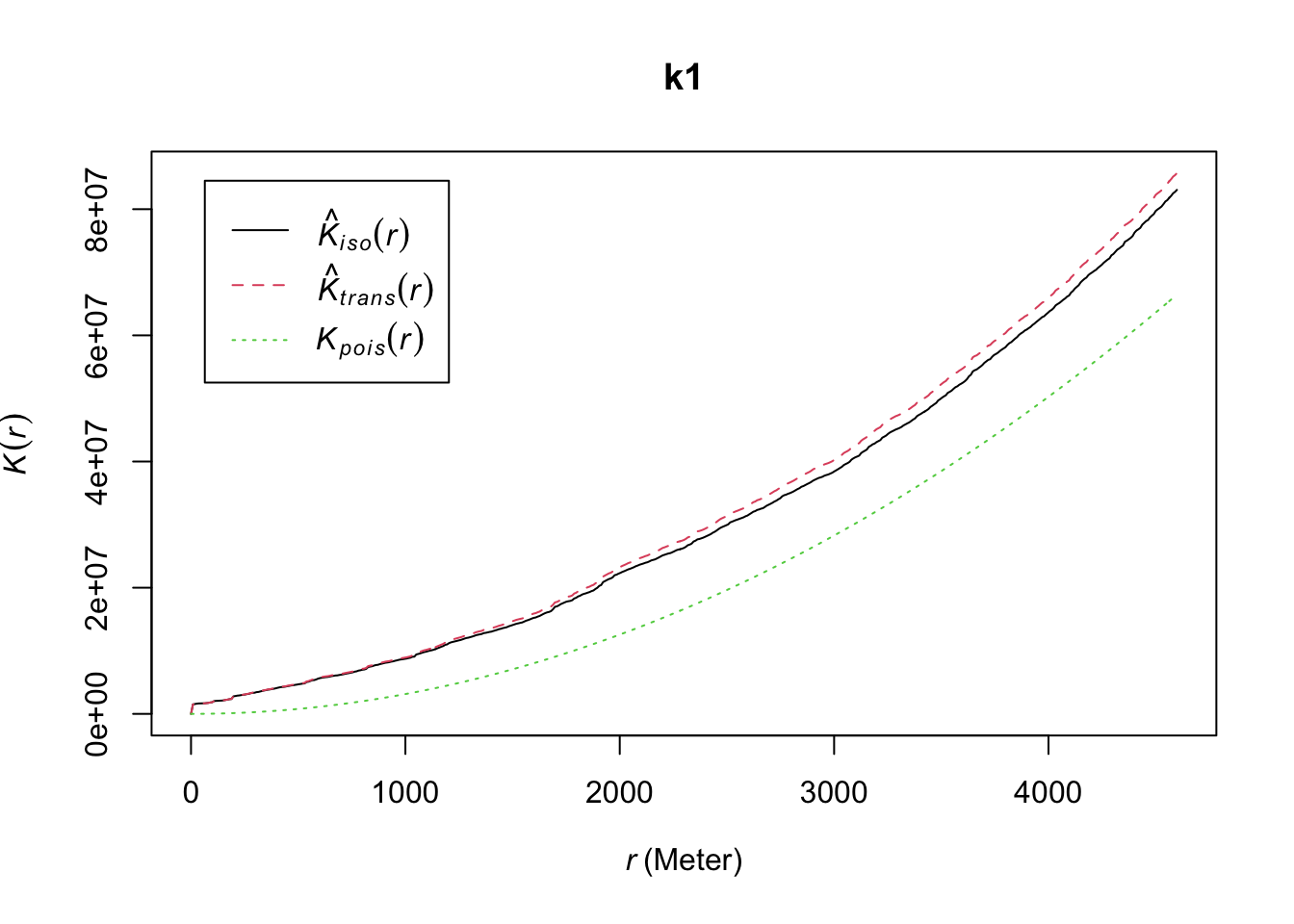
FIGURE 10.2: Isotropic and translation correction techniques for edge effects
The graphic shows the K function using each of the corrections and the theoretical expected curve under a Poisson process of independence. When there is clustering we expect the empirical K-function estimated from the observed data to lie above the empirical K-function for a completely random pattern. This indicates that a point has more “neighboring” points than it would be expected under a random process.
It is possible to use Monte Carlo simulations to draw the confidence interval around the theoretical expectations. This allow us to draw envelope plots, that can be interpreted as a statistical significance test. If the homicide data were generated at random we would expect the observed K function to overlap with the envelope of the theoretical expectation. Baddeley, Rubak, and Turner (2015), in particular, suggest the use of global envelopes as a way to avoid data snooping. For this we use the envelop function from spatstat. As arguments we use the data input, the function we are using for generating K (Kest), the number of simulations, and the parameters needed to obtain the global envelope.
set.seed(200)
E_1 <- envelope(delitos_jit, Kest, nsim=39, rank = 1, global = TRUE,
              verbose = FALSE) # We set verbose to false for sparser reporting
plot(E_1)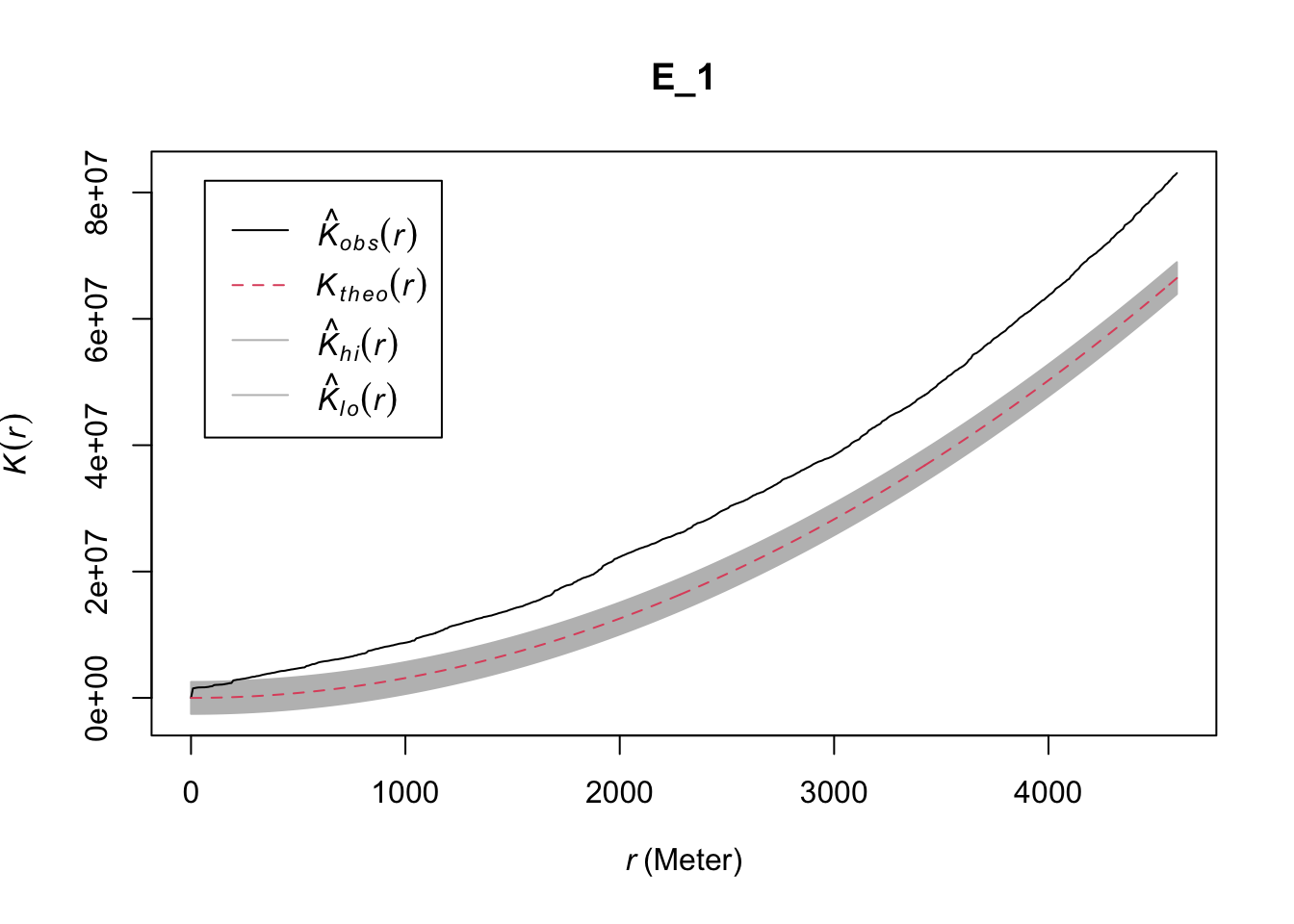
FIGURE 10.3: Global envelope plot for clustering in Buenos Aires homicide data
This envelope suggest significant clustering above the 200 meter mark. The problem, though, is that (as noted above) this test only works if we have a homogeneous process. The envelope will also fail to overlap with the observed K function if there are variations in intensity. We also saw previously the reverse, that it is hard to assess homogeneity without assuming independence. In Chapter 7 we saw how if we suspect the process is not homogeneous, we can estimate it with nonparametric techniques such as kernel density estimation. We can apply this here (see also Chapter 7: Spatial point patterns of crime events in this book).
set.seed(200)
plot(density.ppp(delitos_jit, sigma = bw.scott(delitos_jit),edge=T),
     main=paste("Density estimate of homicides in Buenos Aires"))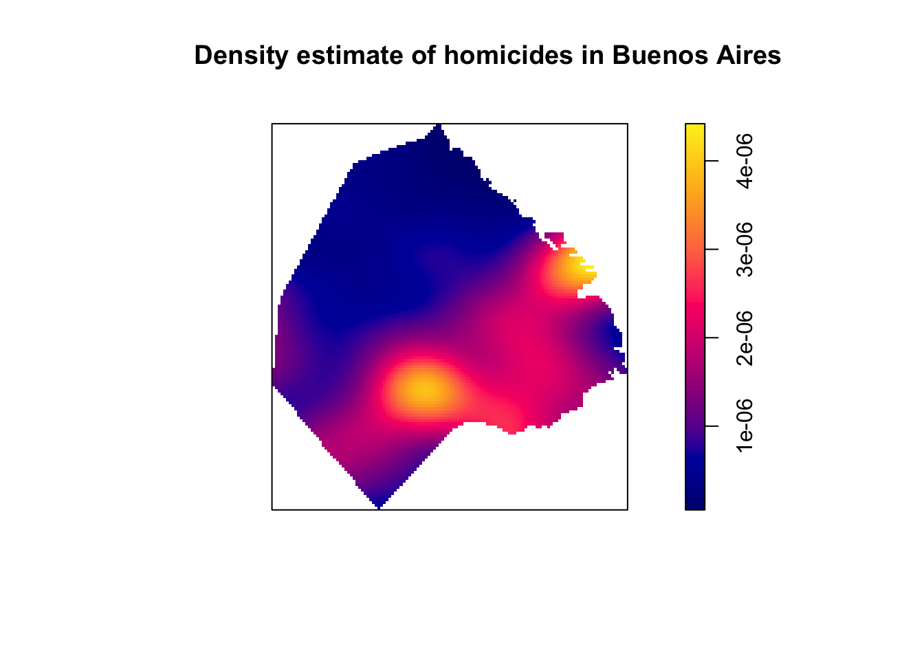
FIGURE 10.4: KDE map of homicides in Buenos Aires
Baddeley, Rubak, and Turner (2015) discuss how we can adjust our test for independence when we suspect inhomogeneity, as long as we are willing to make other assumptions (e.g., the correlation between any two given points only depend on their relative location). This adjusted K-function is implemented in the Kinhom() function in spatstat. This function estimates the inhomogeneous K function of a non-stationary point pattern. It requires as necessary inputs the ppp object with the point pattern we are analysing and a second argument lambda which should provide the values of the estimated intensity function. The function provides flexibility in how lambda can be entered. It could be a vector with the values, an object of class im like the ones we generate with density.ppp(), or it could be omitted. If lambda is not provided, we can provide the parameters as we did in the density.ppp() function, and the relevant values will be generated for us that way. We could, for example, input this parameter as below:
set.seed(200)
inhk_hom <- Kinhom(delitos_jit,
                   correction = c("isotropic", "translate"),
                   sigma = bw.scott)
plot(inhk_hom)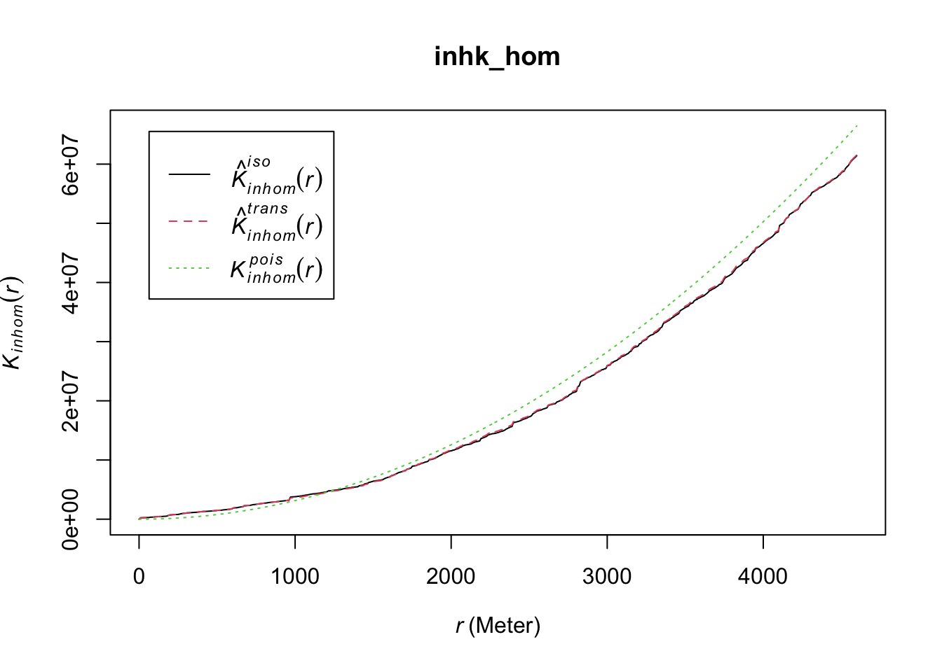
FIGURE 10.5: Inhomogeneous (adjusted) K function for non-stationary point pattern
Once again we can build an envelope to use in the manner of confidence intervals to interpret whether there is any significant clustering.
set.seed(200)
E_2 <- envelope(delitos_jit, Kinhom, nsim=39, rank = 1, global = TRUE,
              verbose = FALSE) # We use this for sparser reporting
plot(E_2)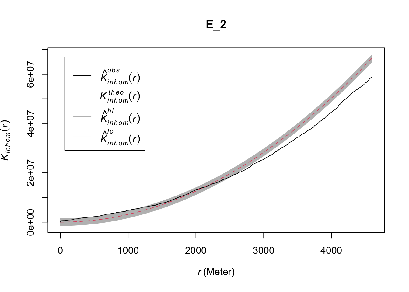
FIGURE 10.6: Global envelope plot for clustering in case of inhomogeneity
In this example once we allow for varying intensity, the spatial dependence no longer holds for a range of distances.
10.2.4 Network constrained K function
We already warned in Chapter 8 about the dangers of using planar point pattern analysis to data that lies along a network. Not recognising this network structure can lead to errors. Lu and Chen (2007), for example, have shown how the standard K functions are problematic when studying crime in an urban environment. They discuss how the planar K-function to analyze the spatial autocorrelation patterns of crimes (that are typically distributed along street networks) can result in false alarm problems, which depending on the nature of the street network and the particular point pattern, could be positive or negative. As Baddeley, Rubak, and Turner (2015) also indicates when the point locations are constrained to only exist in a network we are likely to find “spurious evidence of short-range clustering (due to concentrations of points in a road) and long-range regularity (due to spatial separation of different roads)” (p. 736).
Lu and Chen (2007) recommend to use a network K function that examines distance along the network, by street distance. They argued this should be “more relevant for crime control policing and police man-power dispatching purpose, considering that police patrol and many other crime management activities are commonly conducted following street networks” (p. 627). This recommendation is being followed in recent studies (see, for example, Khalid et al. (2018)), although it is still much more common in the professional practice of crime analysis to continue using, incorrectly, the planar K function.
The network K function was developed by Okabe and Yamada (2001) and was first implemented in SANET. Chapter 7 of Okabe and Sugihara (2012) also provides a thorough discussion of this adaptation and its computation. We can use functionality implemented in the spatstat package to use the network constrained K. For that we need a lpp object, that we discussed in Chapter 8. For convenience we will use a lpp data set about crime around University of Chicago that ships with the spatstat package. We could get the standard K as above.
set.seed(200)   # set seed for reproducibility
data(chicago)   # load chicago data (in spatstat package)

# Estimate Ripley's K with envelope
E_3 <- envelope(as.ppp(chicago), Kest, nsim=99, rank = 1, global = TRUE, verbose = FALSE)
plot(E_3) # plot result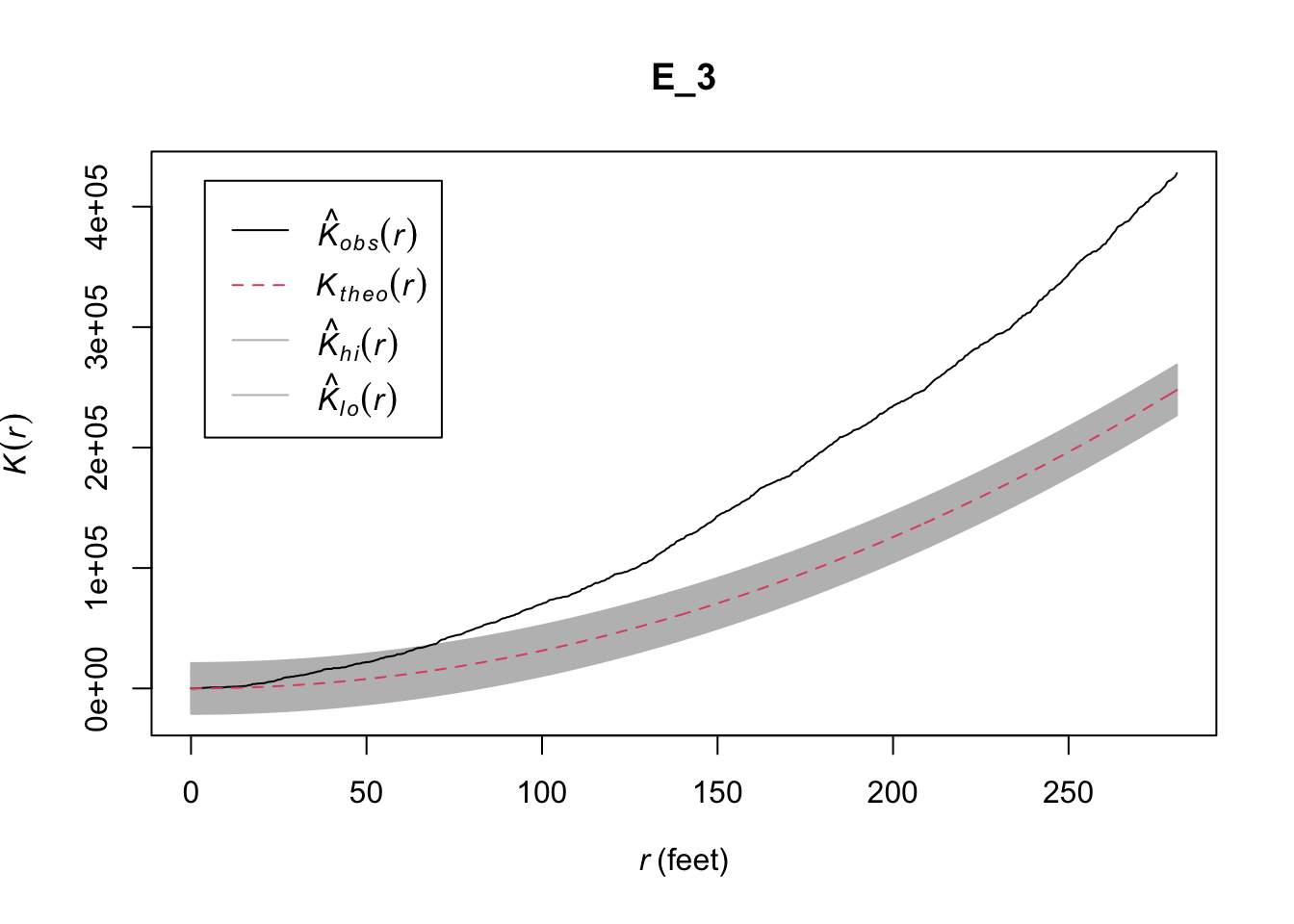
FIGURE 10.7: Ripley’s K for crime around University of Chicago with envelope
How would we do this now taking the network into consideration? We can use the methods introduced by Okabe and Yamada (2001) with the function linearK(). The function linearK() computes an estimate of the linear K function for a point pattern on a linear network. For this we need to specify the parameter for correction= to be "none". If correction=“none”, the calculations do not include any correction for the geometry of the linear network. The result is the network K function as defined by Okabe and Yamada (2001).
We can wrap this within the envelope() function for inference purposes. This will generate an envelope assuming a homogeneous Poisson process. We also limit the number of simulations (nsim =) to 99, and suppress a verbose output.
set.seed(200)   # set seed for reproducibility

E_4 <- envelope(chicago, linearK, correction = "none", nsim= 99, verbose = FALSE)

plot(E_4) # plot result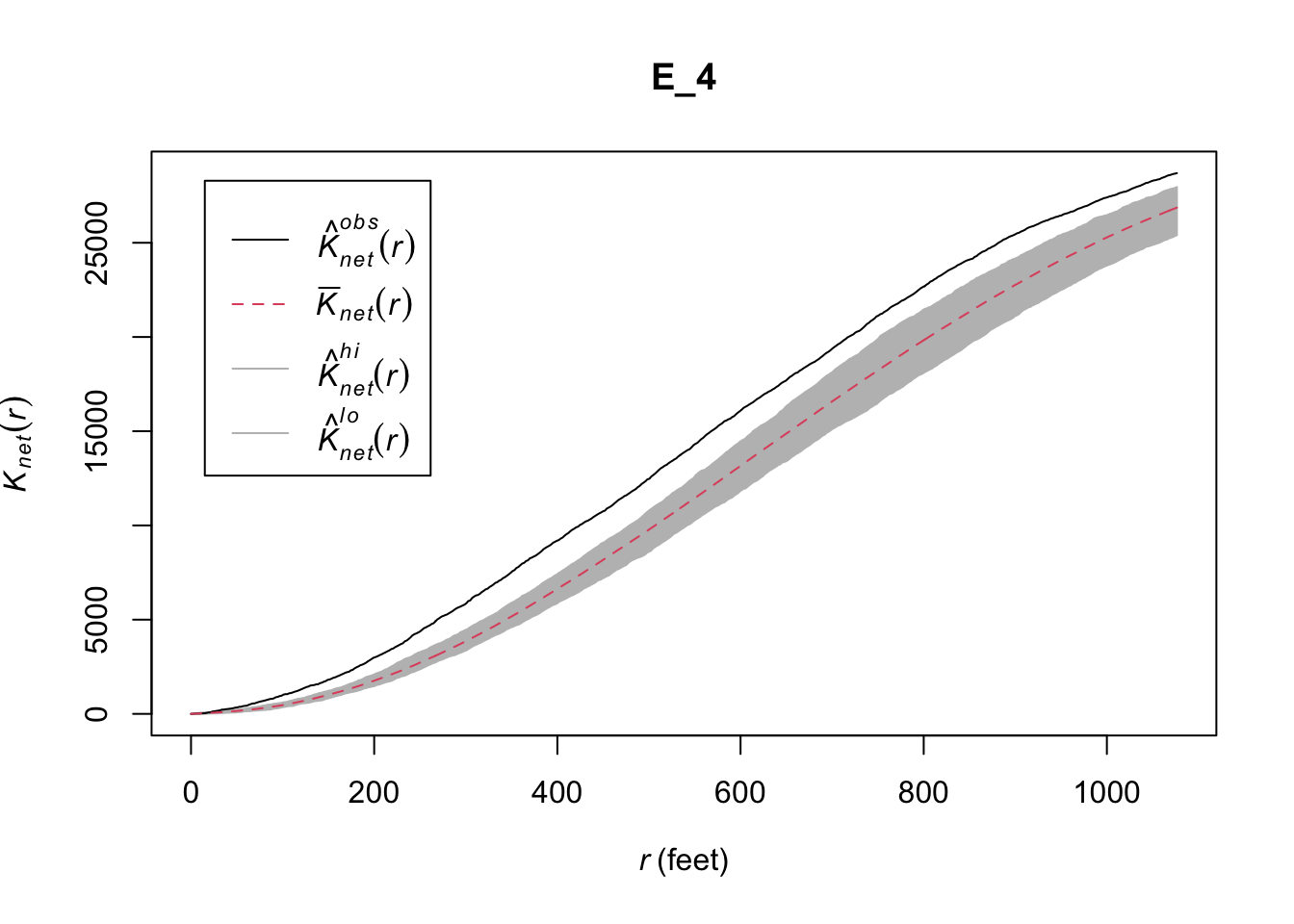
FIGURE 10.8: Estimate linear K for a point pattern (crimes) on a linear network (University of Chicago network)
As noted by Baddeley, Rubak, and Turner (2015) in there is a difference between what we get with Kest and with linearK. Whereas the two planar “K function is a theoretical expectation for the point process that is assumed to have generated our data… the empirical K-function of point pattern data” (that we get with linearK) “is an empirical estimator of the K-function of the point process” (p. 739, the emphasis is ours).
A limitation of the Okabe-Yamada network-K function is that, unlike the general Ripley´s K which is normalised, you cannot use it for “comparison between different point processes, with different intensities, observed in different windows… because it depends on the network geometry” (p. 739). This is a problem that was approached by Ang, Baddeley, and Nair (2012) who proposed a “geometrically corrected” K function. You can see the mathematical details for this function in either Baddeley, Rubak, and Turner (2015) or in greater depth in Ang, Baddeley, and Nair (2012). This geometrically corrected k function is implemented as well in the linearK() function. If we want to obtain this solution we need to specify as an argument correction="Ang" or simply not include this argument, for this is the default in linearK():
set.seed(200)
E_5 <- envelope(chicago, linearK, correction = "Ang", nsim= 99, verbose = FALSE)
plot(E_5)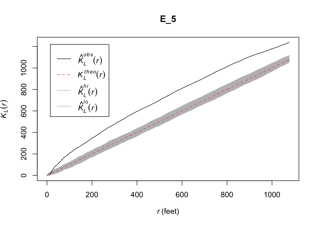
FIGURE 10.9: Geometrically corrected linear K function for a point pattern (crimes) on a linear network (University of Chicago network)
Finally, there is also an equivalent to the geometrically corrected K function that allows for an inhomogeneous point process that can be obtained using linearKinhom() (see Baddeley and Turner (2005) for details).
These methods all help discuss about spatial autocorrelation in point pattern data. In the next section, we will consider how we might find out whether such clustering exists in data measured at polygon (rather than point) level.
10.3 Exploring spatial autocorrelation in lattice data
10.3.1 Burglary in Manchester
To illustrate spatial autocorrelation in lattica data, we are going to hop across the globe to Manchester, UK. To follow, read in the file burglary_manchester_lsoa.geojson which contains burglaries per Lower Layer Super Output Area (LSOA), which is the data with which we will be working here.
burglary <- st_read("data/burglary_manchester_lsoa.geojson",
                    quiet=TRUE)
To have a look at the data, we can plot it quickly with tmap:
tm_shape(burglary) +
  tm_bubbles("burglary", border.lwd=NA, perceptual = TRUE) +
  tm_borders(alpha=0.1) +
  tm_layout(legend.position = c("right", "bottom"),
            legend.title.size = 0.8,
            legend.text.size = 0.5)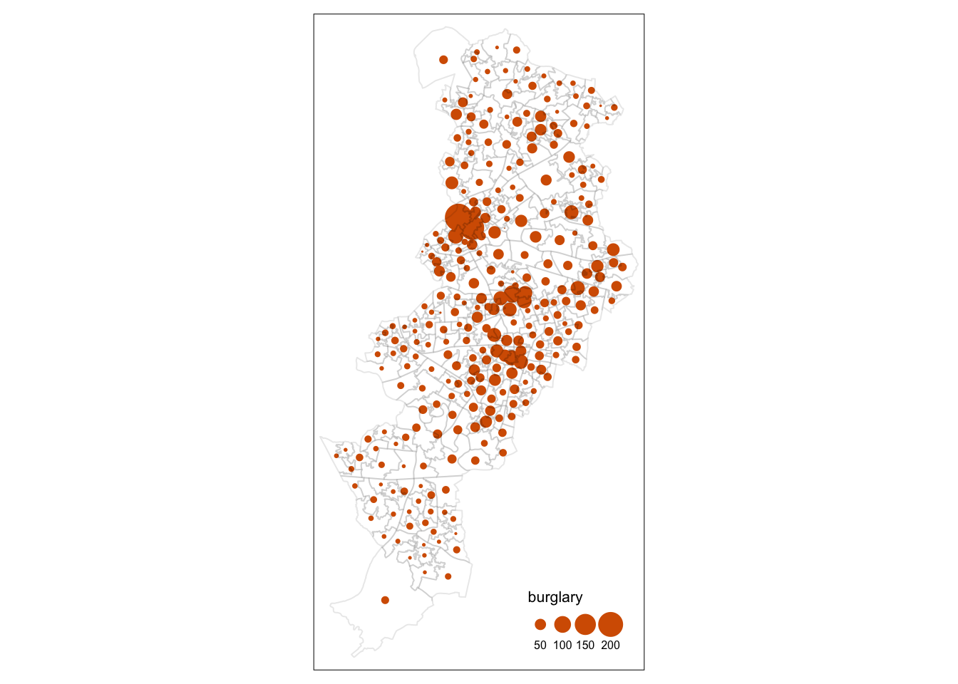
FIGURE 10.10: A quick look at burglary in Manchester
Do you see any patterns? Are burglaries randomly spread around the map? Or would you say that areas that are closer to each other tend to be more alike? Is there evidence of clustering? Do burglaries seem to appear in certain pockets of the map? To answer these questions, we will need to consider whether we see similar values in neighbouring areas.
10.3.2 What is a neighbour?
Previously we asked whether areas are similar to their neighbours or to areas that are close. But what is a neighbour? Or what do we mean by close? How can one define a set of neighbours for each area? If we want to know if what we measure in a particular area is similar to what happens on its neighbouring areas, we first need to establish what we mean by a neighbour.
10.3.2.1 Contiguity-based neighbours
There are various ways of defining a neighbour. Most rely on topological or geometrical relationships among the areas. First, we can say that two areas are neighbours if they share boundaries, if they are next to each other. In this case we talk of neighbours by contiguity. By contiguous you can, at the same time, mean all areas that share common boundaries (what we call contiguity using the rook criteria, like in chess) or areas that share common boundaries and common corners, that is, that have any point in common (and we call this contiguity using the queen criteria). When we use this criteria we can refine our definition by defining the intensity of neighbourliness “as a function of the lenght of the common border as a proportion of the total border” (Haining and Li 2020, 89). Given that in criminology we mostly work with irregular lattice data (such as police districts or census geographies), the queen criteria makes more sense. There is little theoretical justification for why, say, a police district would only exhibit dependence according to the rook criteria.
When defining neighbours by contiguity we may also specify the order of contiguity. First order contiguity means that we are focusing on areas immediately contiguous (those in dark blue in the figure below. Second order means that we consider neighbours only those areas that are immediately contiguous to our first order neighbours (the light blue areas in the figure below) and you could go on and on. Look at the graphic below for clarification:
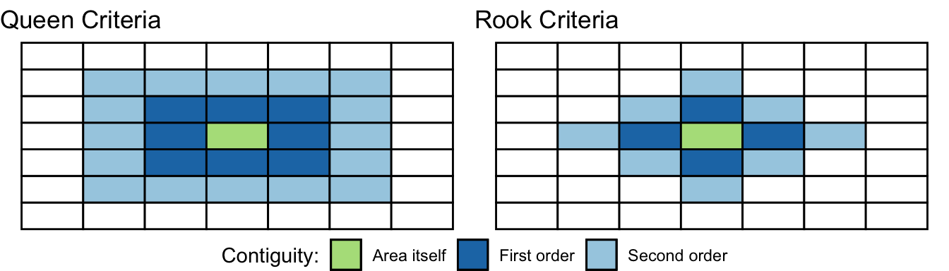
FIGURE 10.11: Defining neighbours by contiguity
10.3.2.2 Distance-based neighbours
Secondly, we may define neighbours by geographical distance. You can consider neighbours those areas that distant-wise are close to each other (regardless of whether boundaries are shared). The distance metric often will be euclidean, but other commonly used distance metrics could also be employed (for example, Manhattan). Often one takes the centroid of the polygon as the location to take the distance from. More sophisticated approaches may involve taking a population weighted centroid, where the location of the centroid depends on the distribution of the population within an area.
Other approaches to define neighbours are graph-based, attribute-based, or interaction-based (e.g., flow of goods or people between areas). Contiguity and distance are the two most commonly used methods, though.
You will come across the term spatial weight matrix at some point or, using mathematical notation, \(W\). Essentially the spatial weight matrix is a \(n\) by \(n\) matrix with, often, ones and zeroes (in the case of contiguity based definitions) identifying if any two observations are neighbours. So you can think of the spatial weight matrix as the new data table that we are constructing with our definition of neighbours (whichever definition that is).
When working with contiguity measures the problem of “islands” sometimes arise. The spatial weight matrix in this case would have zeroes for the row representing this “island”. This is not permitted in the subsequent statistical use of this kind of matrix. A common solution is to “join” islands to the spatial units in the “mainland” that are closer.
So how do you build such a matrix with R? Well, let’s turn to that. But to make things a bit simpler, let’s focus not on the whole of Manchester, but just in the LSOAs within the city centre. Calculating a spatial weights matrix is a computationally intensive process, which means it takes a long time. The larger area you have (which will have more LSOAs) the longer this will take.
We will use code we covered in Chapter 2 to clip the spatial object with the counts of burglaries to only those that intersect with the City Centre ward. If any of the following are unclear, visit Basic geospatial operations in R in this book.
# Read a geojson file with Manchester wards and select only the city centre ward
city_centre <- st_read("data/manchester_wards.geojson", quiet = TRUE) %>%
  filter(wd16nm == "City Centre")

# Reproject the burglary data
burglary <- st_transform(burglary, 27700)
# Intersect
cc_intersects <- st_intersects(city_centre, burglary)
cc_burglary <- burglary[unlist(cc_intersects),]
# Remove redundant objects
rm(city_centre)
rm(cc_intersects)
We can now have a look at our data. Let’s use the view mode of tmap to enable us to interact with the map.
# Plot with tmap
tmap_mode("view")
tm_shape(cc_burglary) +
  tm_fill("burglary", style = "quantile", palette = "Reds", id="code") +
  tm_borders() +
  tm_layout(main.title = "Burglary counts", main.title.size = 0.7 ,
            legend.position = c("right", "top"), legend.title.size = 0.8)
So now we have a new spatial object “cc_burglary” with the 23 LSOA units that compose the City Centre of Manchester. By focusing in a smaller subset of areas we can visualise perhaps a bit better what comes next.
10.3.3 Creating a list of neighbours based on contiguity
Since it is an interactive map, if you are following along, you should be able to click on each LSOA, and see it’s unique ID. You could, manually go through, and find the neighbours for each one this way. However, it would be very, very tedious having to identify the neighbours of all the areas in our study area by hand. That’s why we love computers. We can automate tedious work so that they do it and we have more time to do fun stuff.
To calculate our neighbours, we are first going to turn our sf object into spatial (sp) objects, so we can make use of the functions from the sp package that allow us to create a list of neighbours.
#We coerce the sf object into a new sp object
cc_burglary_sp <- as(cc_burglary, "Spatial")
In order to identify neighbours we will use the poly2nb() function from the spdep package that we loaded at the beginning of our session. The spdep package provides basic functions for building neighbour lists and spatial weights and tests for spatial autocorrelation for areal data like Moran’s I (more on this below).
The poly2nb() function builds a neighbours list based on regions with contiguous boundaries. If you look at the documentation you will see that you can pass a queen argument that takes TRUE or FALSE as options. If you do not specify this argument the default is set to true, that is, if you don’t specify queen = FALSE this function will return a list of first order neighbours using the Queen criteria.
nb_queen <- poly2nb(cc_burglary_sp, row.names=cc_burglary_sp$code)
class(nb_queen)
## [1] "nb"We see that we have created a nb, neighbour list object called nb_queen. We can get some idea of what’s there if we ask for a summary.
summary(nb_queen)## Neighbour list object:
## Number of regions: 23
## Number of nonzero links: 100
## Percentage nonzero weights: 18.9
## Average number of links: 4.348
## Link number distribution:
##
## 2 3 4 5 6 7 8
## 3 4 6 5 3 1 1
## 3 least connected regions:
## E01033673 E01033674 E01033684 with 2 links
## 1 most connected region:
## E01033658 with 8 linksThis is basically telling us that using this criteria each LSOA polygon has an average of 4.3 neighbours (when we just focus on the city centre) and that all areas have some neighbours (there are no islands). The link number distribution gives you the number of links (neighbours) per area. So here we have 3 polygons with 2 neighbours, 3 with 3, 6 with 4, and so on. The summary function here also identifies the areas sitting at both extreme of the distribution. We can graphically represent the links using the following code:
# We first plot the boundaries
plot(cc_burglary_sp, col='white', border='blue', lwd=2)
# Then we use the coordinates function to obtain
# the coordinates of the polygon centroids
xy <- coordinates(cc_burglary_sp)
#Then we draw lines between the polygons centroids
# for neighbours that are listed as linked in nb_bur
plot(nb_queen, xy, col='red', lwd=2, add=TRUE)
FIGURE 10.12: Neighbouring relationships between LSOAs with Queen contiguity criteria
10.3.4 Generating the weight matrix
We can transform the object nb_queen, the list of neighbours, into a spatial weights matrix. A spatial weights matrix reflects the intensity of the geographic relationship between observations. For this we use the spdep function nb2mat() (make a matrix out of a list of neighbours). The argument style sets what kind of matrix we want. B stands for the basic binary coding, you get a 1 for neighbours, and a 0 if the areas are not neighbours.
wm_queen <- nb2mat(nb_queen, style='B')You can view this matrix by autoprinting the object wm_queen which we just created:
wm_queenThis matrix has values of 0 or 1 indicating whether the elements listed in the rows are adjacent (using our definition, which in this case was the Queen criteria) with each other. The diagonal is full of zeroes. An area cannot be a neighbour of itself. So, if you look at the first two and the second column you see a 1. That means that the LSOA with the code E01005065 is a neighbour of the second LSOA (as listed in the rows) which is E01005066. You will have zeroes for many of the other columns because this LSOA only has 4 neighbours.
In many computations we will see that the matrix is row standardised. We can obtain a row standardise matrix changing the code, specifically setting the style to W (the indicator for row standardised in this function):
wm_queen_rs <- nb2mat(nb_queen, style='W')Row standardisation of a matrix ensure that the sum of the rows adds up to 1. So, for example, if you have four neighbours and that has to add up to 4, you need to divide 1 by 4, which gives you 0.25. So in the columns for a polygon with 4 neighbours you will see 0.25 in the column representing each of the neighbours.
10.3.5 Spatial weight matrix based on distance
10.3.5.1 Defining neighbours based on a critical threshold of distance
As noted earlier we can also build the spatial weight matrix using some metric of distance. Remember that metrics such as Euclidean distance only makes sense if you have projected data. This is so because it does not take into account the curvature of the earth. If you have non projected data, you can either transform the data into a projected system (what we have been doing in earlier examples) or you need to use distance metrics that work with the curvature of earth (e.g., arc-distance or great-circle distance).
The simplest spatial distanced-based weights matrix is obtained defining a given radius within each area and only consider as neighbours other areas that fall within such radius. So that we avoid “islands”, the radius needs to be chosen in a way that guarantees that each location has at least one neighbor. So the first step would be to find an appropriate radius for establishing neighbourliness.
Previous to this we need the centroids for the polygons. We already showed above how to obtain this using coordinates() function in the sp package.
xy <- coordinates(cc_burglary_sp)Then we use the knearneigh() function from the spdep package to find the nearest neighbour to each centroid. This function will just do that, look for the centroid closest to each of the other centroids. Then we turn the created object with this information into a nb object as defined earlier using knn2nb() also in spdep package:
nearest_n <- knearneigh(xy) # find nearest neighbours for each centroid coordiate pair
nb_nearest_n <- knn2nb(nearest_n) # transform into nb class object
Now we have a nb list that for each area define its nearest neighbour. What we need to do is to compute the distance from each centroid to its nearest neighbour (nbdists() will do this for us) and then find out what is the maximum distance (we can use max()), so that we use this as the critical threshold to define the radius we will use (to avoid the appearance of isolates in our matrix).
radius <- max(unlist(nbdists(nb_nearest_n, xy)))
radius
## [1] 690.9Now that we now the maximum radius we can use it to avoid isolates. The function dnearneigh() will generate a list of neigbhours within the radius we will specify. Notice the difference between knearneigh(), that we used earlier, and dnearneigh(). The first function generates a knn class object with the single nearest neighbour to each area \(i\), whereas dnearneigh() generates a nb object with all the areas \(j\) within a given radius of area \(i\) being defined as neighbours.
For dnearneigh() we need to define as parameters the object with the coordinates, the lower distance bound andthe upper distance bound (the “radius” we just calculated). If you were to be working with non projected data you would need to specify longlat as TRUE. The function assumes we have projected data and, thus, we don’t need to specify this argument in our case, since our data are indeed using the British Grid projection. As we did with the nb objects generated through contiguity we can use summary() to get a sense of the resulting list of neighbours.
nb_distance <- dnearneigh(xy, 0, radius)
summary(nb_distance)
## Neighbour list object:
## Number of regions: 23
## Number of nonzero links: 88
## Percentage nonzero weights: 16.64
## Average number of links: 3.826
## Link number distribution:
##
## 1 2 3 4 5 6 7
## 3 4 4 4 2 3 3
## 3 least connected regions:
## 1 17 23 with 1 link
## 3 most connected regions:
## 5 12 18 with 7 linksAnd as earlier we can also plot the results:
# We first plot the boundaries
plot(cc_burglary_sp, col='white', border='blue', lwd=2)
# Then we plot the distance-based neighbours
plot(nb_distance, xy, lwd=2, col="red", add=TRUE)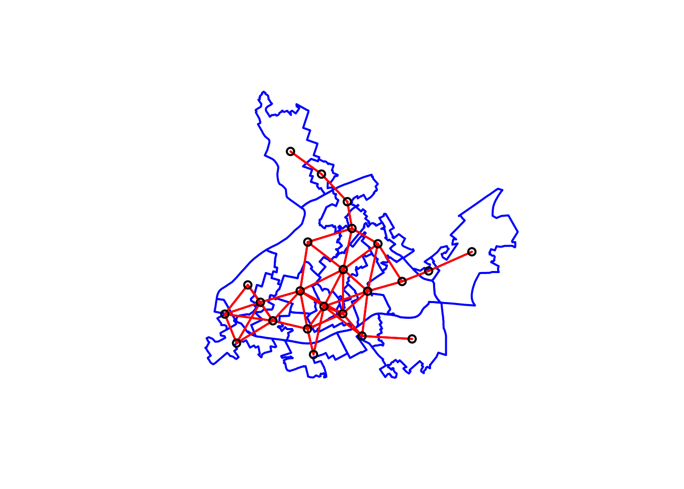
FIGURE 10.13: Neighbouring relationships between LSOAs with distance based criteria
We could now use this nb object to generate a spatial weight matrix in the same way as earlier:
wm_distance <- nb2mat(nb_distance, style='B')If we we autoprint the object we will see this is a matrix with 1 and 0 just as the contiguity-based matrix we generated earlier.
10.3.5.2 Using the inverse distance weights
Instead of just using a critical threshold of distance to define a neighbour we could use a function to define the weight assigned to the distance between two areas. Typical functions used are the inverse distance, the inverse distance raised to a power, and the negative exponential. All these functions essentially do the same, they decrease the weight as the distance increases. They impose a distance decay effect. Sometimes these functions are combined with a distance threshold (Haining and Li 2020).
The first steps in the procedure simply reproduce what we did earlier up to the point where we generated the bur_dist_1 object, so we won’t repeat them here and simply invoke this object. We adapt code and instructions provided by the tutorials of the Center for Spatial Data Science of the University of Chicago prepared by Anselin et al. (2021). Once we get to this point we need to generate the inverse distances. This requires us to take the following steps:
-Calculate the distance between all neighbours -Compute the inverse distance for this calculated distances -Assign them as weight values
Let’s go one step at the time. First we use nbdists() from the spdep package to generate all the distances:
distances <- nbdists(nb_distance, xy)Now that we have an object with all the distances we need to compute the inverse distances. Taking the inverse simply involves dividing 1 by each of the distances. We can easily do that with the following code:
inv_distances <- lapply(distances, function(x) (1/x))If you look inside the generated object you will see all the inverse distances:
View(inv_distances)You will notice that the values are rather small. The projection we use measures distance in meters. Considering our polygons are census geographies “close” to the ideas of neighbourhoods you will have distances between their centroids that are large. If we take the inverse, as we did, we will unavoidably produce small values very close to zero. We could rescale this to obtain values that are not this small. We can change our units to something larger, like kilometers, or if we want, we can just apply some maths here:
inv_distances_r <- lapply(distances, function(x) (1/(x/100)))Once we have generated the inverse distance we can move to generate the weights based on these using nb2mat().
wm_inverse_dist <- nb2mat(nb_distance,
                glist = inv_distances_r,
                style='B')
The glist argument identifies the inverse distances and the style set to "B" ensures we are not using row standardisation. If we view this object we will see that rather than zeroes and ones we see the inverse distances used as weights. In this case, all areas neighbour each other (but not themselves!) and their “neighbouringness” is defined with this distance measure.
10.3.6 Spatial weight matrix based on k-neighbors
Chi and Zhu (2020) suggest that using the distance based spatial weight matrix tend to result in too few neighbours for rural areas and many neighbours for urban areas. In this case they point out that the k-nearest neighbourhood structure may be more appropriate. K-neighbours also avoids the problem of isolates without having to specify a radius for a critical threshold.
Computing the list of neighbours is pretty straightforward and uses functions we are familiar with by now. In the first place we use knearneigh() to get an oject of class knn. In this instance, though, we pass a parameter k identifying the number of neighbours we want for each area. We will set this to 3. Then we use knn2nb() to generate the list of neighbours.
nb_k3 <- knn2nb(knearneigh(xy, k = 3))As before we can use this list of neighbours to create a matrix and we can visualise the relationships with a plot:
# Get the matrix
wm_k3 <- nb2mat(nb_k3, style='B')
# We first plot the boundaries
plot(cc_burglary_sp, col='white', border='blue', lwd=2)
# Then we plot the distance-based neighbours
plot(nb_k3, xy, lwd=2, col="red", add=TRUE)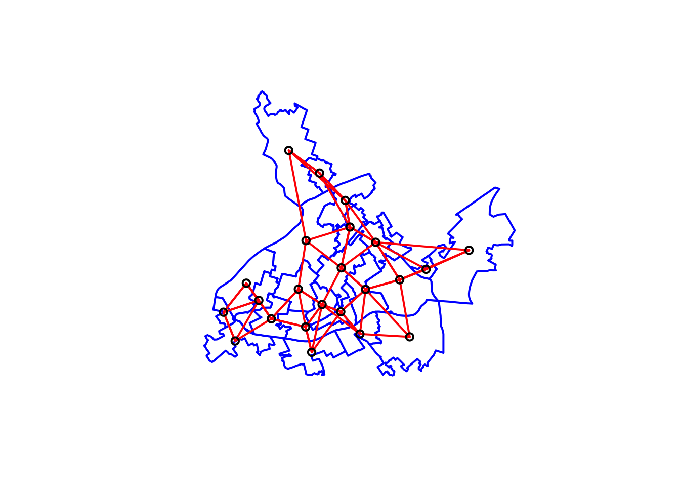
FIGURE 10.14: Neighbouring relationships between LSOAs with distance based criteria using k (k=3) nearest neighbours approach
10.4 Choosing the correct matrix
So what is the best approach to creating your spatial weights matrix? As we will see later, the spatial weight matrix not only is used for exploring spatial autocorrelation. It also plays a key role in the context of spatial regression. How we specify the matrix is important.
As noted above, contiguity and distance are the two most commonly used methods. In earlier applications researchers would select a particular matrix without a strong rationale for it. You should be guided by theory in how you define the neighbors in your study, unfortunately “substantive theory regarding spatial effects remain an underdeveloped research area in most of the social sciences” (Darmofal 2015, 23) or as Chi and Zhu (2020) put it “there is limited theory available regarding how to select which spatial matrix to use.”
In this context, it may make sense to explore various definitions and see if our findings are robust to these specifications. Aldstadt and Getis (2006) developed an algorithm (AMOEBA) which is a design for the construction of a spatial weights matrix using empirical data that can also simultaneously identify the geometric form of spatial clusters. Chi and Zhu (2020) propose to use this as a possible starting point in the comparisons, though the procedure is not yet fully implemented in R (there is an AMOEBA package but it only generates a vector with the spatial clusters, not the matrix). They also suggest using the spatial weight matrix corresponding to high spatial autocorrelation and high statistical significance as more appropriate for exploratory data analysis of a given variable, and for the purpose of regression to use the matrix with the highest correlation and significance when exploring the residuals of the model.
In any case, the choice of spatial weights should be made carefully, as it will affect the results of subsequent analyses based on it. But now, that we know how to build one, we can move to implementing it in order to measure whether or not we can observes spatial autocorrelation in our data.
10.4.1 Measuring global autocorrelation
10.4.1.1 Moran’s I
The most well known measure of spatial autocorrelation is the Moran’s I. It was developed by Patrick Alfred Pierce Moran, an Australian statistician. Like the more familiar Pearson’s \(r\) correlation coefficient, which is used to measure the dependency between a pair of variables, Moran´s I aims to measure dependency. This statistic measures how one area is similar to others surrounding it in a given attribute or variable. When the value of an attribute in areas defined as neighbours in our spatial weight matrix are similar Moran’s I will be large and positive (closer to 1). When the value of an attribute in neighbouring areas are dissimilar Moran’s I will be negative, tending to -1. In the first case, when there is positive spatial dependence, we speak of clustering. In the latter, what we observe is spatial dispersion (areas alike, in an attribute, “repel” each other). In social science applications, positive spatial autocorrelation is more likely to be expected. There are fewer social processes that would lead us to expect negative spatial autocorrelation. When Moran´s I is close to zero, we fail to find evidence for either dispersion or clustering. The null hypothesis in a test of spatial autocorrelation is that the values of the attribute in question are randomly distributed across space.
Moran’s I is a weighted product-moment correlation coefficient, where the weights reflect geographic proximity. Unlike autocorrelation in timeseries (which is unidimensional: the future cannot affect the past), spatial autocorrelation is multidimensional, the dependence between an area and its neighbors is either simultaneous or reciprocal. Moran´s I is defined as:
\[I = \frac{N}{W}* \frac{\sum_{i} \sum_{j} w_{ij} (x_{i}-\overline{x})(x_{j}-\overline{x})}{\sum_{i}(x_{i}-\overline{x})^2}\]
where \(N\) is the number of spatial areas indexed by \(i\) and \(j\); \(x\) is our variable of interest; \(\overline{x}\) is the mean of \(x\); \(w_{ij}\) is the spatial weight matrix with zeroes in the diagonal; and \(W\) is the sum of all of \(w_{ij}\).
We can easily compute this statistic with the moran.test() function in spdep package. This function does not take as an input the spatial weight matrix that we create using nb2mat(). Instead it prefers to read this information from a listw class object. This kind of object includes the same information than the matrix, but it does it in a more efficient way that helps with the computation (see Brunsdon and Comber (2015), p. 230 for details). So the first step to use moran.test() is to turn our matrix into a listw class object.
Before we can use the functions from spdep to compute the global Moran’s I we need to create a listw type spatial weights object (instead of the matrix we used above). Let’s use the objects we created using the various criteria. To get the same value as above we use style='B' to use binary (TRUE/FALSE) weights.
lw_queen <-  nb2listw(nb_queen, style='B')
lw_distance <- nb2listw(nb_distance, style='B')
lw_k3 <- nb2listw(nb_k3, style='B')
lw_inverse_d <- nb2listw(nb_distance,
                glist = inv_distances_r,
                style='B')
Now we can apply the moran.test() function.
moran.test(cc_burglary_sp$burglary, lw_queen)##
## Moran I test under randomisation
##
## data: cc_burglary_sp$burglary
## weights: lw_queen
##
## Moran I statistic standard deviate = 1.6,
## p-value = 0.06
## alternative hypothesis: greater
## sample estimates:
## Moran I statistic Expectation Variance
## 0.12033 -0.04545 0.01111So the Moran’s I here is 0.12, which does not look very large. With this statistic we have a benchmarking problem. Whereas with standard correlation the value is always restricted to lie within the range of -1 to 1, the range of Moran´s I varies with the W matrix. How can we establish the range for our particular matrix? It has been shown that the maximum and minimum values of \(I\) are the maximum and minimum values of the eigenvalues of \(\frac{(W + W^T)}{2}\) (see Brunsdon and Comber (2015), p. 232 for details). Don’t worry if you don’t know what an eigenvalue is at this point. The thing is we can use this understanding to calculate the Moran´s range using the following code:
# Adapted from Brunsdon and Comber (2015)
moran_range <- function(lw) {
  wmat <- listw2mat(lw)
  return(range(eigen((wmat + t(wmat))/2)$values))
}
moran_range(lw_queen)
## [1] -2.541 5.023On absolute scale, thus, this does not look like a very large value of spatial autocorrelation.
The second issue is whether this statistic is significant. If we assume a null hypothesis of independence, what is the probability of obtaining a value as extreme as 0.12. The spatial autocorrelation (Global Moran’s I) test is an inferential statistic, which means that the results of the analysis are always interpreted within the context of its null hypothesis. For the Global Moran’s I statistic, the null hypothesis states that the attribute being analysed is randomly distributed among the features in your study area; said another way, the spatial processes promoting the observed pattern of values is random chance. Imagine that you could pick up the values for the attribute you are analysing and throw them down onto your features, letting each value fall where it may. This process (picking up and throwing down the values) is an example of a random chance spatial process. When the p-value returned by this tool is statistically significant, you can reject the null hypothesis of complete spatial randomness.
The moran.test() function can compute the variance of the Moran´s I under the assumption of normallity or under the randomisation assumption (which is the default at least we set the argument randomisation to FALSE). We can also use a Monte Carlo procedure. The way Monte Carlo works is that the values of burglary are randomly assigned to the polygons, and the Moran’s I is computed. This is repeated several times to establish a distribution of expected values under the null hypothesis. The observed value of Moran’s I is then compared with the simulated distribution to see how likely it is that the observed values could be considered a random draw.
We use the function moran.mc() to run a permutation test for Moran’s I statistic calculated by using some number of random permutations of our numeric vector, for the given spatial weighting scheme, to establish the rank of the observed statistic in relation to the simulated values. Pebesma and Bivand (2021) argue that if we compare the Monte Carlo and analytical variances of \(I\) under randomisation, we typically see few differences, arguably rendering Monte Carlo testing unnecessary.
In moran.mc() we need to specify our variable of interest (burglary), the listw object we created earlier (ww), and the number of permutations we want to run (here we choose 99).
set.seed(1234)

burg_moranmc_results <- moran.mc(cc_burglary_sp$burglary, lw_queen, nsim=99)

burg_moranmc_results
##
## Monte-Carlo simulation of Moran I
##
## data: cc_burglary_sp$burglary
## weights: lw_queen
## number of simulations + 1: 100
##
## statistic = 0.12, observed rank = 92, p-value =
## 0.08
## alternative hypothesis: greaterSo, the probability of observing this Moran’s I if the null hypothesis was true is 0.08. This is higher than our alpha level of 0.05. In this case, we cannot conclude that there is significant global spatial autocorrelation. We can use this test to check for our various specifications of the spatial weight matrix:
moran.test(cc_burglary_sp$burglary, lw_distance)##
## Moran I test under randomisation
##
## data: cc_burglary_sp$burglary
## weights: lw_distance
##
## Moran I statistic standard deviate = 3, p-value
## = 0.002
## alternative hypothesis: greater
## sample estimates:
## Moran I statistic Expectation Variance
## 0.28763 -0.04545 0.01266moran.test(cc_burglary_sp$burglary, lw_k3)##
## Moran I test under randomisation
##
## data: cc_burglary_sp$burglary
## weights: lw_k3
##
## Moran I statistic standard deviate = 1.9,
## p-value = 0.03
## alternative hypothesis: greater
## sample estimates:
## Moran I statistic Expectation Variance
## 0.18567 -0.04545 0.01423moran.test(cc_burglary_sp$burglary, lw_inverse_d)##
## Moran I test under randomisation
##
## data: cc_burglary_sp$burglary
## weights: lw_inverse_d
##
## Moran I statistic standard deviate = 2.4,
## p-value = 0.008
## alternative hypothesis: greater
## sample estimates:
## Moran I statistic Expectation Variance
## 0.23700 -0.04545 0.01380As we can see using the different specifications of neighbours produces results that are more suggestive of dependence. Such results further highlight the importance of picking appropriate and justified spatial weights for your analysis.
We can also make a “Moran scatterplot” to visualize spatial autocorrelation. This type of scatterplot was introduced by Anselin (1996) as a tool to visualise the relationship between the value of interest and its spatial lag, but also to explore local clusters and areas of non-stationairy (we will discuss this in greater detail in next chapter). Note the row standardisation of the weights matrix.
wm_queen_rs <- mat2listw(wm_queen, style='W')
# Checking if rows add up to 1 (they should)
mat <- listw2mat(wm_queen_rs)

#This code simply sums each row to see if they sum to 1
# we are only displaying the first 15 rows in the matrix
apply(mat, 1, sum)[1:15]
## E01005065 E01005066 E01005128 E01005212 E01033653
## 1 1 1 1 1
## E01033654 E01033655 E01033656 E01033658 E01033659
## 1 1 1 1 1
## E01033661 E01033662 E01033664 E01033667 E01033672
## 1 1 1 1 1Now we can plot. Anselin (1996) propose to center the variables around their mean, which is not the default taken by moran.plot(), so we need to specify this ourselves when plotting by virtue of using scale(). This simply substract the mean from each value, so that the mean of the resulting variable will be 0.
moran.plot(as.vector(scale(cc_burglary_sp$burglary)), wm_queen_rs)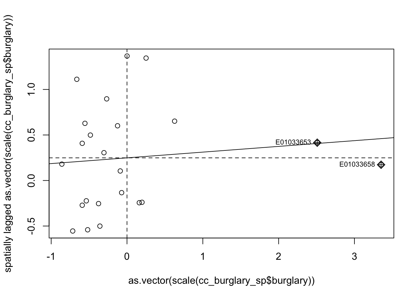
FIGURE 10.15: Moran scatterplot of burglary
The X axis represents the values of our burglary variable in each unit (each LSOA) and the Y axis represents a spatial lag of this variable. A spatial lag in this context is simply the average value of the burglary count in the areas that are considered neighbours of each LSOA. So we are plotting the value of burglary against the average value of burglary in the neighbours. The slope of the fitted line represents the Moran’s I. And you can see the correlation is almost flat here. We will further explain this scatterplot in next chapter. Anselin (1996) suggests that the effective interpretation of this scatterplot should focus on the extent to which the fitted regression line that we see plotted reflects well the overall pattern of association between the variable of interest and its spatial lag: “the indication of observations that do not follow the overall trend represents useful information on local instability or non-stationarity” (p. 116-117).
As with any correlation measure, you could get positive spatial autocorrelation, that would mean that as you move further to the right in the X axis you have higher levels of burglary in the surrounding area. This is what we see here. But the correlation is fairly low and as we saw is not statistically significant. You can also obtain negative spatial autocorrelation. That is, that would mean that areas with high level of crime tend (it’s all about the global average effect!) to be surrounded by areas with low levels of crime. This is clearly not what we see here.
10.4.1.2 Geary’s C
Another measure of global autocorrelation is Geary’s C. Unlike Moran’s I, which measures similarity, Geary’s C measures dissimilarity. The value is achieved from considering the squared difference for attribute similarity. In the equation
\[C = \frac{(N-1)*\sum_i\sum_j w_{ij}*(x_i - x_j)^2}{2* \sum_i\sum_j w_{ij}* \sum_i(x_i - \bar{x})^2}\]
the \((x_i - x_j)^2\) measures the dissimilarity between observations \(x_i\) and neighbours \(x_j\).
This means that the interpretation for the Geary’s C is essentially the inverse of that of the Moran’s I. Positive autocorrelation is seen when \(C < 1\) (or \(z < 0\)), while negative autocorrelation is seen when \(C > 1\) (or \(z > 0\)). The nice thing about Geary’s C is that it doesn’t need any assumptions about linearity to be made (unlike Moran’s I).
So how do we go about implementing this in R? For obtaining this statistic we can use geary.test() function from the spdep package. Like with Moran’s I, we specify the variable of interest (cc_burglary_sp$burglary) and the spatial weights matrix (lw_queen) :
geary.test(cc_burglary_sp$burglary, lw_queen)##
## Geary C test under randomisation
##
## data: cc_burglary_sp$burglary
## weights: lw_queen
##
## Geary C statistic standard deviate = -1.7,
## p-value = 1
## alternative hypothesis: Expectation greater than statistic
## sample estimates:
## Geary C statistic Expectation Variance
## 1.39340 1.00000 0.05395Note that for Geary’s C, the test assumes that the weights matrix is symmetric. For inherently non-symmetric matrices, such as k-nearest neighbour matrices discussed above, you can make use of the listw2U() helper function which constructs a weights list object to make the matrix symmetric.
It is very important to understand that global statistics like the spatial autocorrelation (Global Moran’s I, Geary’s C) tool assess the overall pattern and trend of your data. They are most effective when the spatial pattern is consistent across the study area. In other words, you may have clusters (local pockets of autocorrelation), without having clustering (global autocorrelation). This may happen if the sign of the clusters negate each other. In general, Moran’s I is a better measure of global correlation, as Geary’s C is more sensitive to local correlations.
10.4.2 The rgeoda and sfweight packages
Traditionally the generation of a weight matrix was done with functions included in the spdep program, and this is what we had introduced above. We do want to note however, that more recently the functionality of GeoDa, a very well known point and click interface for spatial statistics originally developed by Luc Anselin (a key figure in the field of spatial statistics), has been brought to R via the rgeoda package. This package is fast, though “less flexible when modifications or enhancements are desired” (Pebesma and Bivand 2021). The nomenclature of the functions is slightly more intuitive and there are subtle variations in some of the formulas. It works with sf objects, and so may be useful for integrating our analysis to these objects. It is enough now that you are aware of the content of this chapter, and one path to implementing what we learned with the sp package. This should equip you to be able to explore these other packages as well, which will have different ways of achieving these outcomes.
For example, to create queen contiguity weights, you can use the queen_weights() function from the rgeoda package, and as an argument you only need to pass the name of your polygon object (cc_burglary).
queen_w_geoda <- queen_weights(cc_burglary)
summary(queen_w_geoda)
## name value
## 1 number of observations: 23
## 2 is symmetric: TRUE
## 3 sparsity: 0.189035916824197
## 4 # min neighbors: 2
## 5 # max neighbors: 8
## 6 # mean neighbors: 4.34782608695652
## 7 # median neighbors: 4
## 8 has isolates: FALSEThere are similar functions for other types of weights:
# For example:
# For our k 3 nearest neighbours
knn_weights(cc_burglary, 3)
# For distance
distance_weights(cc_burglary,  min_distthreshold(cc_burglary))
More details are available in the documentation for rgeoda.
It is also worth mentioning sfweight. The sfweight package, still only available from GitHub at time of this writing and therefore we could consider it as “in ongoing development”, aims “to provide a more streamlined interface to the spdep” package. The goal of this package is to create and simpler workflow for creating neighbors, spatial weights, and spatially lagged variables. You can read more about it in its GitHub repository.
10.5 Further Reading
For a deeper understanding of the study of spatial dependence on point patterns we recommend Baddeley, Rubak, and Turner (2015). Haining and Li (2020) and Darmofal (2015) both contain useful chapters on the spatial weight matrix that provide a bit more detail than we do here, whilst maintaining an accessible level. We highly recommend too the series of videolectures provided by Luc Anselin in the YouTube channel of the Center for Spatial Data Science (University of Chicago). Prof. Anselin has been one of the key authors in the field of spatial econometrics during the last 25 years. His lectures are both high quality and accessible for someone starting in the field of spatial statistics. You will find lectures on the spatial weight matrix, global autocorrelation, and local indicators of spatial autocorrelation (which we cover in the next chapter) in Anselin (2021). In the website for the Center for Spatial Data Science you will also find R tutorials that provide instructions in how to specify the spatial weight matrix using other approaches we have not covered here (Anselin et al. 2021).