Chapter 4 Mapping rates and counts
4.1 Introduction
In the first chapter we showed you fairly quickly how to create maps by understanding how data may have spatial elements, and how that can be linked to geometries. In this one instead we will get to know how to think about thematic maps, and how to apply your learning to creating your own maps of this variety. In the process we will discuss various types of thematic maps and the issues they raise.
Thematic maps focus on representing the spatial pattern of a variable of interest (e.g, crimes, trust in the police, etc.) and they can be used for exploration and analysis or for presentation and communication to others. There are different types of thematic maps depending on how the variable of interest is represented. In this and the next chapters we will introduce some of these types of particular interest for crime analysis, the different challenges they pose, and some ideas that may help you to choose the best representation for your data. Critically, we need to think about the quality of the data we work with, for adequate measurement is the basis of any data analysis.
We will introduce in particular two common types of thematic maps used for mapping quantitative variables: choropleth (thematic) maps and proportional symbol maps. In previous chapters we introduced two separate packages for creating maps in R (ggplot2 and leaflet). Here we will introduce a third package for creating maps: tmap. The libraries we use in this chapter are as follow:
# Packages for reading data and data carpentry
library(readr)
library(dplyr)
library(janitor)
# Packages for data exploration
library(skimr)
# Packages for handling spatial data and for geospatial carpentry
library(sf)
# Packages for mapping and visualisation
library(tmap)
library(tmaptools)
# Packages for spatial analysis
library(DCluster)
# Packages with spatial datasets
library(geodaData)4.2 Thematic maps: key terms and ideas
4.2.1 Choropleth maps
Choropleth maps display variation in areas (postal codes, police districts, census administrative units, municipal boundaries, regional areas, etc.) through the use of the colour that fills each of these areas in the map. A simple case can be to use a light to dark color to represent less to more of the quantitative variable. They are appropriate to compare values across areas.
Most thematic maps you encounter are classified choropleth maps. They group the values of the quantitative variable into a number of classes, typically between 5 and 7. We will return to this later in the chapter. It is one of the most common forms of statistical maps and like pie charts they are subject to ongoing criticism. Tukey (1979) concluded they simply do not work. And there are indeed a number of known problems with choropleth maps:
They may not display variation within the geographical units being employed. You are imposing some degree of distortion by assuming all parts of an area display the same value. Our crime map may show a neighbourhood as secure, when there is a part of this neighbourhood that has a high level of crime. And viceversa.
Boundaries of geographical areas are to a large extent arbitrary (and unlikely to be associated with major discontinuities in your variable of interest). In crime analysis we very often use census administrative units, but these rarely represent natural neighbourhoods.
They work better if areas are of similar size. Areas of greater size may be more heterogeneous internally than those of smaller size: that is, they potentially have the largest error of representation. Also, visual attention may be drawn by areas that are large in size (if size is not the variable used to create a ratio)
4.2.2 What do we use choropleth maps for?
4.2.2.1 Crime rates
In a choropleth map you “can” show raw totals (absolute values), for example number of crimes, or derived values (ratios), such as crime per 100,000 inhabitants. But as a general rule, you should restrict choropleth maps to show derived variables such as rates or percentages Field (2018). This is because the areas we often use are of different size and this may introduce an element of confusion in the interpretation of choropleth maps. The size of say, a province or a county, “has a big effect on the amount of color shown on the map, but unit area may have little relationship, or even an inverse relationship, to base populations and related counts.” (Brewer 2006: S30)
Mapping counts, that is mapping where a lot of the crime incidents concentrate is helpful, but we may want to understand as well if this is simply a function of the spatial distribution of the population at risk. As Ratcliffe (2010) suggests “practitioners often recognize that a substantial density of crime in a location is sufficient information to initiate a more detailed analysis of the problem”, but equally we may want to know if “this clustering of crime is meaningfully non-random, and if the patterns observed are still present once the analysis has controlled for the population at risk.” (p. 11-12).
A map of rates essentially aims to provide information into geographic variation of crime risk - understood as the probability that a crime may occur. Maps of rates are ultimately about communicating the risk of crime, with greater rates suggesting a higher probability of becoming a victim of crime.
In social science the denominator on mapped ratios is typically some form of population size, which typically we will want as current as possible. In other fields some measure of area size may be a preferred choice for the denominator. However, a great deal of discussion in crime analysis has focused on the choice of the right denominator. Authors relate to this as the denominator dilemma: “the problem associated with identifying an appropriate target availability control that can overcome issues of spatial inequality in the areal units used to study crime” (Ratcliffe 2010). The best measure for your denominator is one which captures opportunities. If for example you are interested in residential burglary, it makes sense to use number of inhabited households as your denominator (rather than population size). Whatever denominator you choose, you will usually want to make a case as to why that is the best representation of the opportunities for the crime type you’re interested in.
As noted, population is a common choice, but it is not always the one that best captures crime opportunities. Population is also highly mobile during the day. People do not stay in the areas where they live, they go to work, they go to school, they travel for tourism purposes, and in doing so they alter the population structure of any given area. As Ratcliffe (2010) highlights with an example “the residential population (as is usually available from the census) tells the researcher little about the real number of people outside nightclubs at 2 a.m”. Geographers and criminologists, thus, distinguish between the standard measures of population (that relate to people that live in an area) provided by the census and government statistical authorities; and the so called ambient population, that relates to people that occupy an area at a given time, and which typically are a bit more difficult to source (see for example: Andresen (2011)).
As we will see later, one of the key problems with mapping rates is that the estimated rates can be problematic if the enumeration areas we are studying have different population counts (or whatever it is we are counting in the denominator). When this happens, and those population counts produce small samples, we may have rates for some locations (those with more population) that are better estimated than others and, therefore, are less subject to noise.
Aside from problems with the denominator, we may also have problems with our numerator. In crime analysis, the key variable we map is geocoded crime, that is crime for which we know its exact location. The source for this variable tends to be crime reported to and recorded by the police. Yet, we know this is an imperfect source of data. A very large proportion of crime is not reported to the police. In England and Wales, for example, it is estimated that around 60% of crime is unknown to the police. And this is an average! The unknown figure of crime is larger for certain types of crime (e.g., interpersonal violence, sexual abuse, fraud, etc.). What is more, we know that there are community-level attributes that are associated with the level of crime reporting to the police (Goudriaan, Witterbrood, and Nieuwbeerta 2006).
Equally, not all police forces or units are equally adept at properly recording all crimes reported to the police. An in-depth study conducted in England and Wales concluded that over 800,000 crimes reported to the police were not properly recorded (an under-recording of 19%, which is higher for violence and sexual abuse, 33% and 26% respectively) (Her Majesty Inspectorate of Constabulary 2014). There are, indeed, institutional, economic, cultural and political factors that may shape the quality of crime recording across different parts of the area we want to map out. Although all this has been known for a while, criminologists and crime analysts are only now beginning to appreciate how this can affect the quality of crime mapping and the decision making based on this mapping (Buil-Gil, Medina, and Shlomo 2021; Hart and Zandbergen 2012).
Finally, the quality of the geocoding process, which varies across crime type, also comes into the equation. Sometimes there are issues with positional accuracy or the inability to geocode an address. Some authors suggest we need to be able to geocode at least 85% of the crime incidents to get accurate maps (Ratcliffe 2004), otherwise geocoded crime records may be spatially biased. More recent studies offer a less conservative estimate depending on the level of analysis and number of incidents (Andresen et al. 2020), although some authors, on the contrary, argue for a higher hit rate and consider that hot spot detection techniques are very sensitive to the presence of non-geocoded data (Briz-Redón, Martı́nez-Ruiz, and Montes 2020b).
Although most of the time crime analysts are primarily concerned with mapping crime incidence and those factors associated with it, increasingly we see interest in the spatial representation of other variables of interest to criminologists such as fear of crime, trust in the police, and more. In these cases, the data may come from surveys and the problem that may arise is whether we have a sample size large enough to derive estimates at the geographical level that we may want to work with. When this is not the case, methods for small area estimation are required (for details and criminological examples see Buil-Gil et al. (2019)). There has also been recent work mapping perception of place and fear of crime at micro-levels (see Solymosi, Bowers, and Fujiyama (2015) and Solymosi et al. (2020)).
4.2.2.2 Prevalence vs incidence
There are many concepts in science that acquire multiple and confusing meanings. Two you surely will come across when thinking about rates are: incidence and prevalence. These are well defined in epidemiology. Criminology and epidemiology often use similar tools and concepts, but not in this case. In criminological applications these terms often are understood differently and in, at least, two possible ways. Confused? You should be!
In public health and epidemiology prevalence refers to proportion of persons who have a condition at or during a particular time period, whereas incidence refers to the proportion or rate of persons who develop a condition during a particular time period. The numerator for prevalence is all cases during a given time period that have the condition, whereas the numerator for incidence is all new cases. What changes is the numerator and the key dimension in which it changes is time.
In criminology, on the other hand, you will find at least two ways of defining these terms. Those that focus on studying developmental criminology define prevalence as the percentage of a population that engages in crime during a specified period (number of offenders per population in a given time), while offending incidence refers to the frequency of offending among those criminally active during that period (number of offences per active offenders in a given time). For these criminologists the (total) crime rate in a population is the product of the prevalence and the incidence (Blumstein et al. 1986).
Confusingly, though, you will find authors and practitioners that consider incidence as equivalent to the (total) crime rate, as the number of crimes per population, and prevalence, as the number of victims per population. To make things more confusing, sometimes you see criminologists defining incidence as the number of crimes during a time period (say a year) and prevalence as the number of victims during the lifetime. To avoid this confusion when producing maps is probably best to avoid these terms and simply refer to crime rate or victimisation rate and be very clear in your legends about the time period covered for both.
4.2.3 Proportional and graduate symbol maps: mapping crime counts
Proportional symbol maps, on the other hand, are used to represent quantitative variables for either areas or point locations. Each area gets a symbol and the size represents the intensity of the variable. It is expected with this type of map that the reader could estimate the different quantities mapped out and to be able to detecting patterns across the map (Field 2018). The symbols typically will be squares or circles that are scaled “in proportion to the square root of each data value so that symbol areas visually represent the data values” (Brewer 2006: S29). Circles are generally used since they are considered to perform better in facilitating visual interpretation.
We often use proportional symbol maps to represent count data (e.g., number of crimes reported in a given area). A common problem with proportional symbol maps is symbol congestion/overlap, especially if there are large variations in the size of symbols or if numerous data locations are close together.
A similar type of map uses graduated symbol maps. As with choropleth classing, the symbol size may represent data ranges. They are sometimes used when data ranges are too great to practically represent the full range on a small map.
4.3 Creating proportional symbol maps
In this chapter we are going to introduce the tmap package. This package was developed to easily produce thematic maps. It is inspired by the ggplot2 package and the layered grammar of graphics. It was written by Martjin Tennekes, a Dutch data scientist. It is fairly user friendly and intuitive. To read more about tmap see Tennekes (2018).
In tmap each map can be plotted as a static map (plot mode) or shown interactively (view mode). We will start by focusing on static maps.
For the purpose of demonstrating some of the functionality of this package we will use the Manchester crime data generated in the first chapter. We have now added a few variables obtained from the Census that will be handy later on. You can obtain the data in a GeoJSON format from the companion data to this book (see Preamble if you still need to download this data!). Now let’s import the data, saved in the file manchester.geojson using the st_read() function from the sf package.
manchester <- st_read("data/manchester.geojson", quiet=TRUE)Every time you use the tmap package you will need a line of code that specifies the spatial object you will be using. Although originally developed to handle sp objects only, it now also has support for sf objects. For specifying the spatial object we use the tm_shape() function and inside we specify the name of the spatial object we are using. Its key function is simply to do just that, to identify our spatial data. On its own, this will do nothing apparent. No map will be created. We need to add additional functions to specify what we are doing with that spatial object, how we want to represent it. If you try to run this line on its own, you’ll get an error telling you you must “Specify at least one layer after each tm_shape” (or it might say “Error: no layer elements defined after tm_shape” depending on your R version).
tm_shape(manchester)The main plotting method consists of elements that we can add. The first element is the tm_shape() function specifying the spatial object, and then we can add a series of elements specifying layers in the visualisation. They can include polygons, symbols, polylines, raster, and text labels as base layers.
In tmap you can use tm_symbols for this. As noted, with tmap you can produce both static and interactive maps. The interactive maps rely on leaflet. You can control whether the map is static or interactive with the tmap_mode() function. If you want a static map you pass plot as an argument, if you want an interactive map you pass view as an argument.
Let’s create a static map first:
tmap_mode("plot") # specify we want static map
tm_shape(manchester) +
tm_bubbles("count") # add a 'bubbles' geometry layer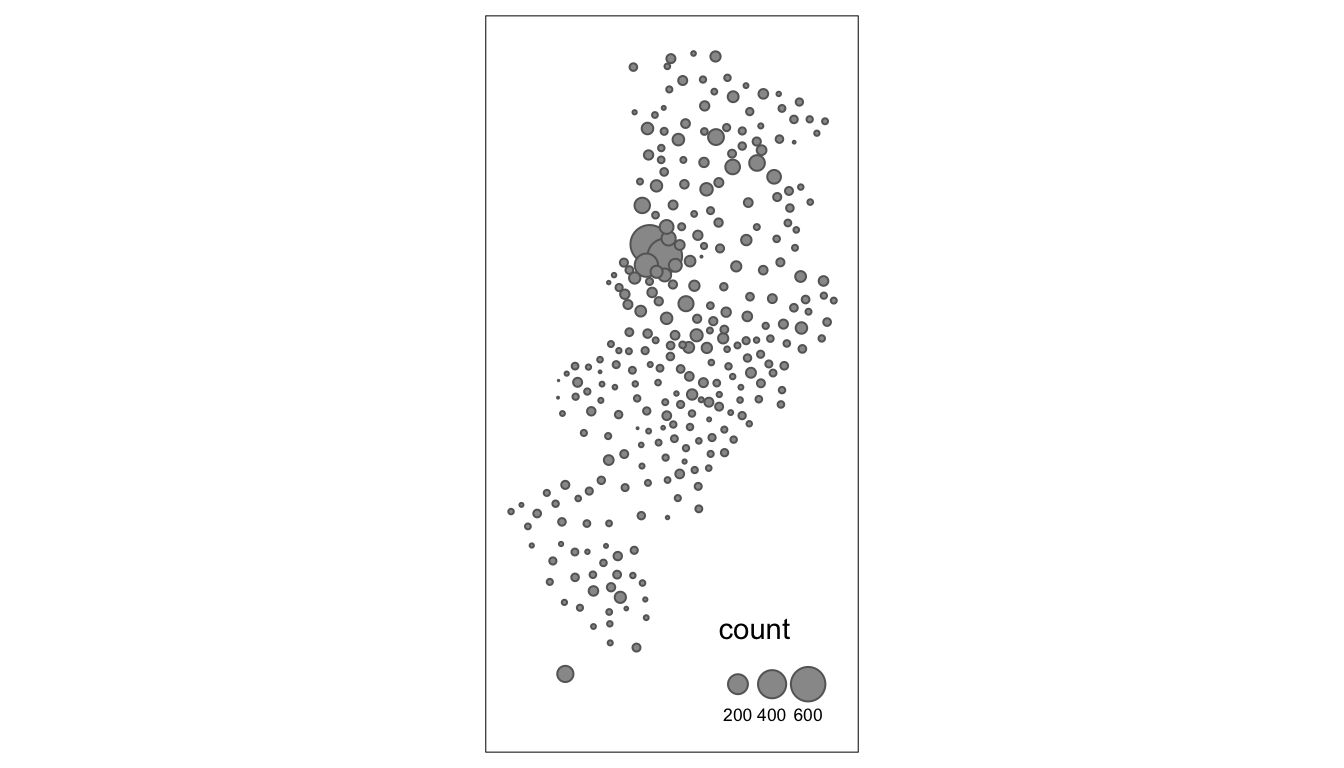
FIGURE 4.1: Bubble map of crime in each LSOA in Manchester
In the map prodiced, each bubble represents the number of crimes in each LSOA within the city of Manchester. We can add the borders of the census areas for better representation. The border.lwd argument set to NA in the tm_bubbles() is asking R not to draw a border to the circles. Whereas tm_borders() brings back a layer with the borders of the polygons representing the different LSOAs in Manchester city. Notice how we are modifying the transparency of the borders with the alpha parameter. In addition, we are adding a tm_layout() function that makes explicit where and how we want the legend.
#use tm_shape function to specify spatial object
tm_shape(manchester) +
#use tm_bubbles to add the bubble visualisation,
# but set the 'border.lwd' parameter to NA,
# meaning no symbol borders are drawn
tm_bubbles("count", border.lwd=NA) +
#add the LSOA border outlines using tm_borders,
# but set their transparency using the alpha parameter
# (0 is totally transparent, 1 is not at all)
tm_borders(alpha=0.1) +
#use tm_layout to make the legend look nice
tm_layout(legend.position = c("right", "bottom"),
legend.title.size = 0.8, legend.text.size = 0.5)## The legend is too narrow to place all symbol sizes.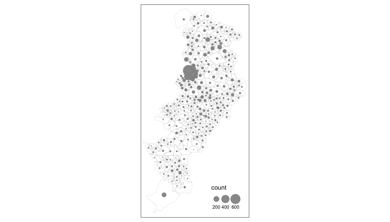
FIGURE 4.2: Bubble map with aesthetic settings
There are several arguments that you can pass within the tm_bubble() function that control the appearance of the symbols. The scale argument controls the symbol size multiplier number. Larger values will represent the largest bubble as larger. You can experiment with the value you find more appropriate. Another helpful parameter in tm_bubble() is alpha, which you can use to make the symbols more or less transparent as a possible way to deal with situations where you may have a significant degree of overlapping between the symbols. You can play around with this and modify the code we provide above with different values for these two arguments.
By default, the symbol area sizes are scaled proportionally to the data variable you are using. As noted above this is done by taking the square root of the normalized data variable. This is called mathematical scaling. However, “it is well known that the perceived area of proportional symbols does not match their mathematical area; rather, we are inclined to underestimate the area of larger symbols. As a solution to this problem, it is reasonable to modify the area of larger circles in order to match it with the perceived area.” (Tanimura, Kuroiwa, and Mizota 2006) The perceptual = TRUE option allows you to use a method that aims to compensate for how the default approach may underestimate the area of the larger symbols. Notice the difference between the map we produced and this new one.
tm_shape(manchester) +
tm_bubbles("count", border.lwd=NA, perceptual = TRUE) + # add perceptual = TRUE
tm_borders(alpha=0.1) +
tm_layout(legend.position = c("right", "bottom"),
legend.title.size = 0.8, legend.text.size = 0.5)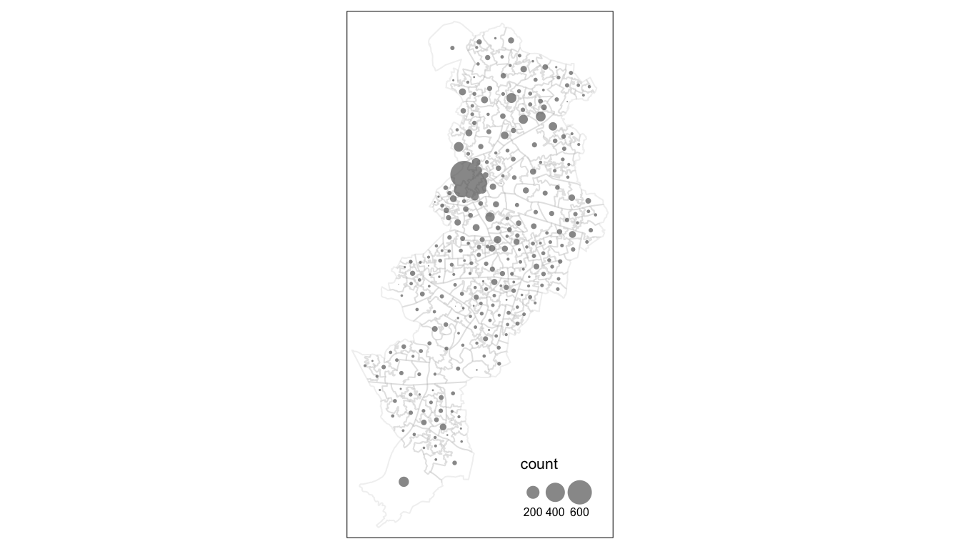
FIGURE 4.3: Bubble map with perceptual parameter set to TRUE
We can see that we get much larger bubbles in the City Centre region of Manchester local authority. There is a chance that this is due to greater number of people present in this area. Unless we control for this, by mapping rates, we may not be able to meaningfully tell the difference…!
4.4 Mapping rates rather than counts
4.4.1 Generating the rates
We have now seen the importance of mapping rates rather than counts of things, and that is for the simple reason that population is not equally distributed in space. That means that if we do not account for how many people are somewhere, we end up mapping population size rather than our topic of interest.
The manchester object we are working with has a column named respop that includes the residential population in each of the LSOA areas. These areas for the whole of the UK have an average population of around 1500 people. We can see a similar picture for Manchester city, with an average closer to 1700 here.
hist(manchester$respop, main = "Distribution of residential population across LSOAs")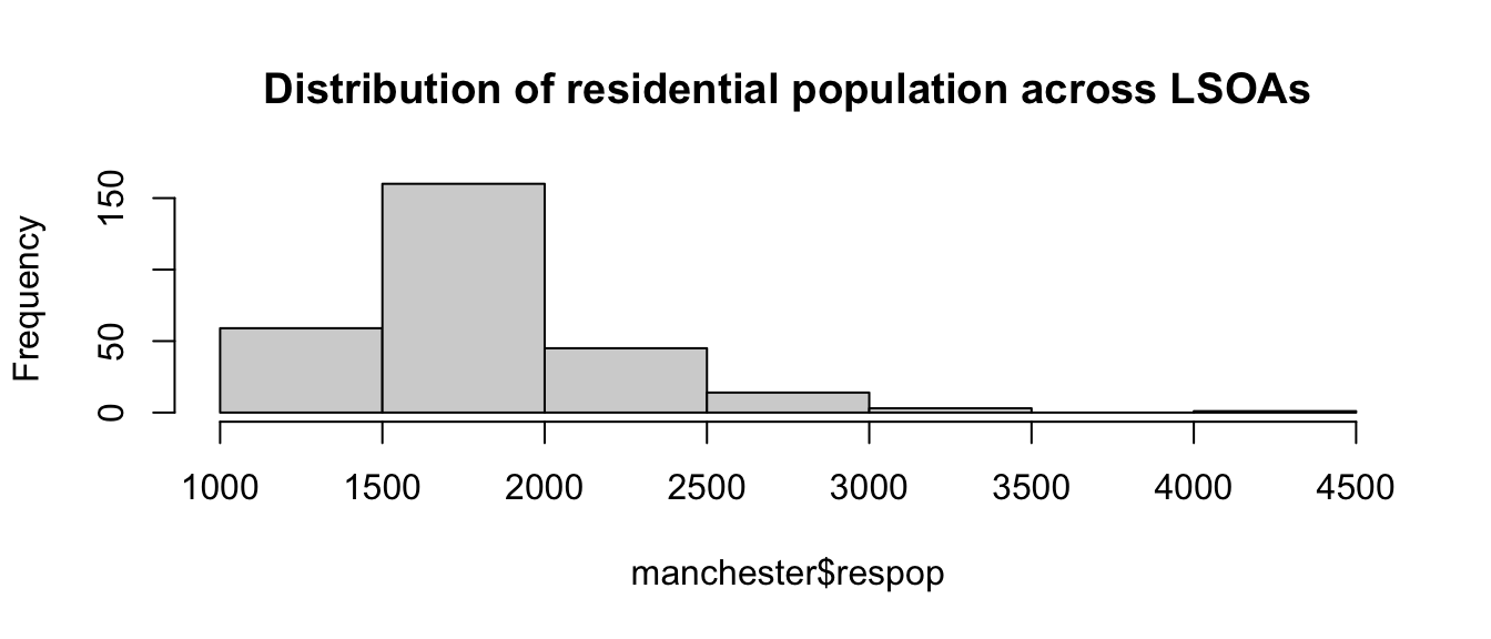
FIGURE 4.4: Histogram of respop variable
We also have a variable wkdpop that represents the workday population. This variable re-distributes the usually resident population to their places of work, while those not in work are recorded at their usual residence. The picture it offers is much more diverse than the previous variable and in some ways is closer to the notion of an “ambient population” (with some caveats: for example it does not capture tourists, people visiting a place to shop or to entertain themselves in the night time economy, etc.).
hist(manchester$wkdpop, main = "Distribution of workday population across LSOAs")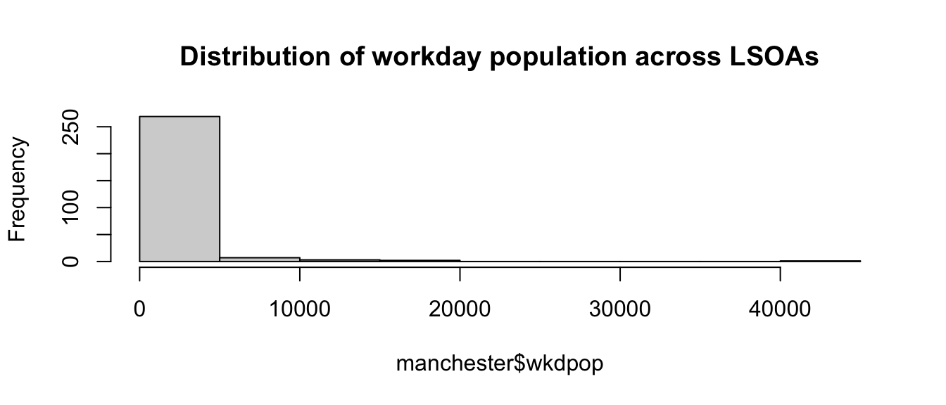
FIGURE 4.5: Histogram of wkdpop variable
The distribution of the workday population is much more skewed than the residential population, with most LSOAs having only 5,000 or fewer workday population, but the busiest LSOAs attracting over 40,000 people during the working day. This gives an idea of the relevance of the “denominator dilemma” we mentioned earlier. In this section we will create rates of crime using both variables in the denominator to observe how the emerging picture varies.
First we need to create new variables. For this we can use the mutate() function from the dplyr package. This is a very helpful function to create new variables in a dataframe based on transformations or mathematical operations performed on other variables within the dataframe. In this function, the first argument is the name of the data frame, and then we can pass as arguments all new variables we want to create as well as the instructions as to how we are creating those variables.
First we want to create a rate using the usual residents, since crime rates are often expressed by 100,000 inhabitants we will multiply the division of the number of crimes by the number of usual residents by 100,000. We will then create another variable, crimr2, using the workday population as the denominator. We will store this new variables in our existing manchester dataset. You can see that below we then specify the name of a new variable crimr1 and then tell the function we want that variable to equal (for each case) the ratio of the values in the variable count (number of crimes) by the variable respop (number of people residing in the area). We then multiply the result of this division by 100,000 to obtain a rate expressed in those terms. We can do likewise for the alternative measure of crime.
manchester <- mutate(manchester,
crimr1 = (count/respop)*100000, # crime per residential population
crimr2 = (count/wkdpop)*100000) # crime per workday populationAnd now we have two new variables, one for crime rate with residential population as a denominator, and another with workplace population as a denominator.
4.4.2 Creating a choropleth map with tmap
The structure of the grammar for producing a choropleth map is similar to what we use for proportional symbols. First we identify the object with tm_shape() and then we use a geometry to be represented. We will be using the tm_polygons() passing as an argument the name of the variable with our crime rate.
tm_shape(manchester) +
tm_polygons("crimr1")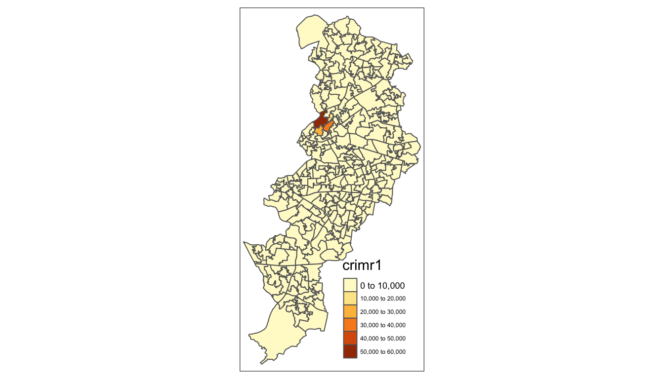
FIGURE 4.6: Crime rate per residential population
We have used tm_polygons() but we can also add the elements of a polygon map using different functions that break down what we represent here. In the map above you see the polygons have a dual representation, the borders are represented by lines and the colour is mapped to the intensity of the quantitative variable we are displaying. With darker colours representing more of the variable, the areas with more crimes.
Instead of using tm_polygon() we can use the related functions tm_fill(), for the colour inside the polygons, and tm_borders(), for the aesthetics representing the border of the polygons. Say we find the borders distracting and we want to set them to be transparent. In that case we could just use tm_fill().
tm_shape(manchester) +
tm_fill("crimr1")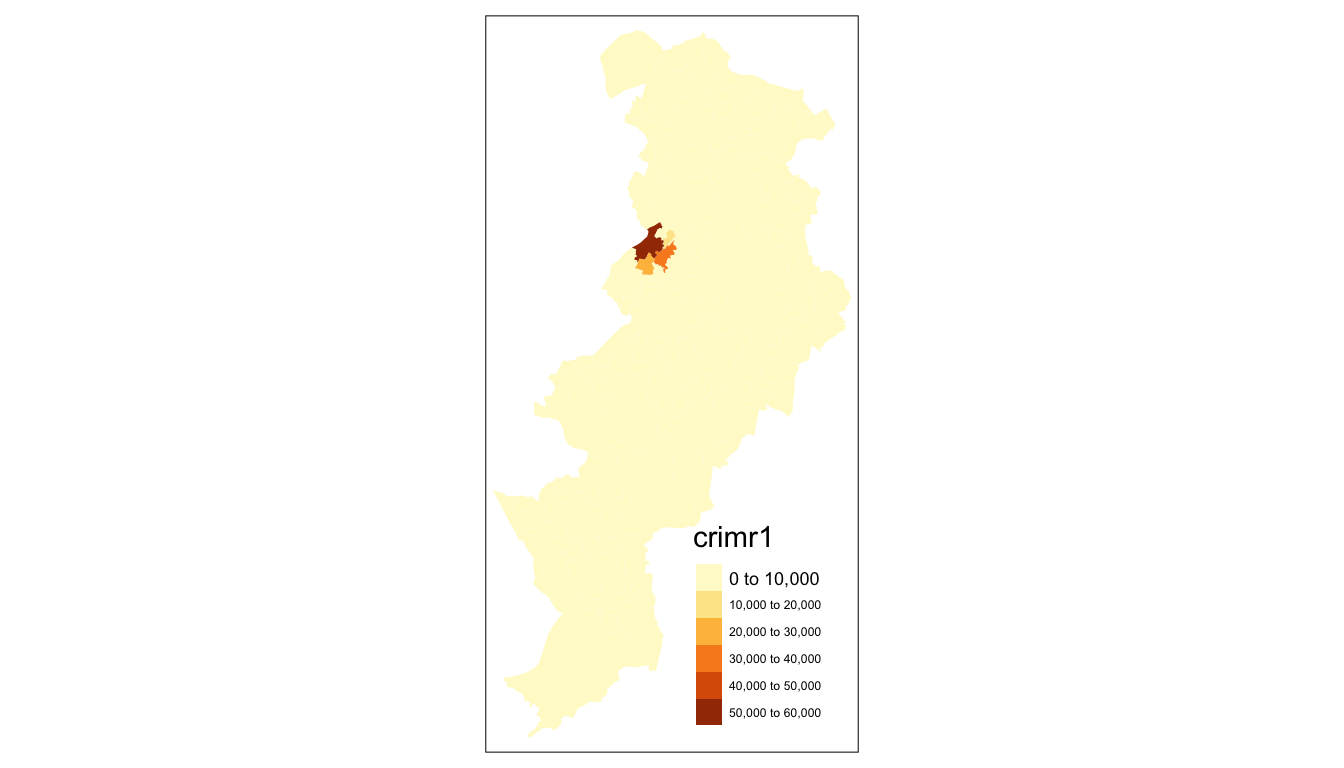
FIGURE 4.7: Crime rate per residential population mapped with tm_fill() function
As you can see here, the look is a bit cleaner. However, we don’t need to get rid of the borders completely. Perhaps we want to make them a bit more translucent. We could do that by adding the border element but making the drawing of the borders less pronounced.
tm_shape(manchester) +
tm_fill("crimr1") +
tm_borders(alpha = 0.1)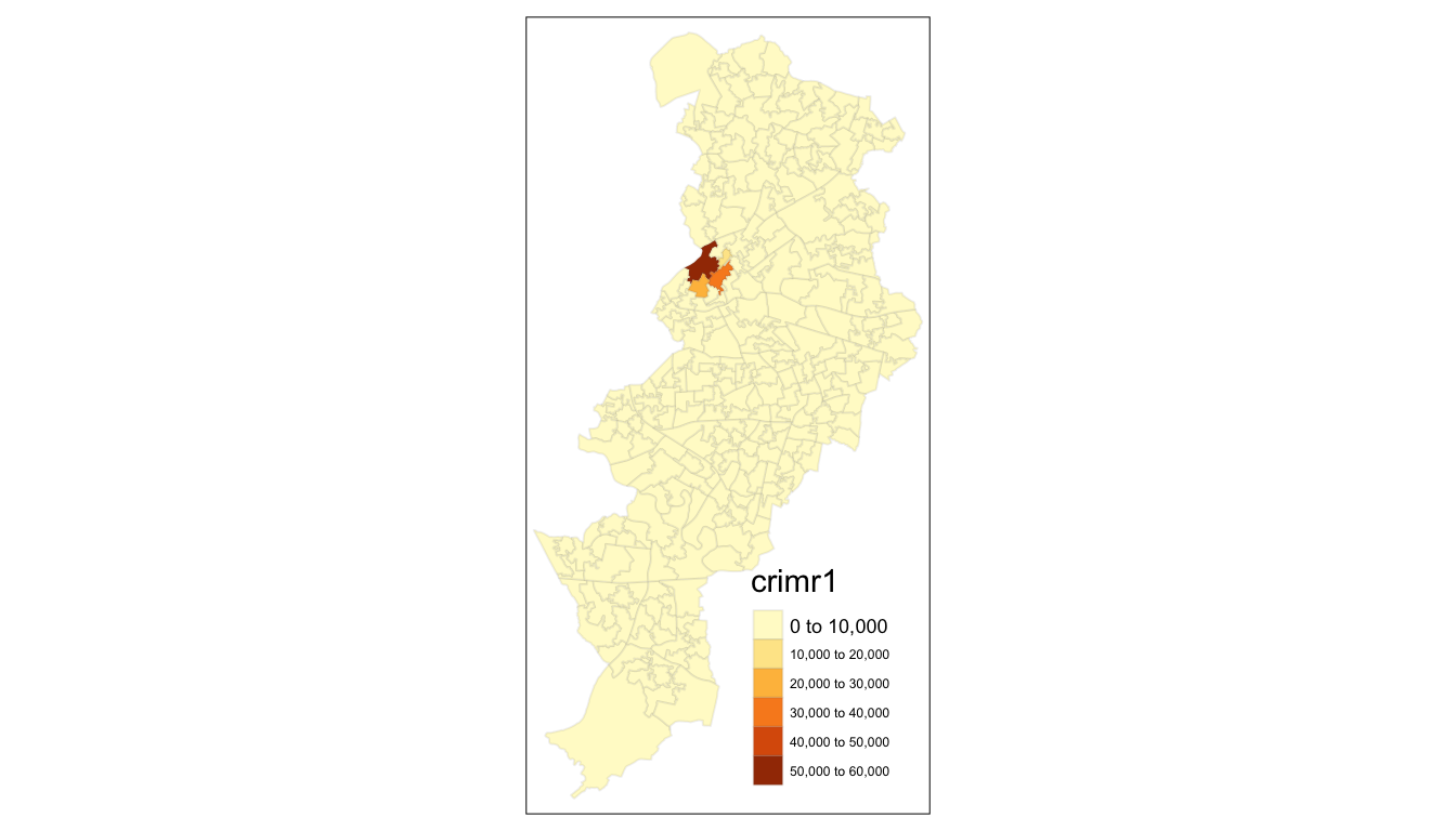
FIGURE 4.8: Crime rate per residential population mapped with tm_fill() and borders
The alpha parameter that we are inserting within tm_borders() controls the transparency of the borders, we can go from 0 (totally transparent) to 1 (not transparent). You can play around with this value and see the results.
Notice as well that the legend in this map is not very informative and could be improved in terms of aesthetics. We can add a title within the tm_fill to clarify what “crimr1” means, and we can use the tm_layout() function to control the appearance of the legend. This later function, tm_layout(), allows you to think about many of the more general cosmetics of the map.
tm_shape(manchester) +
tm_fill("crimr1", title = "Crime per 100,000 residents") +
tm_borders(alpha = 0.1) +
tm_layout(main.title = "Crime in Manchester City, Nov/2017",
main.title.size = 0.7 ,
legend.outside = TRUE, # Place legend outside of map
legend.title.size = 0.8)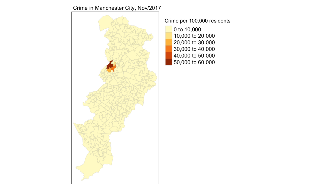
FIGURE 4.9: Crime rate per residential population mapped with aesthetics considered
We can also change the style of the maps we produce, for example by making them more friendly to colour blind people. We can use the tmap_style() function to do so. Once you set the style of the subsequent maps in your session will stick to this stil. If you want to reverse to a different style when using tmap you need to do so explicitly.
current_style <- tmap_style("col_blind")See how the map changes.
tm_shape(manchester) +
tm_fill("crimr1", title = "Crime per 100,000 residents") +
tm_borders(alpha = 0.1) +
tm_layout(main.title = "Crime in Manchester City, Nov/2017",
main.title.size = 0.7 ,
legend.outside = TRUE, # Takes the legend outside the main map
legend.title.size = 0.8,
)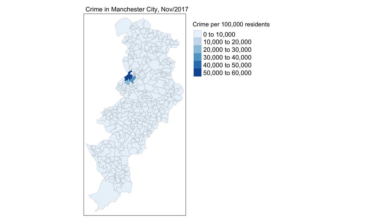
FIGURE 4.10: Crime rate per residential population with col_blind style
We will discuss more about map aesthetics in Chapter 5. For now, let’s talk about another important decision when it comes to thematic maps, the choice of classification system.
4.5 Classification systems for thematic maps
In thematic mapping, you have to make some key decisions, the most important one being how to display your data. When mapping a quantitative variable, we often have to “bin” this variable into groups. For example in the map we made below, the default binning applied was to display LSOAs grouped into those with a number of 0 to 10,000 crimes per 100,000 residents, then from 10,000 to 20,000, and so on. But why these? How were these groupings decided upon?
The quantitative information is usually classified before its symbolization in a thematic map. Theoretically, accurate classes that best reflect the distributional character of the data set can be calculated. There are different ways of breaking down your data into classes. We will discuss each in turn here.
The equal interval (or equal step) classification method divides the range of attribute values into equally sized classes. What this means is that the values are divided into equal groups. Equal interval data classification subtracts the maximum value from minimum value in your plotted variable and then divides this by the number of classes to get the size of the intervals. This approach is best for continuous data. The range of the classes is structured so that it covers the same number of values in the plotted variable. With highly skewed variables this plotting method will focus our attention in areas with extreme values. When mapping crime it will create the impression that everywhere is safe, save a few locations. The graphic below shows five classes and the function shows the locations (represented by points) that fall within each class.
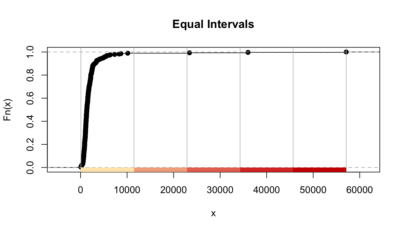
FIGURE 4.11: Results for equal intervals classification
The quantile map bin the same count of features (areas) into each of its classes. This classification method places equal numbers of observations into each class. So, if you have five classes you will have 20 percent of the areas within each class. This method is best for data that is evenly distributed across its range. Here, given that our variable is highly skewed, notice how the top class includes areas with fairly different levels of crime, even if it does a better job at separating areas at the lower end of the crime rate continuum. Several authors consider that quantile maps are inappropriate to represent the skewed distributions of crime (Harries 1999).
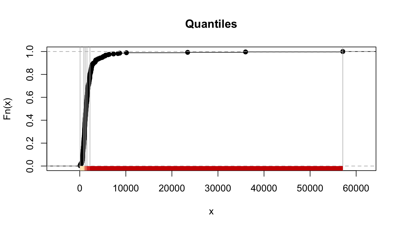
FIGURE 4.12: Results for quantiles classification
The natural breaks (or Jenks) classification method utilizes an algorithm to group values in classes that are separated by distinct break points. It is an optimisation method which takes an iterative approach to its groupings to achieve least variation within each class. Cartographers recommend to use this method with data that is unevenly distributed but not skewed toward either end of the distribution.

FIGURE 4.13: Results for Jenks classification
The standard deviation map uses the standard deviation (standardised measure of observations’ deviation from the mean) to bin the observations into classes. This classification method forms each class by adding and subtracting the standard deviation from the mean of the dataset. It is best suited to be used with data that conforms to a normal distribution.
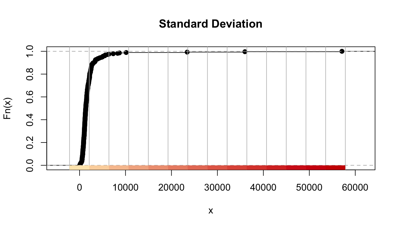
FIGURE 4.14: Results for standard deviation classification
The headtails method This uses a method proposed by Jiang (2013) as a solution for variables with a heavy tail distribution, like we often have with crime. “This new classification scheme partitions all of the data values around the mean into two parts and continues the process iteratively for the values (above the mean) in the head until the head part values are no longer heavy-tailed distributed. Thus, the number of classes and the class intervals are both naturally determined.” (Jiang 2013, 482)
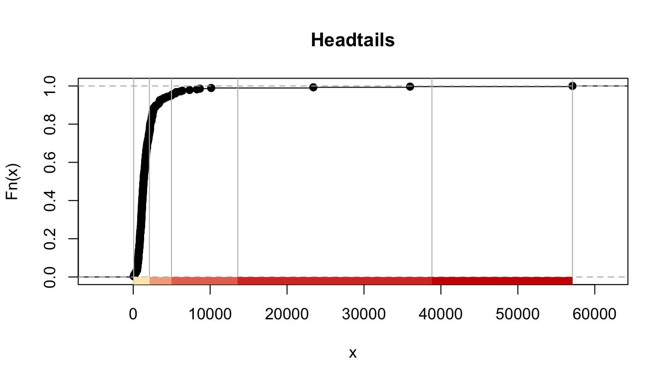
FIGURE 4.15: Results for headtails classification
Not only do you need to choose the classification method, you also need to decide on the number of classes. This is critical. The convention in cartography is to choose between 5 to 7 classes, although some authors would say 5 to 6 (Field 2018). Less than five and you loose detail, more than 6 or 7 and the audience looking at your map starts to have problems to perceive the differences in the symbology and to understand the spatial pattern displayed.
If you want to lie with a map, it would be very easy by using a data classification scheme that conveys the message that you want to get across. It is, thus, important that your decisions are based on good practice and are impartial.
For comparing the effects of using different methods we can use small multiples. Small multiples is simply a way of reproducing side by sides similar maps for comparative purposes. To be more precise small multiples are sets of charts of the same type, with the same scale, presented together at a small size and with minimal detail, usually in a grid of some kind. The term was popularized by Edward Tufte, appearing first in his Visual Display of Quantitative Information in 1983 (Tufte 2001).
There are different ways of creating small multiples with tmap as you could see in the vignettes for the package, some of which are quicker but a bit more restricted. Here we are going to use tmap_arrange(). With tmap_arrange() first we need to create the maps we want and then we arrange them together.
Let’s make five maps, each one using a different classification method: Equal interval, Quantile, Natural breaks (Jenks), Standard Deviation, and Headtails. For each map, instead of visualising them one by one, just assign them to a new object. Let’s call them map1, map2, map3, map4, map5. So let’s make map1. This will create a thematic map using equal intervals.
map1 <- tm_shape(manchester) +
#Use tm_fill to specify variable, classification method,
# and give the map a title
tm_fill("crimr1", style="equal", title = "Equal") +
tm_layout(legend.position = c("left", "top"),
legend.title.size = 0.7, legend.text.size = 0.5)Now create map2, with the jenks method often preferred by geographers.
map2 <- tm_shape(manchester) +
tm_fill("crimr1", style="jenks", title = "Jenks") +
tm_layout(legend.position = c("left", "top"),
legend.title.size = 0.7, legend.text.size = 0.5)Now create map3, with the quantile method often preferred by epidemiologists.
map3 <- tm_shape(manchester) +
tm_fill("crimr1", style="quantile", title = "Quantile") +
tm_layout(legend.position = c("left", "top"),
legend.title.size = 0.7, legend.text.size = 0.5)Let´s make map4, standard deviation map, which maps the values of our variable to distance to the mean value.
map4 <- tm_shape(manchester) +
tm_fill("crimr1", style="sd", title = "Standard Deviation") +
tm_layout(legend.position = c("left", "top"),
legend.title.size = 0.7, legend.text.size = 0.5)And finally let’s make map5, which is handy with skewed distributions.
map5 <- tm_shape(manchester) +
tm_fill("crimr1", style="headtails", title = "Headtails") +
tm_layout(legend.position = c("left", "top"),
legend.title.size = 0.7, legend.text.size = 0.5)Notice that we are not plotting the maps, we are storing them into R objects (map1 to map5). This way they are saved, and you can call them later, which is what we need in order to plot them together using the tmap_arrange() function. So if you wanted to map just map3 for example, all you need to do, is call the map3 object. Like so:
map3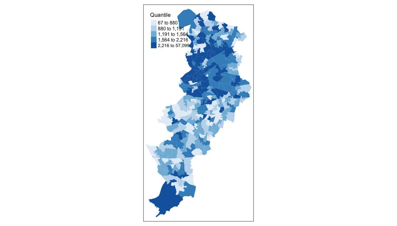
FIGURE 4.16: Quantile classification of crime in Manchester
But now we will plot all 5 maps together, arranged using the tmap_arrange() function. Like so:
# deploy tmap_arrange to plot these maps together
tmap_arrange(map1, map2, map3, map4, map5) 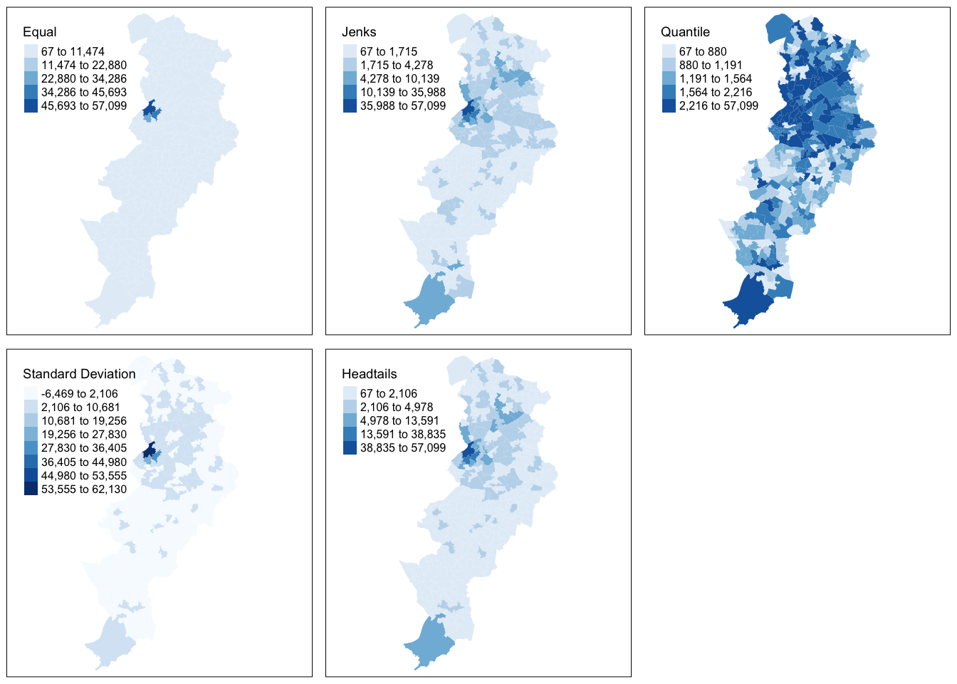
FIGURE 4.17: Compare maps using the different classifications of crime in Manchester
As we can see using data-driven, natural breaks (as the Jenks or Headtails method do, in different ways) to classify data is useful when mapping data values that are not evenly distributed, since it places value clusters in the same class. The disadvantage of using this approach is that it is often difficult to make comparisons between maps (for example of different crimes or for different time periods) since the classification scheme used is unique to each data set.
There are some other classification methods built into tmap which you can experiment with if you’d like. Your discrete gradient options are “cat”, “fixed”, “sd”, “equal”, “pretty”, “quantile”, “kmeans”, “hclust”, “bclust”, “fisher”, “jenks”, “dpih”, “headtails”, and “log10_pretty”. A numeric variable is processed as a categorical variable when using “cat”, i.e. each unique value will correspond to a distinct category.
Taken from the help file we can find more information about these, for example the “kmeans” style uses kmeans clustering technique (a form of unsupervised statistical learning) to generate the breaks. The “hclust” style uses hclust to generate the breaks using hierarchical clustering and the “bclust” style uses bclust to generate the breaks using bagged clustering. These approaches are outisde the scope of what we cover, but just keep in mind that there are many different ways to classify your data, and you must think carefully about the choice you make, as it may affect your readers’ conclusions from your map.
Imagine you were a consultant working for one of the political parties in the city of Manchester. Which map would you choose to represent to the electorate the situation of crime in the city if you were the party in control of the local government and which map you would choose if you were working for the opposition? As noted above, it is very easy to mislead with maps and, thus, this means the professional map maker has to abide by strict deontological criteria and take well justified impartial decisions when visualising data.
Cameron (2005) suggests the following:
“To know which classification scheme to use, an analyst needs to know how the data are distributed and the mapping objective. If the data are unevenly distributed, with large jumps in values or extreme outliers, and the analyst wants to emphasize clusters of observations that house similar values, use the natural breaks classification approach. If the data are evenly distributed and the analyst wants to emphasize the percentage of observations in a given classification category or group of categories, use the quantile classification approach. If the data are normally distributed and the analyst wants to represent the density of observations around the mean, use the equal interval approach. If the data are skewed and the analyst wants to identify extreme outliers or clusters of very high or low values, use the standard deviation classification approach.”
No matter the choice you make, be sure to be explicit about why you made it, and the possible implications it has for your maps.
4.6 Interactive mapping with tmap
So far we have been producing static maps with tmap. But this package also allows for interactive mapping by linking with leaflet. To change whether the plotted maps are static or interactive we need to use the tmap_mode() function. The default is tmap_mode("plot"), which corresponds to static maps. If we want to change to interactive display we need to change the argument we pass to tmap_mode("view").
tmap_mode("view")## tmap mode set to interactive viewingWhen you use tmap, R will remember the mode you want to use. So once you specify tmap_mode("view"), all the subsequent maps will be interactive. It is only when you want to change this behaviour that you would need another tmap_mode() call. When using the interactive view we can also add a basemap with the tm_basemap() function and passing as an argument a particular source for the basemap. Here we specify OpenStreetMap, but there are many other choices.
Let’s explore the distribution of the two alternative definitions of crime rates in an interactive way.
tm_shape(manchester) +
tm_fill("crimr1", style="jenks", palette= "Reds",
title = "Crime per residential pop", alpha = 0.6) +
tm_basemap(leaflet::providers$OpenStreetMap)If you are following along, you can now scroll down to see that the crime rate is highest in the city centre of Manchester, but there are also pockets of high level of the crime rate in the North East of the city, Harpurhey and Moston (areas of high levels of deprivation) and in the LSOA farthest to the South (where the international airport is located).
How does this change if we use the crime rate that uses the workday population?
tm_shape(manchester) +
tm_fill("crimr2", style="jenks", palette= "Oranges",
title = "Crime per workday pop", alpha = 0.8,) +
tm_basemap(leaflet::providers$OpenStreetMap)Things look different, don’t they? For starters look at the values in the labels for the various classes. They are much less extreme. One of the reasons why we see such extreme rates in the first map is linked to the very large discrepancy between the residential population and the workday population in some parts of Manchester, like the international airport and the city centre (that attract very large volume of visitors, but have few residents). The LSOA with the highest crime rate (when using the residential population as the denominator) is E01033658. We can filter to find the number of crimes (in the count variable) that took place here.
manchester %>% filter(code=="E01033658") %>% select(code, count, respop, wkdpop)| code | count | respop | wkdpop |
|---|---|---|---|
| E01033658 | 744 | 1303 | 42253 |
We can see in this area there were 744 crime incidents for a residential population of 1303, but the workday population is as high as 4.2253^{4} people. So, of course, using these different denominators is bound to have an impact in the resulting rate. As noted earlier, the most appropriate denominator represents some measure of the population at risk.
Once again, we can rely on some advice from Cameron (2005):
“In the final analysis, although choropleth maps are very useful for visualizing spatial distributions, using them for hot spot analyses of crime has certain disadvantages. First, attention is often focused on the relative size of an area, so large areas tend to dominate the map. Second, choropleth maps involve the aggregation of data within statistical or administrative areas that may not correspond to the actual underlying spatial distribution of the data.”
4.7 Smoothing rates: adjusting for small sample noise
In previous sections we discussed how to map rates. It seems a fairly straightforward issue, you calculate a rate by dividing your numerator (e.g: number of crimes) by an appropriately selected denominator (e.g: daytime population). You get your variable with the relevant rate and you map it using a choropleth map. However, things are not always that simple.
Rates are funny animals. Gelman and Price (1999) goes so far as to suggest that all maps of rates are misleading. The problem at hand is well known in spatial epidemiology: “plotting observed rates can have serious drawbacks when sample sizes vary by area, since very high (and low) observed rates are found disproportionately in poorly-sampled areas” (Gelman and Price 1999, 3221). There is associated noise for those areas where the denominators give us a small sample size. And it is hard to solve this problem.
Let’s illustrate with an example. We are going to use historic data on homicide across US counties. The dataset was used as the basis for the study by Baller et al. (2001). It contains data on homicide counts and rates for various decades across the US as well as information on structural factors often thought to be associated with violence. The data is freely available through the webpage of Geoda, a clever point-and-click interface developed by Luc Anselin (a spatial econometrician and coauthor of the above paper) and his team, to make spatial analysis accessible. It is also available as one of the datasets in the geodaData package.
To read a data available in a library we have loaded we can use the data() function. If we check the class() of this object we will see it was already stored in geodaData as a sf object.
data("ncovr")
class(ncovr)## [1] "sf" "data.frame"Let’s look at the “ncvor” data. We can start by looking at the homicide rate for 1960.
summary(ncovr$HR60)## Min. 1st Qu. Median Mean 3rd Qu. Max.
## 0.00 0.00 2.78 4.50 6.89 92.94We can see that the county with the highest homicide rate in the 1960s had a rate of 92.9368 homicides per 100,000 individuals. That is very high. Just to put it into context in the UK, homicide rate is about 0.92 per 100,000 individuals. Where is that place? I can tell you is a place called Borden. Check it out:
borden <- filter(ncovr, NAME == "Borden")## old-style crs object detected; please recreate object with a recent sf::st_crs()borden$HR60## [1] 92.94Borden county is in Texas. You may be thinking… “Texas Chainsaw Massacre” perhaps? No, not really. Ed Gein, who inspired the film, was based and operated in Wisconsin. Borden’s claim to fame is rather more prosaic: it was named after Gail Borden, the inventor of condensed milk. So, what’s going on here? Why do we have a homicide rate in Borden that makes it look like a war zone? Is it that it is only one of the six counties where alcohol is banned in Texas?
To get to the bottom of this, we can look at the variable HC60 which tells us about the homicide count in Borden:
borden$HC60## [1] 1What? A total homicide count of 1. How can a county with just one homicide have a rate that makes it look like the most dangerous place in the US? To answer this, let’s look at the population of Borden county in the 1960s, contained in the PO60 variable.
borden$PO60## [1] 1076Well, there were about 1076 people living there. It is among some of the least populous counties in our data:
summary(ncovr$PO60)## Min. 1st Qu. Median Mean 3rd Qu. Max.
## 208 9417 18408 57845 39165 7781984If you contrast that population count with the population of the average county in the US, that’s tiny. One homicide in such a small place can end up producing a big rate. Remember that the rate is simply dividing the number of relevant events by the exposure variable (in this case population) and multiplying by a constant (in this case 100,000 since we expressed crime rates in those terms). Most times Borden looks like a very peaceful place:
borden$HR70## [1] 0borden$HR80## [1] 0borden$HR90## [1] 0It has a homicide rate of 0 in most decades. But it only takes one homicide and, bang, it goes top of the league. So a standard map of rates is bound to be noisy. There is the instability that is introduced by virtue of having areas that may be sparsely populated and in which one single event, like in this case, will produce a very noticeable change in the rate.
In fact, if you look at the counties with the highest homicide rate in the “ncovr” dataset you will notice all of them are places like Borden, areas that are sparsely populated, not because they are that dangerous, but because of the instability of rates. Conversely the same happens with those places with the lowest rate. They tend to be areas with a very small sample size.
This is a problem that was first noted by epidemiologists doing disease mapping. But a number of other disciplines have now noted this and used some of the approaches developed by public health researchers that confronted this problem when producing maps of disease (aside: techniques and approaches used by spatial epidemiologists are very similar to those used by criminologists -in case you ever think of changing careers or need inspiration for how to solve a crime analysis problem).
One way of dealing with this is by smoothing or shrinking the rates. This basically as the word implies aims for a smoother representation that avoids hard spikes associated with random noise. There are different ways of doing that. Some ways use a non-spatial approach to smoothing, using something called a empirical bayesian smoother. How does this work? This approach takes the raw rates and tries to “shrink” them towards the overall average. What does this mean? Essentially, we compute a weighted average between the raw rate for each area and the global average across all areas, with weights proportional to the underlying population at risk. What this procedure does is to have the rates of smaller areas (those with a small population at risk) to have their rates adjusted considerably (brought closer to the global average), whereas the rates for the larger areas will barely change.
Here we are going to introduce the approach implemented in DCluster, a package developed for epidemiological research and detection of clusters of disease. Specifically we can implement the empbaysmooth() function which creates a smooth relative risks from a set of expected and observed number of cases using a Poisson-Gamma model as proposed by Clayton and Kaldor (1987). The function empbaysmooth() expects two parameters, the expected value and the observed value. Let´s defined them first.
#First we define the observed number of cases
ncovr$observed <- ncovr$HC60
#To compute the expected number of cases through indirect standardisation
#we need the overall incidence ratio
overall_incidence_ratio <- sum(ncovr$HC60)/sum(ncovr$PO60)
#The expected number of cases can then be obtained by multiplying the overall
#incidence rate by the population
ncovr$expected <- ncovr$PO60 * overall_incidence_ratioWith this parameters we can obtain the raw relative risk:
ncovr$raw_risk <- ncovr$observed / ncovr$expected
summary(ncovr$raw_risk)## Min. 1st Qu. Median Mean 3rd Qu. Max.
## 0.000 0.000 0.614 0.994 1.520 20.510And then estimate the smoothed relative risk:
res <- empbaysmooth(ncovr$observed, ncovr$expected)In the new object we generated, which is a list, you have an element which contains the computed rates. We can add those to our dataset:
ncovr$H60EBS <- res$smthrr
summary(ncovr$H60EBS)## Min. 1st Qu. Median Mean 3rd Qu. Max.
## 0.234 0.870 0.936 0.968 1.035 2.787We can observe that the dispersion narrows significantly and that there are fewer observations with extreme values once we use this smoother.
Instead of shrinking to the global relative risk, we can shrink to a relative rate based on the neighbours of each county. Shrinking to the global risk ignores the spatial dimension of the phenomenon being mapped out and may mask existing heterogeneity. If instead of shrinking to a global risk, we shrink to a local rate, we may be able to take unobserved heterogeneity into account. Marshall (1991) proposed a local smoother estimator in which the crude rate is shrunk towards a local, “neighbourhood”, rate. To compute this we need the list of neighbours that surround each county (we will discuss this code in the Chapter on Spatial Dependence, so for now just trust us we are computing the rate of the areas that surround each country):
ncovr_sp <- as(ncovr, "Spatial")## old-style crs object detected; please recreate object with a recent sf::st_crs()
## old-style crs object detected; please recreate object with a recent sf::st_crs()w_nb <- poly2nb(ncovr_sp, row.names=ncovr_sp$FIPSNO)
eb2 <- EBlocal(ncovr$HC60, ncovr$PO60, w_nb)
ncovr$HR60EBSL <- eb2$est * 100000We can now plot the maps and compare them:
tmap_mode("plot")
current_style <- tmap_style("col_blind")
map1<- tm_shape(ncovr) +
tm_fill("HR60", style="quantile",
title = "Raw rate",
palette = "Reds") +
tm_layout(legend.position = c("left", "bottom"),
legend.title.size = 0.8, legend.text.size = 0.5)
map2<- tm_shape(ncovr) +
tm_fill("HR60EBSL", style="quantile",
title = "Local Smooth",
palette = "Reds") +
tm_layout(legend.position = c("left", "bottom"),
legend.title.size = 0.8, legend.text.size = 0.5)
tmap_arrange(map1, map2) 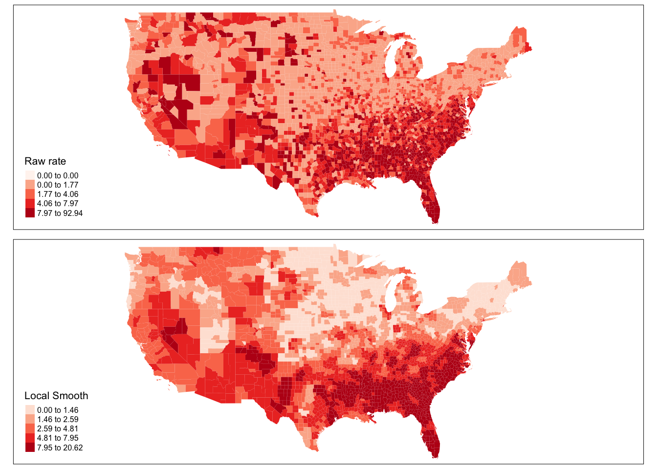
FIGURE 4.18: Compare raw and smoothed rates across counties in the USA
Notice that the quantiles are not the same, so that will make your comparison difficult. Let´s look at a boxplot of these variables. In the map of raw rates we have the most variation.
#Boxplots with base R graphics
boxplot(ncovr$HR60, ncovr$HR60EBSL,
main = "Different rates of homicide per 100,000 people",
names = c("Raw rate",
"Local base smoother"),
ylab = "Rates")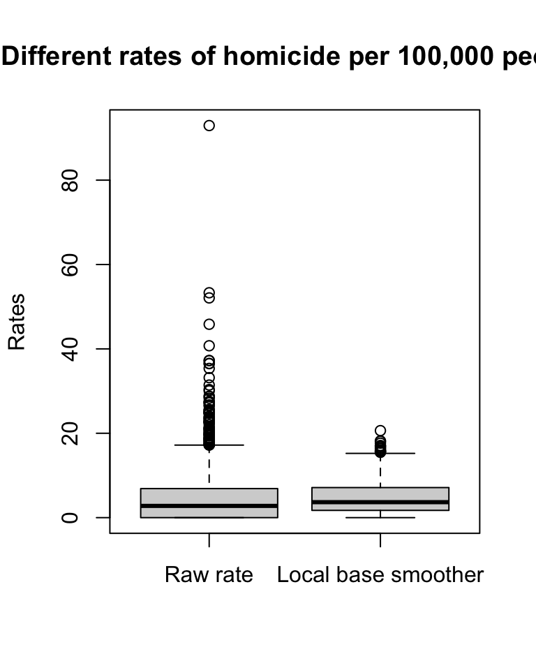
FIGURE 4.19: Boxplots to compare variation in rates
The range for the raw rates is nearly 93. Much of the variation in observed homicide rates by county is attributable to statistical noise due to the small number of (observed and expected) homicides in low-population counties. Because of this noise, a disproportionate fraction of low-population counties are observed to have extremely high (or low) homicide rates when compared to typical counties in the United States. With smoothing we reduce this problem and if you contrast the maps you will see how this results in a clearer and smoother spatial pattern for the rate that is estimated borrowing information from their neighbours.
So to smooth or not too smooth? Clearly we can see how smoothing stabilises the rates and removes noise. But as Gelman and Price (1999) suggests this introduces other artifacts and autocorrelation into our estimates. Some people are also not too keen on maps of statistically adjusted estimates. Yet, the conclusions one can derive from mapping raw rates (when the denominator varies significantly and we have areas with small sample size) means that smoothing is often a preferable alternative (Waller and Gotway 2004). The problem we have with maps of estimates is that we need information about the variability and it is hard to map this out in a convenient way (Gelman and Price 1999). Lawson (2021b), in relation to the similar problem of disease mapping, suggests that “at the minimum any map of relative risk for a disease should be accompanied with information pertaining to estimates of rates within each region as well as estimates of variability within each region” (p. 38) whereas “at the other extreme it could be recommended that such maps be only used as a presentational aid, and not as a fundamental decision-making tool” (p. 38).
4.8 Summary and further reading
This chapter introduced some basic principles of thematic maps. We learned how to make them using the tmap package, we learned about the importance of classification schemes, and how each one may produce a different looking map, which may tell a different story. For further reading, Brewer (2006) provides a brief condensed introduction to thematic mapping for epidemiologists but that can be generally extrapolated for crime mapping purposes. We have talked about the potential to develop misleading maps and Monmonier (1996) “How to lie with maps” provides good guidance to avoid that our negligent choices when producing a map confuse the readers. Carr and Pickle (2010) offers a more detailed treatment of small multiples and micromaps.
Aside from the issues we discussed around the computation and mapping of rates there is a growing literature that is identifying the problem of ignoring that rates (as a standardising mechanism) using population in the denominator assumes that the relationship between crime and population is linear, when this is not generally the case. Oliveira (2021) discusses the problem and provides some solutions. Mapping rates, more generally, has been more thoroughly discussed within spatial epidemiology than in criminology. There is ample literature on disease mapping that address in more sophisticated ways some of the issues we introduce here (see Waller and Gotway (2004), Lawson (2021a), Lawson (2021b), or Lawson (2021c)). Much of this work on spatial epidemiology adopts a Bayesian framework. We will talk a bit more about this later on, but if you want a friendly introduction to Bayesian data analysis we recommend McElreath (2018).