Chapter 11 Detecting hot spots and repeats
11.1 Introduction
11.1.1 Clusters, hot spots of crime, and near repeat victimisation
There has been a great interest within criminology and crime analysis in the study of local clusters of crime or hot spots over the last 30 years. Hot spots is the term typically used within criminology and crime analysis to refer to small geographical areas with a high concentration of crime. Weisburd (2015) argues for a law of concentration of crime that postulates that a large proportion of crime events occur at relatively few places (such as specific addresses, street intersections, street blocks, or other small micro places) within larger geographical areas such as cities. In one of the earlier contributions to this field of research, Sherman, Gartin, and Buerger (1989) noted how roughly 3% of all addresses in Minneapolis (USA) generated about 50% of all calls to police services. A number of subsequent studies have confirmed this pattern elsewhere. Steenbeek and Weisburd (2016) argue that, in fact, most of the geographical variability of crime (58% to 69% in their data from the Hague) can be attributed to micro geographic units, with a very limited contribution from the neighbourhood level (see, however, Ramos et al. (2021)). This literature also argues that many crime hot spots are relatively stable over time (Andresen and Malleson 2011; Andresen, Curman, and Linning 2017; Andresen, Linning, and Malleson 2017).
There is also now a considerable body of research evaluating police interventions that take this insight as key for articulating responses to crime. Hot spots policing, or place based policing, assumes that police can reduce crime by focusing their resources on the small number of places that generate a majority of crime problems (Braga and Weisburd 2010). Policing crime hot spots has become a popular strategy in the US and efforts to adopt this approach have also taken place elsewhere. Theoretically one could use all sort of proactive creative approaches to solve crime in these locations (using for example conceptual and tactical tools from Goldstein (1990) problem oriented policing approach), though too often in practice directed patrol becomes the default response. Recent reviews of the literature (dominated by the US experience) suggest the approach can have a small effect size (Braga et al. 2019), though some authors contend alternative measures of effect size (which are suggestive of a moderate effect) should be used instead (Braga and Weisburd 2020). Whether these findings would replicate well in other contexts is still an open question (see, for example, Collazos et al. (2020))
Thus, figuring out the location of hot spots and how to detect clusters of crime is of great significance for crime analysis. In previous chapters we explored ways to visualise the concentration of crime incidents in particular locations as a way to explore places with an elevated intensity of crime. We used tesselation and kernel density estimation as a way to do this. But, as noted by Chainey (2014):
“Maps generated using KDE and the other common hotspot mapping methods are useful for showing where crime concentrates but may fail to unambiguously determine what is hot (in hotspot analysis terms) from what is not hot. That is, they may fail in separating the significant spatial concentrations of crime from those spatial distributions of less interest or from random variation.”
Apparent clusters may indeed appear by chance alone (Marshall 1991). There are a number of tools that have been developed to detect local clusters among random variation. It is not exaggerated to say that this has been a key concern in the field of spatial statistics with practical applications in many fields of study. In crime analysis, for example, it is common to use the local \(Gi^*\) statistic, which is a type of a local indicator of spatial autocorrelation. Another popular LISA is the local Moran’s \(I\), developed by Anselin (1995).
These LISA statistics serve two purposes. On one hand, they may be interpreted as indicators of local pockets of nonstationarity, to identify outliers. On the other hand, they may be used to assess the influence of individual locations on the magnitude of the global statistic (Anselin 1995). Anselin (1995) suggests that any LISA satisfies two requirements (p. 94):
- a) the LISA for each observation gives an indication of the extent of significant spatial clustering of similar values around that observation;
- b) the sum of LISAs for all observations is proportional to a global indicator of spatial association”.
These measures of local spatial dependence are available in tools often used by crime analysts (CrimeStat, GeoDa, ArcGIS, and also R). But it is important to realise that there are some subtle differences in implementation that reflect design decisions by the programmers. These differences in design may result on apparent differences in numerical findings generated with these different programs. The defaults used by different software may give the impression different results are achieved. Bivand and Wong (2018) offers an excellent thorough review of these different implementations (and steps needed for ensuring comparability). Our focus here will be in introducing the functionality of the spdep packages.
Aside from these LISAs, in spatial epidemiology a number of techniques have been developed for detecting areas with an unusually high risk of disease (Marshall 1991b). Although originally developed in the context of clusters of disease (“a set of neighbouring areas where far more cases than expected appear during a concrete period of time” (Gomez-Rubio, Ferrandiz, and Lopez 2005: p. 190), these techniques can also be applied to the study of crime. Most of the methods in spatial epidemiology are based on the idea of “moving windows”, such as the spatial scan statistic developed by Kulldorff (1997). Several packages bring these scan statistics to R. There are also other packages that use different algorithms to detect disease clusters, such as AMOEBA, that is based in the Getis-Ord algorithm. As we will see we are spoiled for choice in this regard. Here we will only provide a glimpse into how to perform a few of these tests with R.
In crime analysis the study of repeat victimisation is also relevant. This refers to the observed pattern of repeated criminal victimisation against the same person or target. The idea that victimisation presages further victimisation was first observed in studies of burglary, where the single best predictor of new victimisation was past victimisation. This opened up an avenue of research led by British scholars Ken Pease and Graham Farrell, that also noticed that the risk of revictimisation is much higher in the days immediate to the first offence and that repeat victimisation accounts for a non trivial proportion of crime (Pease 1998). There continues to be some debate as to whether this is to do with underlying stable vulnerabilities (the flag hypothesis) or to increased risk resulting form the first victimisation (the boost hypothesis), although likely both play a role. Subsequent research has extended the foci of application well beyond the study of burglary and the UK (for a review see Pease and Farrell (2017) and Pease, Ignatans, and Batty (2018)). From the very beginning this literature emphasised the importance for crime prevention policy, for this helps to identify potential targets for it. The advocates of this concept argue that using insights from repeat victimisation is a successful approach to crime reduction (Grove et al. 2014; Farrell and Pease 2017).
A related phenomenon is that of near repeat victimisation. Townsley, Homel, and Chaseling (2003), building in the epidemiological notion of contagion, proposed and tested the idea that “proximity to a burgled dwelling increases burglary risk for those areas that have a high degree of housing homogeneity and that this risk is similar in nature to the temporarily heightened risk of becoming a repeat victim after an initial victimisation” (p. 615). Or as, in a subsequent paper, Bowers and Johnson (2004) put it “following a burglary at one home the risk of burglary at nearby homes is amplified” (p. 12). So if we combine the ideas of repeat victimisation and near repeats we would observe: (1) a heightened but short lived risk of victimisation for the original victim following a first attack and (2) a heightened but also short lived risk for those “targets” located nearby. Although most studies on near repeats have focused on studying burglary there are some that have also successfully applied this concept to other forms of criminal victimisation. In 2006 and with funds from the US National Institute of Justice, Jerry Ratcliffe developed a free point and click interface to perform near repeat analysis (Ratcliffe 2020). This software can be accessed from his personal home page. But out focus in this chapter will be in a package (NearRepeat) developed by Wouter Steenbeek in 2019 to bring this functionality into R Steenbeek (2021). At the time of writing, this package is not yet available from CRAN but needs to be installed from its GitHub repository. This can be done by using the install_github() function from the remotes package, with the code below;
remotes::install_github("wsteenbeek/NearRepeat")Additionally, for this chapter we will need the following packages:
# Packages for handling data and for geospatial carpentry
library(dplyr)
library(readr)
library(sf)
library(raster)
# Packages for detecting clusters
library(spdep)
library(rgeoda)
library(DCluster)
library(spatstat)
# Packages for detecting near repeat victimisation
library(NearRepeat) # Available at https://github.com/wsteenbeek/NearRepeat
# Packages for visualisation and mapping
library(tmap)
library(mapview)
library(RColorBrewer)
# Packages with relevant data for the chapter
library(crimedata)
11.1.2 Burglaries in Manchester
We return to burglaries in Manchester for most of this chapter. The files we are loading include the geomasked locations of burglary occurrences in 2017, for the whole of Manchester city and separately for its city centre. Later in this chapter we will look at the whole of Manchester and we will use counts of burglary per Lower Super Output Area (LSOA), so we will also load this aggregated data now.
# Create sf object with burglaries for Manchester city
manc_burglary <- st_read("data/manc_burglary_bng.geojson",
                         quiet=TRUE)
manc_burglary <- st_transform(manc_burglary , 4326)
# Create sf object with burglaries in city centre
cc_burglary <- st_read("data/manch_cc_burglary_bng.geojson",
                       quiet=TRUE)
cc_burglary <- st_transform(cc_burglary , 4326)
# Read the boundary for the Manchester city centre ward
city_centre <- st_read("data/manchester_wards.geojson",
                       quiet = TRUE) %>%
  filter(wd16nm == "City Centre")
city_centre <- st_transform(city_centre, 4326)
# Read the boundary for Manchester city
manchester <- st_read("data/manchester_city_boundary_bng.geojson",
                      quiet = TRUE)
manchester <- st_transform(manchester , 4326)
# Read into R the count of burglaries per LSOA
burglary_lsoa <- st_read("data/burglary_manchester_lsoa.geojson",
                    quiet = TRUE)
# Place last file in projected British National Grid
burglary_lsoa <- st_transform(burglary_lsoa, 27700)
Now that we have all the data we need in our environment, let’s get started.
11.2 Using raster micro grid cells to spot hot spots
Analysis which produces “hot spots” generally focuses on understanding small places or micro geographical units where crime (or other topic of interest) may concentrate. There are different ways in which one could define this “micro unit”. A number of studies, recognising the nature of police data, look at this from the perspective of street segments. Another way of approaching the problem would be to define-micro grid cells. Chainey (2021) argues that if street segments are available this should be the preferred level of analysis “because they act as a behavioral setting along which social activities are organized” (p. 42). Yet, as we will see throughout this chapter, most of the more traditional techniques that have been developed for detecting local clusters, and that are available in standard software for hot spot detection, were designed for points and polygons rather than lines. The focus on this chapter is in these more traditional techniques and therefore we will use micro grid cells as the vector object to work with throughout this chapter.
In Chapter 4 we discussed alternatives to choropleth maps, and one of these was to use a grid map. This is a process whereby a tessellating grid of a shape such as squares or hexagons is overlaid on top of our area of interest, and our points are aggregated to such a grid. We explored this using ggplot2 package. We also used this approach when discussing quadrat counting with ppp objects and using the functionality provided by the spatstat package in Chapter 7.
Here we can revisit this with another approach, using the raster package. First we need to create the grid by using the raster() function. The first argument defines the extent for the grid. By using our manchester sf object we ensure it includes all of our study area. Then the resolution argument defines how large we want the cells in this grid to be. You can play around with this argument and see how the results will vary.
# Create empty raster grid
manchester_r <- raster(manchester, resolution = 0.004)
We can then use the rasterize() function to count the number of points that fall within each cell. This is just a form of quadrat counting as the one we introduced in Chapter 7. The rasterize() function takes as the first argument the coordinates of the points. The second argument provides the grid we just created (manchester_r). The field = argument in this case is assigned a value of 1 so that each point is counted a unit. Then we use the fun = argument to specify what we want to do with the points. In this case, we want to "count" the points within each cell. The rasterize() function by default will set at NA all the values where there are no points. We don’t want this to be the case, as no points is meaningful in our case (means 0 crimes in that grid). So that the raster include those cells as zero we use the background = argument and set it to zero:
# Fill the grid with the count of incidents within each cell
m_burglary_raster <- rasterize(manc_burglary,
                                manchester_r,
                                field = 1,
                                fun = "count",
                                background = 0)
We can now plot our results:
# Use base R functionality to plot the raster
plot(m_burglary_raster)
plot(st_geometry(manchester), border='#00000040', add=T)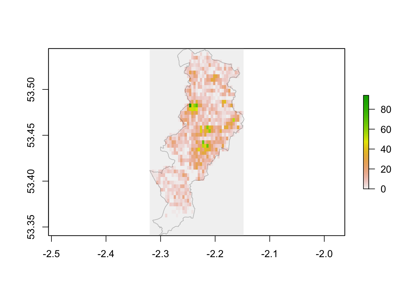
FIGURE 11.1: Raster map of burglary across Manchester
This kind of map is helpful if you want to get a sense of the distribution of crime over the whole city. However, from a crime analyst’s operational point of view the interest may be at a more granular scale. We want to dive in and observe the micro-places that may be areas of high crime within certain parts of the city. We can do this by focusing on particular neighbourhoods. In Manchester, City Centre ward has one of the highest counts of burglaries - so let’s zoom in on here.
When we read in our files at the start of the chapter, we created the city_centre object, which contains the LSOAs in this ward, and also cc_burglary which contains only those burglaries which occurred in the city centre.
Let’s repeat the steps of creating a raster, and then the grid which we demonstrated above for all Manchester Local Authority, but now for the City Centre only.
# Create empty grid for the City Centre
city_centre_r <- raster(city_centre, resolution = 0.0009)
# Produce raster object with the number of incidents within each cell
burglary_raster_cc <- rasterize(cc_burglary,
                                city_centre_r,
                                field = 1,
                                fun = "count",
                                background = 0)
# Plot results with base R
plot(burglary_raster_cc)
plot(st_geometry(city_centre), border='#00000040', add=T)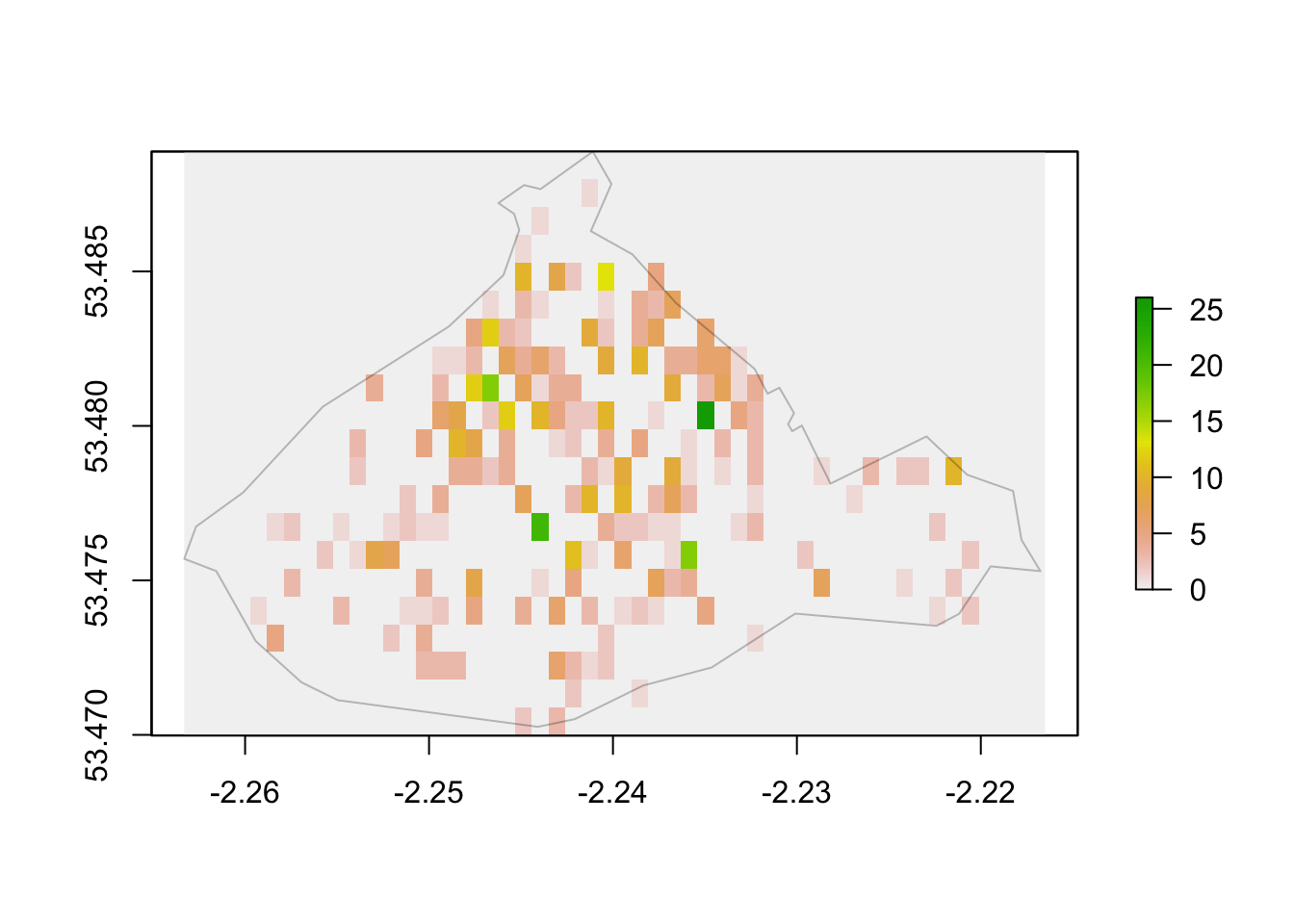
FIGURE 11.2: Raster map of burglary in City Centre only
You can see in the above map where hotspots might occur. However you also see that we have created cells of 0 burglaries outside of the boundary of our City Centre ward. This is not quite true, as we didn’t include burglaries which occurred outside of here. Therefore, we should not have in this raster object incidents outside the boundaries of the neighborhoud. Instead, we want to declare those cells as NAs. We can do that with the mask() function in the raster package.
burglary_raster_cc <- mask(burglary_raster_cc, city_centre)
plot(burglary_raster_cc)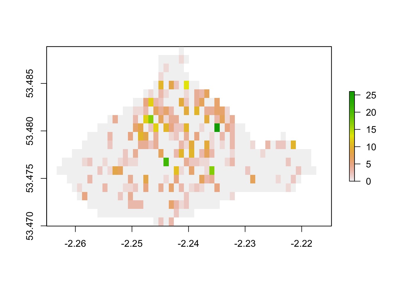
FIGURE 11.3: Raster plot of burglary
Now you can see we indicate more clearly where we have cells which contain no burglaries at all in our data, versus where we do not have data to be able to talk about burglaries.
To better understand what might be going on in out grids with higher burglary count, let’s add some context. We will use mapview for this. This is another great package if you want to give your audience some interactivity. It does what is says in the tin:
it “provides functions to very quickly and conveniently create interactive visualisations of spatial data. Its main goal is to fill the gap of quick (not presentation grade) interactive plotting to examine and visually investigate both aspects of spatial data, the geometries and their attributes. It can also be considered a data-driven API for the leaflet package as it will automatically render correct map types, depending on the type of the data (points, lines, polygons, raster)” (Appelhans et al. 2021).
With very few lines of code you can get an interactive plot. Here we first will use brewer.pal() from the RColorBrewer package to define a convenient palette (see CHapter 5 for details on this) and then use the mapview() function from the mapview package to plot our raster layes we created above. Below you see how we increase the transparency with the alpha.region argument and how we use col.regions to change from the default palette to the one we created.
my.palette <- brewer.pal(n = 9, name = "OrRd")
mapview(burglary_raster_cc,
        alpha.regions = 0.7,
        col.regions = my.palette)
We can now explore the underlying environmental backcloth behind the areas with high burglary count, and build hypotheses and research questions about what might be going on there, for example whether these are crime attractors, crime generators, or other types of crime places. However keep in mind that these are illustrations of the counts of observed burglaries, and there is nothing here which declares something a “hot spot”. For that, keep reading!
11.3 Local Getis-Ord
The maps above and the ones we introduced in Chapter 7 (produced through kernel density estimation) are helpful for visualising the varying intensity of crime across the study region of interest. However, as we noted above, it may be hard to discern random variation from clustering of crime incidents simply using these techniques. There are a number of statistical tools that have been developed to extract the signal from the noise, to determine what is “hot” from random variation. Many of these techniques were originally designed to detect clusters of disease.
In crime analysis is common to use a technique developed by Arthur Getis and JK Ord in the early 1990s (see Getis and Ord (1992) and Ord and Getis (1995)), partly because it was implemented in the widely successful ArcGIS software tool as part of their hot spot analysis tool. This statistic provides a measure of spatial dependence at the local level. They are not testing homogeneity, they are testing dependence of a given attribute around neighbouring areas (which could be operationalised as micro cells in a grid, as above, or could be some form of administrative areas, like wards, or census boundaries like LSOAs or census blocks).
Whereas the tests we covered in the previous chapter measure dependence at the global level (whereas areas are surrounded by alike areas), these measures of local clustering try to identify pockets of dependence. They are also called local indicators of spatial autocorrelation. It is indeed useful for us to be able to assess quantitatively whether crime events cluster in a non-random manner. In the words of Jerry Ratcliffe (2010), however, “while a global Moran’s I test can show that crime events cluster in a non-random manner, this simply explains what most criminal justice students learn in their earliest classes.” (p. 13). For a crime analyst and practitioner, while clustering is of interest, learning about the existence and location of local clusters is of paramount importance.
There are two variants of the local Getis-Ord statistic. The local \(G\) is computed as a ratio of the weighted average of the values of the attribute of interest in the neighboring locations, not including the value at the location. It is generally used for spread and diffusion studies. The local \(G^*\),on the other hand, includes the value at the location in both numerator and denominator. It is more generally used for clustering studies (for formula details see Getis and Ord (1992) and Ord and Getis (1995)). High positive values indicate the possibility of a local cluster of high values of the variable being analysed (“hot spot”), very low relative values a similar cluster of low values (“cold spot”).
“A value larger than the mean (or, a positive value for a standardized z-value) suggests a High-High cluster or hot spot, a value smaller than the mean (or, negative for a z-value) indicates a Low-Low cluster or cold spot” (Anselin 2020).
For statistical inference, a Bonferroni-type test is suggested in the the papers by Getis and Ord, where tables of critical values are included. The critical values for the 95th percentile under the assumptions discussed by Ord and Getis (1995) are for \(n\)=30: 2.93, \(n\)=50: 3.08, \(n\)=100: 3.29, \(n\)=500: 3.71, and for \(n\)=1000: 3.89. Anselin (2020) suggest that this analytical approximation may not be reliable in practice and that conditional permutation is advisable. Inference with these local measures are also complicated by problems of multiple comparisons, so it is typically advisable to use some form of adjustment to this problem.
The first step in computing the Getis and Ord statistics involves defining the neighbours of each area. And to do that first we have to turn each cell in our grid into a polygon, so we basically move from the raster to the vector model. This way we can use the methods discussed in Chapter 9 to operationalise neighbouringness in our data. To transform our raster grid cells into polygons we can use the rasterToPolygons() function from the raster package.
# Move to vector model
grid_cc <-  rasterToPolygons(burglary_raster_cc)
What is a neighbour and the code related to defining neighbours is a topic we covered in Chapter 9. For brevity, we will only use the queen criteria for this illustration. Only to indicate that include.self() ensures we get the \(G^*\) variation of the local Getis-Ord test, the second variation we mentioned above.
nb_queen_cc <-  poly2nb(grid_cc)
lw_queen_cc <- nb2listw(include.self(nb_queen_cc), zero.policy=T)
Now that we have the data ready we can, analytically, compute the statistic using the localG() function from the spdep package. We can then add the computed local \(Gi^*\) to each cell. And we can then see the produced z scores:
# Perform the local G analysis (Getis-Ord GI*)
grid_cc$G_hotspot_z <- as.vector(localG(grid_cc$layer, lw_queen_cc))
# Summarise results
summary(grid_cc$G_hotspot_z)
## Min. 1st Qu. Median Mean 3rd Qu. Max.
## -1.411 -1.011 -0.398 0.033 0.835 5.231How do you interpret these? They are z scores. So you expect large absolute values to index the existence of cold spots (if they are negative) or hot spots (if they are positive). Our sample size is 475 cells and there are only a very small handful of cells with values that reach the critical value in our dataset.
A known problem with this statistic is that of multiple comparisons. As noted by Pebesma and Bivand (2021): “although the apparent detection of hotspots from values of local indicators has been quite widely adopted, it remains fraught with difficulty because adjustment of the inferential basis to accommodate multiple comparisons is not often chosen.” So we need to ensure the critical values we use adjust for this. As recommended by Pebesma and Bivand (2021), we can use the p.adjust() function to count the number of observations that this statistic identifies as hot spots using different solutions for the multiple comparison problem, such as Bonferroni, False Discovery Rate (fdr), or the method developed by Benjamini and Yekutielli (BY).
p_values_lg <- 2 * pnorm(abs(c(grid_cc$G_hotspot_z)), lower.tail = FALSE)
p_values_lgmc <- cbind(p_values_lg,
              p.adjust(p_values_lg, "bonferroni"),
              p.adjust(p_values_lg, "fdr"),
              p.adjust(p_values_lg, "BY"))
colnames(p_values_lgmc) <- c("None", "Bonferroni",
                           "False Discovery Rate", "BY (2001)")
apply(p_values_lgmc, 2, function(x) sum(x < 0.05))
## None Bonferroni
## 53 10
## False Discovery Rate BY (2001)
## 15 12We can see that we get fewer significant hot (or cold) spots once we adjust for the problem of multiple comparisons. In general, Bonferroni correction is the more conservative option. Here, the p-value is multiplied by the number of comparisons. This is useful, when let’s say we’re trying to avoid false positives. We will progress with those areas identified with this method.
To map this, we can create a new variable, let’s call it hotspot, which can take the value of “hot spot” if the Bonferroni adjusted p-value is smaller than 0.05 and the z score is positive, and “cold spot” if the Bonferroni adjusted p-value is smaller than 0.05 and the z score is negative. Otherwise it will be labelled “Not significant”.
# convert to simple features object
grid_cc_sf <- st_as_sf(grid_cc)
# Creates p values for Bonferroni adjustment
grid_cc_sf$G_hotspot_bonf <- p.adjust(p_values_lg, "bonferroni")
# Create character vector based on Z score and p values
grid_cc_sf <- grid_cc_sf %>%
  mutate(hotspot = case_when(grid_cc_sf$G_hotspot_bonf < 0.05 &
                               grid_cc_sf$G_hotspot_z > 0 ~ "Hot spot",
                             grid_cc_sf$G_hotspot_bonf < 0.05 &
                               grid_cc_sf$G_hotspot_z < 0 ~ "Cold spot",
                             TRUE ~ "Not significant"))
Now let’s see the result
table(grid_cc_sf$hotspot)##
## Hot spot Not significant
## 10 512Great, we have our 10 significant hot spots, and no significant cold spots apparently. We can now map these values.
#set to view mode and make sure colours are colourblind safe
tmap_mode("view")
tmap_style("col_blind")

# make map of the z-scores
map1 <- tm_shape(grid_cc_sf) +
  tm_fill(c("G_hotspot_z"), title="Z scores", alpha = 0.5)

# make map of significant hot spots
map2 <- tm_shape(grid_cc_sf) +
  tm_fill(c("hotspot"), title="Hot spots", alpha = 0.5)

# print both maps side by side
tmap_arrange(map1, map2, nrow=1)
We can see here that not all the micro grid cells with an elevated count of burglaries exhibit significant local dependence. There are only two clusters of burglaries where we see positive spatial dependence. One is located north of Picadilly Gardens in the Northern Quarter of Manchester (an area of trendy bars and shops, and significant gentrification, in proximity to a methadone delivery clinic) and the Deansgate area of the city centre (one of the main commercial hubs of the city not far from the criminal courts).
11.4 Local Moran’s I and Moran scaterplot
11.4.1 Computing the local Moran’s I
The Local Getis and Ord statistic is a local indicators of spatial autocorrelation. In the previous Chapter of this book, we looked at using the Moran’s I as a global measure of spatial autocorrelation. There is also a local version of Moran’s I, which allow for the decomposition of global indicators of spatial autocorrelation such as Moran’s I discussed in Chapter 9, into the contribution of each observation. This allows us to elaborate on the location and nature of the clustering within our study area, once we have found that autocorrelation occurs globally.
Let’s first look at the Moran’s scatterplot for our data. Remember from last chapter that a Moran’s scatterplot plots the values of the variable of interest, in this case the burglary count on each micro grid, against the spatial lagged value. For creating the Moran’s scatterplot we generally use row standardisation in the weight matrix so that the Y and the X axis are more comparable.
# create row standardised weights
lw_queen_rs <-  nb2listw(nb_queen_cc, style='W')

# build Moran's scatterplot
m_plot_burglary <- moran.plot(as.vector(scale(grid_cc$layer)),
                              lw_queen_rs, cex=1, pch=".",
                              xlab="burglary count",  ylab="lagged burglary count")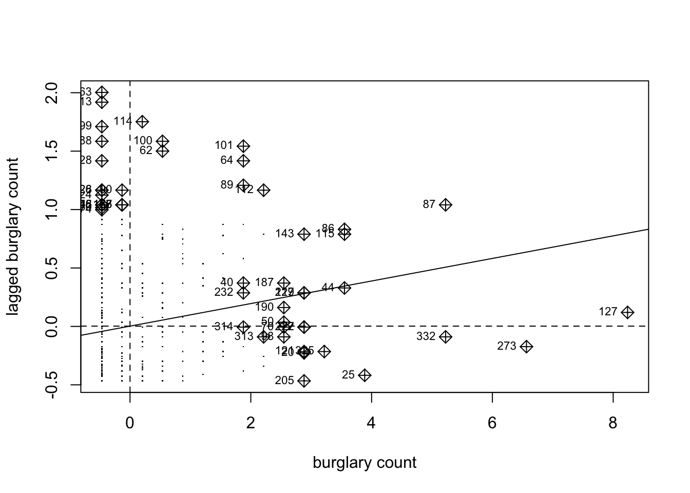
FIGURE 11.4: Moran’s scatterplot for burglary in Manchester
Notice how the plot is split into 4 quadrants structured around the centered mean for the value of burglary and its spatial lag. The top right corner belongs to areas that have high level of burglary and are surrounded by other areas that have above the average level of burglary. These are high-high locations. The bottom left corner belongs to the low-low areas. These are areas with low level of burglary and surrounded by areas with below average levels of burglary. Both the high-high and low-low represent clusters. A high-high cluster is what you may refer to as a hot spot. And the low-low clusters represent cold spots.
In the opposite diagonal we have spatial outliers. They are not outliers in the standard statistical sense, as inextreme observations. Instead, they are outliers in that they are surrounded by areas that are very unlike them. So you could have high-low spatial outliers, areas with high levels of burglary and low levels of surrounding burglary, or low-high spatial outliers, areas that have themselves low levels of burglary (or whatever else we are mapping) and that are surrounded by areas with above average levels of burglary. This would suggest pockets of non-stationarity. Anselin (1996) warns these can sometimes surface as a consequence of problems with the specification of the weight matrix.
The slope of the line in the scatterplot gives you a measure of the global spatial autocorrelation. As we noted earlier, the local Moran’s I help you to identify what are the locations that weigh more heavily in the computation of the global Moran’s I. The object generated by the moran.plot() function includes a measure of this leverage, a hat value, for each location in your study area and we can plot these values if we want to geographically visualise those locations:
# We extract the influence measure and place it in the sp object
grid_cc_sf$lm_hat <- m_plot_burglary$hat
# Then we can plot this measure of influence
tm_shape(grid_cc_sf) + tm_fill("lm_hat")
To compute the local Moran’s I we can use the localmoran() function from the spdep package.
locm_burglary <- localmoran(grid_cc_sf$layer, lw_queen_rs, alternative = "two.sided")As with the local \(G*\) it is necessary to adjust for multiple comparisons. The unadjusted p-value for the test is stored in the fifth column of the object of class localmoran that we generated with the localmoran() function. As before we can extract this element and pass it as an argument to the p.adjust() function in order to obtain p-values with some method of adjustment for the problem of multiple comparisons.
p_values_lm <- locm_burglary[,5]
sum(p_values_lm < 0.05)
## [1] 54NOTE: It is important to note that by default, the localmoran() function does not adjust for the problem of multiple comparisons. This needs to be kept in mind, as it might lead us to erroneously conclude we have many hot or cold spots.
In our example, if we do not adjust for multiple comparisons, then, there would be 33 areas with a significant p value. If we apply again the Bonferroni correction, these get reduced to only 11.
bonferroni_lm <- p.adjust(p_values_lm, "bonferroni")
sum(bonferroni_lm < 0.05)
## [1] 10Another approach is to use conditional permutation for inference purposes, instead of the analytical methods used above. In this case we would need to invoke the localmoran_perm() function also from the spdep package. This approach is based on simulations, so we also have to specify an additional argument nsim setting the number of simulations. Bivand and Wong (2018) suggest that “increasing the number of draws beyond 999 has no effect” (p. 741). The iseed argument ensures we use the same random seed and get reproducible results. As before adjusting for multiple comparisons notably reduces the number of significant clusters.
locm_burglary_perm <- localmoran_perm(grid_cc_sf$layer,
                                      lw_queen_rs,
                                      nsim=499,
                                      alternative="two.sided",
                                      iseed=1)
p_values_lmp <- locm_burglary_perm[,5]
sum(p_values_lmp < 0.05)
## [1] 54bonferroni_lmp <- p.adjust(p_values_lmp, "bonferroni")
sum(bonferroni_lmp < 0.05)## [1] 9We go from 54 to 9 significant regions! This really illustrates the perils of not correcting for multiple comparisons!
11.4.2 Creating a LISA map
In order to map these Local Indicators of Spatial Association (LISA) we need to do some prep work.
First we must scale the variable of interest. As noted earlier, when we scale burglary what we are doing is re-scaling the values so that the mean is zero. We use the scale() function, which is a generic function whose default method centers and/or scales the variable.
# Scale the count of burglary
grid_cc_sf$s_burglary <- scale(grid_cc_sf$layer)
# Creates p values for Bonferroni adjustment
grid_cc_sf$localmp_bonf <- p.adjust(p_values_lmp, "bonferroni")
To produce the LISA maps we also need to generate a spatial lag: the average value of the burglary count in the areas that are considered neighbours of each LSOA. For this we need our listw object, which is the object created earlier, when we generated the list with weights using row standardisation. We then pass this listw object into the lag.listw() function, which computes the spatial lag of a numeric vector using a listw sparse representation of a spatial weights matrix.
#create a spatial lag variable and save it to a new column
grid_cc_sf$lag_s_burglary <- lag.listw(lw_queen_rs, grid_cc_sf$s_burglary)
Make sure to check the summaries to ensure the numbers are in line with our expectations, and nothing weird is going on.
summary(grid_cc_sf$s_burglary)
summary(grid_cc_sf$lag_s_burglary)
We are now going to create a new variable to identify the quadrant in which each observation falls within the Moran Scatter plot, so that we can tell apart the high-high, low-low, high-low, and low-high areas. We will only identify those that are significant according to the p-value that was provided by the local Moran function adjusted for multiple comparisons with out Bonferroni adjustment. The data we need for each observation, in order to identify whether it belongs to the high-high, low-low, high-low, or low-high quadrats are the standardised burglary score (positive or negative), the spatial lag score, and the p-value.
Essentially all we’ll be doing, is assigning a variable values based on where in the plot it is. So for example, if it’s in the upper right, it is high-high, and has values larger than 0 for both the burglary and the spatial lag values. It it’s in the upper left, it’s low-high, and has a value larger than 0 for the spatial lag value, but lower than 0 on the burglary value. And so on, and so on. Here’s an image to illustrate:
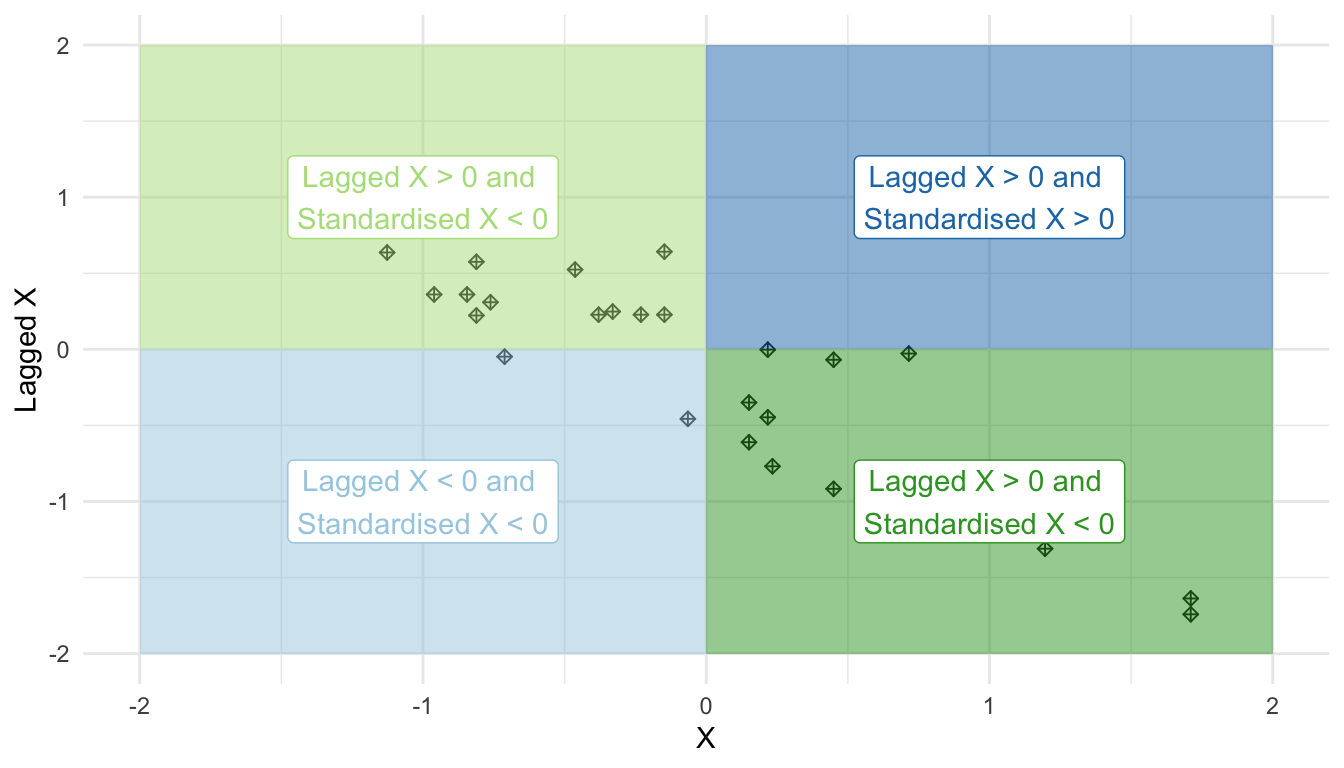
FIGURE 11.5: Quadrants of a Moran scatterplot
So let’s first initialise this variable. In this instance we are creating a new column in the sp object and calling it “quad_sig”.
grid_cc_sf <- grid_cc_sf %>%
  mutate(quad_sig = case_when(localmp_bonf >= .05 ~ "Not significant",
                              s_burglary > 0 &
                                lag_s_burglary > 0 &
                                localmp_bonf < 0.05 ~ "High-high",
                              s_burglary < 0 &
                                lag_s_burglary < 0 &
                                localmp_bonf < 0.05 ~ "Low-low",
                              s_burglary < 0 &
                                lag_s_burglary > 0 &
                                localmp_bonf < 0.05 ~ "Low-high",
                              s_burglary > 0 &
                                lag_s_burglary < 0 &
                                localmp_bonf < 0.05 ~ "High-low" ))
Now we can have a look at what this returns us:
table(grid_cc_sf$quad_sig)##
## High-high Low-high Not significant
## 5 4 513So the 9 significant clusters we found split into 5 high-high and 4 low-high.
Let’s put them on a map, using the standard colours used in this kind of maps:
tm_shape(grid_cc_sf) +
  tm_fill("quad_sig",
          palette= c("red","blue","white"),
          labels = c("High-High","Low-High", "non-significant"),
          alpha=0.5) +
  tm_borders(alpha=.5) +
  tm_layout(frame = FALSE,
            legend.position = c("right", "bottom"),
            legend.title.size = 0.8,
            legend.text.size = 0.5,
            main.title = "LISA with the p-values",
            main.title.position = "centre",
            main.title.size = 1.2)
There we have it, our LISA map of a grid overlay over Manchester’s City Centre ward, identifying local spatial autocorrelation in burglaries.
11.5 Scan satistics
11.5.1 The DCluster package
As we mentioned at the outset of the chapter, a number of alternative approaches using a different philosophy to those that are based on the idea of LISA, have been developed within spatial epidemiology. Rather than focusing on local dependence these tests focus on assessing homogeneity (Marshall 1991):
The null hypothesis when clustering is thought to be due to elevated local risk is usually that cases of disease follow a non-homogeneous Poisson process with intensity proportional to population density. Tests of the null Poisson model can be carried out by comparing observed and expected count” (p. 423).
Here we will look at two well known approaches with a focus on their implementation in the DCluster package: Openshaw’s GAM and Kulldorf’s scan statistic. The package DCluster (Gomez-Rubio, Ferrandiz, and Lopez 2005) was one of the first to introduce tools to assess spatial disease clusters to R. This package precedes sf and it likes the data to be stored in a data frame with at least four columns: observed number of cases, expected number of cases, and the longitude and latitude. It is a bit opinionated in the way it is structured. DCluster, like many packages that are influenced by the epidemiological literature, take as key inputs the observed cases (in criminology this will be criminal occurrences) and expected cases. In epidemiology expected cases are often standardised to account for population heterogeneity. In crime analysis this is not as common (although in some circumstances it should be!).
Straight away we see the problem we encounter here. The criminology of place emphasises small places, but for this level of aggregation (street segments or micro grid cells) we won’t have census variables indexing the population that we could easily use for purposes of standardisation. This means we need to (1) either compromise and look for clusters at a level of aggregation for which we have some population measure that we could use for standardising or (2) get creative an try to find other ways of solving this problem. Increasingly environmental criminologists are trying to find ways of taking this second route (see Andresen et al. (2021)). For this illustration and for convenience reasons, we will take the first one. Although it is important to warn we should try to stick whenever possible to the level of the spatial process we are interested in exploring.
For this example the expected counts will be computed using the overall incidence ratio (i.e., total number of cases divided by the total population: in this case the number of residential dwellings in the area). We will use the unit of analysis of neighbourhoods operationalised as a commonly used census unit of geography in the UK, the Lower Super Output Area (LSOA).
Let’s compute the expected count by dividing the total number of burglaries by the total number of dwellings (if burglaries were evenly distributed across all dwellings in our study area) and then multiplying this with the number of dwellings in each LSOA
# calculate rate per dwelling in whole study area
even_rate_per_dwelling <- sum(burglary_lsoa$burglary) / sum(burglary_lsoa$dwellings)

# expected count for each LSOA times rate per number of dwellings
burglary_lsoa <- burglary_lsoa %>%
  mutate(b_expected = dwellings * even_rate_per_dwelling)
This package requires as well the centroids for the polygons we are using. To extract this we can use st_centroid() function form the sf package. If we want to extract the coordinates individually, we also need to use the st_coordinates() function. All the GEOS functions underlying sf need projected coordinates to work properly, so we need to ensure an adequate projection (which we did when we loaded the data at the outset of the chapter):
# Get coordinates for centroids
lsoa_centroid <- st_centroid(burglary_lsoa) %>%
  st_coordinates(lsoa_centroid)
# Place the coordinates as vectors in our sf dataframe
burglary_lsoa$x <- lsoa_centroid[,1]
burglary_lsoa$y <- lsoa_centroid[,2]
For convenience we will just place these four columns in a new object. Although this is not clear from the documentation, in our experience some of the code will only work if you initialise the data using these column names:
lsoas <- data.frame(Observed = burglary_lsoa$burglary,
                   Expected = burglary_lsoa$b_expected,
                    Population = burglary_lsoa$dwellings,
                    x = burglary_lsoa$x,
                    y = burglary_lsoa$y)
DCluster includes several tests for assessing the general heterogeneity of the relative risks. A chi square test can be run to assess global differences between observed and expected cases.
chtest <- achisq.test(Observed~offset(log(Expected)),
                      as(lsoas, "data.frame"),
                      "multinom",
                      999)
chtest
## Chi-square test for overdispersion
##
## Type of boots.: parametric
## Model used when sampling: Multinomial
## Number of simulations: 999
## Statistic: 4612
## p-value : 0.001It also includes the Pottoff and Withinghill test of homogeneity. The alternative hypothesis of this test is that the observed cases are distributed following a negative binomial distribution (Bivand, Pebesma, and Gómez-Rubio 2013).
pwtest <- pottwhitt.test(Observed~offset(log(Expected)),
                         as(lsoas, "data.frame"),
                         "multinom", 999)
oplus <- sum(lsoas$Observed)
1 - pnorm(pwtest$t0, oplus * (oplus - 1), sqrt(2 * 100 * oplus * (oplus - 1)))
## [1] 0Detail in those two tests and the used code is available from Bivand, Pebesma, and Gómez-Rubio (2013). In what follows we introduce two of the approaches implemented here for the detection of clusters.
11.5.2 Openshaw’s GAM
Stan Openshaw is a retired British geography professor with a interest in geocomputation. We already encountered him earlier, for he wrote one of the seminal papers on the modifiable areal unit problem. In 1987, together with several colleagues, he published his second most highly cited paper introducing what the called a geographical analysis machine (GAM). This was a technique developed to work with point pattern data with the aim of finding clusters (Openshaw et al. 1987). The machine is essentially an automated algorithm that tries to assess whether “there is an excess of observed points within \(x\) km of a specific location” (p. 338). A test statistics is computed for this circular search area and some form of inference can then be made.
The technique requires a grid and will draw circles centred in the intersection of the cells of this grid. From each point of the grid backdrop a radial distance is calculated assuming a Poisson distribution. The ratio of events to candidates is counted up and then the test is done. What we are doing is to observe case counts in overlapping circles and trying to identify potential clusters among these, by virtue of running separate significance test for each of the circles individually. The statistically trained reader may already note a problem with this. In a way this is similar to tests for quadrat counting, only here we have overlapping “quadrats” and we have many more of them (Kulldorff and Nagarwalla 1995).
The opgam() function from DCluster does this for you. You can either specify the grid passing the name of the object containing this grid using the thegrid argument or specify the step size for computing this grid. For this you simply introduce a value for the step argument. You also need to specify the search radius and can specify a explicit significance level of the test performed with the alpha argument. The radius is typically is typically 5 to 10 times the lattice spacing. It is worth mentioning that although one could derive this test using asymptotic theory, DCluster uses a bootstrap approach.
gam_burglary <- opgam(data = as(lsoas, "data.frame"),
                      radius = 50, step = 10, alpha = 0.002)
Once opgam has found a solution we could plot either the circles or the centre of these circles. We can use the following code to do the map, which will be shown in the next section.
gam_burglary_sf <- st_as_sf(gam_burglary, coords = c("x", "y"), crs = 27700)
gam_burglary_sf <- st_transform(gam_burglary_sf, crs = 4326)
tmap_mode("plot")
## tmap mode set to plottingmap_gam <- tm_shape(burglary_lsoa) + tm_borders(alpha = 0.3) +
tm_shape(gam_burglary_sf) + tm_dots(size=0.1, col = "red") +
tm_layout(main.title = "Openshaw's GAM", main.title.size=1.2)One of the problems with this method is that the tests are not independent; “very similar clusters (i.e., most of their regions are the same) are tested” Bivand, Pebesma, and Gómez-Rubio (2013). Inference then is a bit compromised and the approach has received criticism over the years for this failure to solve the multiple testing problem: “any Bonferroni type of procedure to adjust for multiple testing is futile due to the extremely large number of dependent tests performed” (Kulldorff and Nagarwalla 1995). For these reasons and others (see Marshall (1991b)), it is considered hard to ask meaningful statistical questions from a GAM. Notwithstanding this, this technique, as noted by Bivand, Pebesma, and Gómez-Rubio (2013), can still be helpful as part of the exploration of your data, as long as you are aware of its limitations.
11.5.3 Kulldorf’s Scan Statistic
More popular has been the approach developed by Kulldorff and Nagarwalla (1995). This test could be used for aggregated or point pattern data. It aim to overcome the limitations from previous attempts to assess clusters of disease. Unlike previous methods the scan statistic construct circles of varying radius (Kulldorff and Nagarwalla 1995):
“Each of the infinite number of circles thus constructed defines a zone. The zone defined by a circle consists of all individuals in those cells whose centroids lie inside the circle and each zone is uniquely identified by these individuals” (p. 802)
The test statistic then compares the relative risk within the circle to the relative risk outside the circles (for more details see Kulldorff and Nagarwalla (1995) and Kulldorff (1997)).
The scan statistic was implemented by Kulldorff in the SatScan^TM software, freely available from www.satscan.org. This software extends the basic idea to various problems, including spatio temporal clustering. A number of R packages use this scan statistic (smerc, spatstat, SpatialEpi are some of the best known), although the implementation is different across these packages. There is also a package (rsatscan) that can allow us to interface with SatScan^TM via R. Here we will continue focusing on DCluster for parsimony reasons. The vignettes for the other packages provide a useful platform for exploring those other solutions.
For this we return to the opgam() function. There are some key differences in the arguments. The icluster argument, which we didn’t specify previously, needs to make clear now we are using the clustering function for Kulldorff and Nagarwalla scan statistic. R is the number of bootstrap permutations to compute. The model argument allow us to specify the model to generate the random observations. Bivand, Pebesma, and Gómez-Rubio (2013) suggests the use of a negative binomial model ("negbin") to account for over dispersion which may result from unaccounted spatial autocorrelation. And mle specifies parameters that are needed for the bootstrap calculation. These can be computed with the DCluster::calculate.mle() function, which simply takes as arguments the data and the type of model. -when illustrating opgam earlier we used the step method to draw the grid, in this case we will explicitly provide a grid based on our data points.
mle <- calculate.mle(as(lsoas, "data.frame"), model = "negbin")
thegrid <- as(lsoas, "data.frame")[, c("x", "y")]
kns_results <- opgam(data = as(lsoas, "data.frame"),
                   thegrid = thegrid, alpha = 0.02, iscluster = kn.iscluster,
                   fractpop = 0.05, R = 99, model = "negbin",
                   mle = mle)
Once the computation is complete we are ready to plot the data and to compare the result to those obtained with the GAM.
kulldorff_scan <- st_as_sf(kns_results,
                      coords = c("x", "y"),
                      crs = 27700)
kulldorff_scan <- st_transform(kulldorff_scan, crs = 4326)
map_scan <- tm_shape(burglary_lsoa) + tm_borders(alpha = 0.3) +
  tm_shape(kulldorff_scan) + tm_dots(size=0.1, col = "red") +
  tm_layout(main.title = "Kulldorf Scan", main.title.size=1.2)
tmap_arrange(map_gam, map_scan)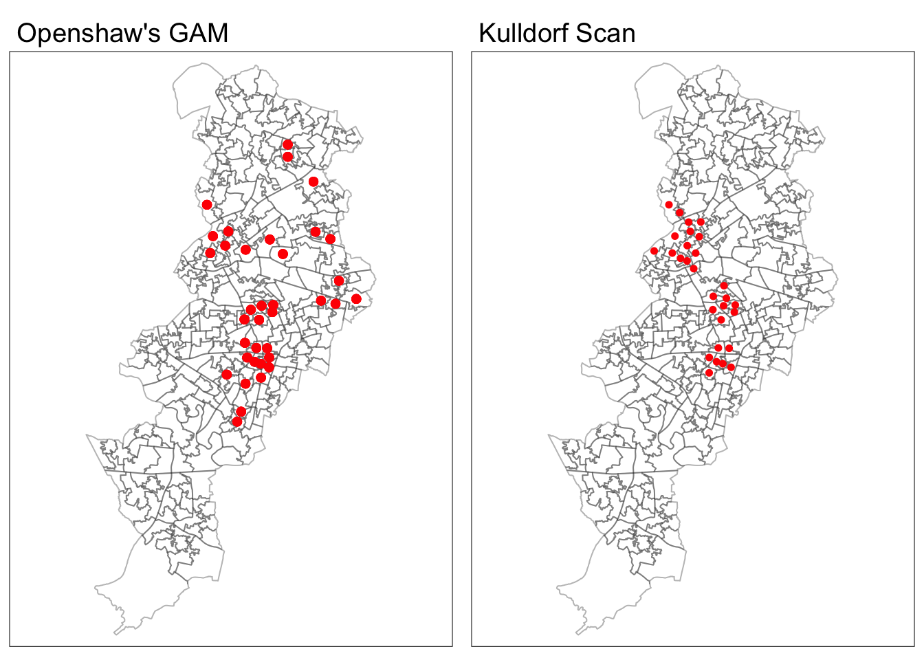
FIGURE 11.6: Difference in results between Openshaw’s GAM and Kulldorf scan statistics
Whereas the GAM picks up a series of location in East and North Manchester known by their high level of concentrated disadvantage, the Kulldorff scan only identifies the clusters around the city centred an areas of student accommodation south of the University of Manchester.
11.6 Exploring near repeat victimisation
Although a good deal of the near repeat victimisation literature focuses on burglary, our Manchester data is not good for illustrating the analysis of near repeat victimisation. For this we need data with more granular time information, than the month in which it took place (the only available from UK open data police portals). So we will return to the burglary data we explored in Chapter 7 when introducing spatial point pattern analysis. Remember, though, that there is a good deal of artificial “revictimisation” in those files for the way that geomasking is introduced. So although we can use that data for illustration purposes beware the results we will report cannot be trusted as genuine.
# Large dataset, so it will take a while
nyc_burg <- get_crime_data(
  cities = "New York", #specifies the city for which you want the data
  years = 2010,        #reads the appropriate year of data
  type = "extended",   #select extended (a fuller set of fields)
  output = "sf") %>%        #Specify you want a sf object with WGS84
  dplyr::filter(offense_type == "residential burglary/breaking & entering" &
           nyc_boro_nm == "MANHATTAN")
manhattan <- st_read("data/manhattan.geojson", quiet=TRUE) %>%
  filter(BoroName == "Manhattan")
manhattan <- st_transform(manhattan, 32118)
nyc_burg <- st_transform(nyc_burg, 32118)
The NearRepeat package uses the Knox test for space time clustering, which has been around since 1964. This test whether there is a significant cluster within a defined distance and time period. The Knox algorithm counts the pair of points within a specified space and time interval and compares this to the expected number of points. “If many of the cases that are ‘close’ in time are also ‘close’ in space or vice versa, then there is space-time interaction” (Kulldorff and Hjalmars 1999). The idea underpinning the test, as highlighted by Mantel (1967), is that “if there is time-space clustering, cases in a cluster will be close both in time and space, while unrelated cases will tend to have a larger average separation in time and space.” (p. 209).
The NearRepeat package is quite straightforward with just a couple of functions, as we will see. The key function is NearRepeat() that takes as inputs the data (a vector with the \(x\) coordinates, a vector with the \(y\) coordinates, and a vector with the time information -which can be an integer, numeric or date). You then need to specify the time and the spatial intervals. Ratcliffe (2020) indicates that:
“The number of spatial bands is dependent on how far you expect a pattern of near repeats to extend. For example, most environmental criminology research suggests that near repeat patterns occur for only a few blocks or a few hundred meters at most. Any effects appear to peter out beyond this distance. Adding additional bands beyond any identified effects rarely adds much value; however the program is often most effective when you experiment with various settings. For fairly large data sets, ten spatial bands is often a good starting point, though experimentation is encouraged… Be advised that selecting too many bands or too narrow a bandwidth can reduce the number of observations in each category and potentially limit the findings by creating too many categories with low (or zero) values in the observed or expected matrices”
And likewise for the temporal bands:
“The number of temporal bands is dependent on how long you expect a pattern of near repeats to extend. For example, the research on repeat victimization suggests that a risk of repeat burglary increases rapidly after an initial burglary, but that this risk dissipates in the months after the incident and the risk returns to the background (normal level for the area) after a few months. Settings of a 30 day temporal bandwidth with 12 temporal bands, or 14 days with 13 temporal bands (to cover a six month period) are common, but experimentation is encouraged.”
The Knox test basically uses these temporal and spatial bands to compute the expected number of pairs of events that are close in time and space and compares this with the observed count. Let’s first prepare the data. We will extract the key vectors to a data frame.
nyc_burg_df <- matrix(unlist(nyc_burg$geometry), ncol = 2, byrow = T)
nyc_burg_df <- as.data.frame(nyc_burg_df)
nyc_burg_df$time <- as.Date(nyc_burg$date_single)
nyc_burg_df <- rename(nyc_burg_df, x = V1, y = V2)
We can then try the test. We look at three temporal intervals of seven days each (defined by tds) and four spatial bands (defined by sds), expressed in meters here. By default this functions relis on the Manhattan distances, but we can also set them to Euclidean if we prefer (method = "euclidean"). The p values are computed using a Monte Carlo simulation approach, so nrep sets the number of simulations we desire. The generic plot() function to the generated object will then generate a heat map with the results of the Knox test.
set.seed(123)
results_knox <- NearRepeat(x = nyc_burg_df$x,
                     y = nyc_burg_df$y,
                     time = nyc_burg_df$time,
                     sds = c(0, 0.1, 100, 200, 400),
                     tds = c(0, 7, 14, 21),
                     nrep = 99)
plot(results_knox)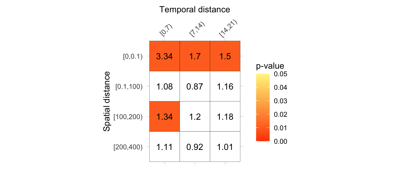
FIGURE 11.7: Results of the Knox test
By default this will plot the cells with significant p values and the knox ratios based on the mean across simulations that are higher than 1.2 (that is, the observed number of pairs is 20% greater than expected). This default can be changed to various options (as discussed in the vignette for the package).
This test was commonly used in epidemiology for preliminary analysis where an infectious origin is suspected before criminologists started to use it. It is worthwhile noticing that within the epidemiological literature there are known concerns with this test (see Kulldorff and Hjalmars (1999) and Townsley, Homel, and Chaseling (2003)). One is bias introduced by shifts in the population, that considering the temporal scale typically considered in criminological issues is not the greatest concern. We also need to worry about arbitrary cut offs and the related problem of multiple comparisons. The near repeat calculator manual suggestion for experimentation around these cut offs likely exacerbates this problem in the practice of crime analysis. Townsley, Homel, and Chaseling (2003) suggest using past findings reported in the literature to establish the time and space intervals. If there are seasonal effects, this test is not well suited to account for them. Finally, the literature also discusses edge effects. Within the epidemiological literature several modifications to the Knox test have been proposed and presumably we will see more of this used by criminologists in the future.
A recent article by Briz-Redón, Martı́nez-Ruiz, and Montes (2020a) proposes a modification of the traditional Knox test. The classic test assumes that crime risk is homogeneous in time and space, despite the fact that this assumpsiton rarely holds. Their procedures relax this assumption, but have yet to be implemented in an R package.
11.7 Further reading
Hot spots of crime are a simply a convenient perceptual construct. As Ned Levine (2013) (Chapter 7, p. 1) highlights “Hot spots do not exist in reality, but are areas where there is sufficient clustering of certain activities (in this case, crime) such that they get labeled such. There is not a border around these incidents, but a gradient where people draw an imaginary line to indicate the location at which the hot spot starts.” Equally, there is not a unique solution to the identification of hot spots. Different techniques and algorithms will give you different answers. He furter emphasises: “It would be very naive to expect that a single technique can reveal the existence of hot spots in a jurisdiction that are unequivocally clear. In most cases, analysts are not sure why there are hot spots in the first place. Until that is solved, it would be unreasonable to expect a mathematical or statistical routine to solve that problem” (Chapter 7, p. 7).
So, as with most data analysis exercises one has to try different approaches and use professional judgment to select a particular representation that may work best for a particular use. Equally, we should not reify what we produce and, instead, take the maps as a starting point for trying to understand the underlying patterns that are being revealed. Critically you want to try several different methods. You will be more persuaded a location is a hot spot if several methods for hot spot analysis point to the same location. Keep in mind as well the points we raised about the problems with police data in earlier chapters. This data presents limitations. There is reporting bias, recording bias, and issues with geocoding quality. Briz-Redón, Martı́nez-Ruiz, and Montes (2020b), specifically, highlight that the common standard of a 85% match in geocoding is not good enough if the purpose is detecting clusters. What we see in our data may not be what it is, because of the quality of this data.
A more advanced approach at considering space time interactions and exploration of highly clustered even sequences than the one assumed by the Knox test rely on the idea of self-exciting points that are common in seismology. For details in this approach see Moehler et al. (2011). Kulldorff et al. (2005) also developed a space time permutation scan statistic for detecting disease outbreaks that may be useful within the context of crime analysis (see, for example, Uittenbogaard and Ceccato (2012) use to study spatio-temporal clusters of crime in Stockholm or Cheng and Adepeju (2014) use of the prospective scan statistic in London). Gorr and Lee (2015) discuss an alternative approach to study and responding to chronic and temporary hotspot. Of interest as well is the work by Adepeju, Langton, and Bannister (2021), and the associated R package Akmedoids(Adepeju, Langton, and Bannister 2020), for classifying longitudinal trajectories of crime at micro places.
Also, as noted in previous chapters, we need to acknowledge the underlying network structure constraining the spatial distribution of our crime data. Shiode et al. (2015) developed a hotspot detection method that uses a network-based space-time search window technique (see also Shiode and Shiode (2020) for more recent work). However, the software implementation of this approach has not yet seen the light as of this writing despite the authors mentioning a “GIS plug-in tool” to be in development in their 2015 paper. Also relevant is the work by Briz-Redón, Martı́nez-Ruiz, and Montes (2019b) that developed a R package (DRHotNet) for ldifferential risk hotspots on a linear network. This is a procedure to detect whether specific type of event is overrepresented in relation to the other types of events observed (say, for example, burglaries in relation to other crimes). There is a detailed tutorial for this package in Briz-Redón, Martı́nez-Ruiz, and Montes (2019a).